AI YouTube Thumbnails: Tested for Readability at 320 Pixels
We generated six YouTube thumbnails with AI and tested each one at 320 pixels wide - roughly what you see on a phone. Three scored very good, three good.

👁 112 reads
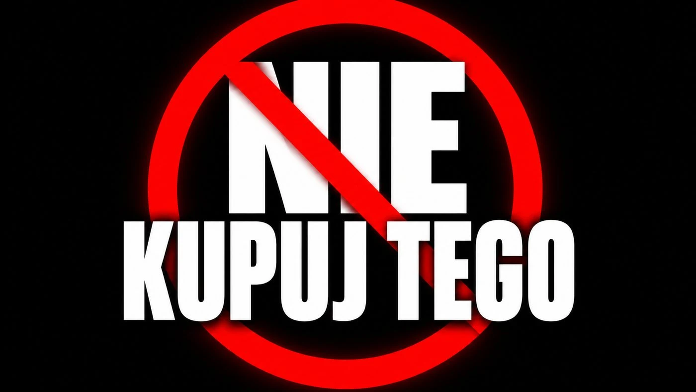
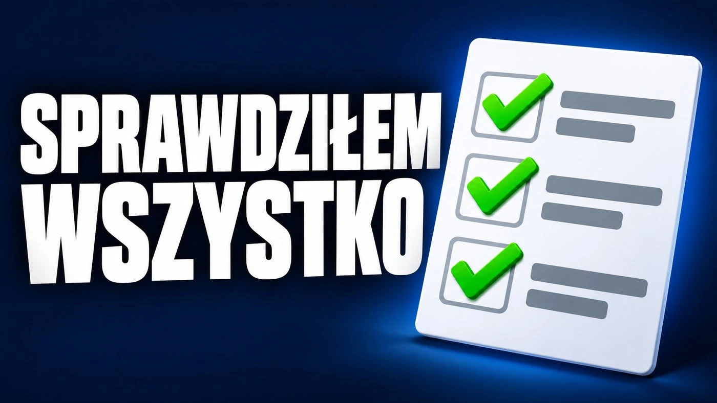
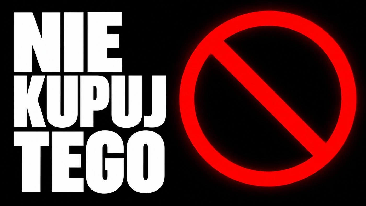
A YouTube thumbnail has one job: be readable when it’s small. We generated six thumbnails and tested each one scaled down to 320 pixels wide - roughly what you see in the suggestions list on a phone. Result: three very good, three good, none unreadable.
Seven thumbnails in 16:9 format




Results
| Text | Readability at 320 px | Notes |
|---|---|---|
| I TESTED FOR 30 DAYS | good, “30 DAYS” particularly clear | tested in Polish |
| FOR FREE | very good | tested in Polish |
| DON’T BUY THIS | very good | tested in Polish |
| HOLY GRAIL AI | good, background competes with text | tested in Polish |
| I CHECKED EVERYTHING | good, top line most cramped | tested in Polish |
The thumbnail with DON’T BUY THIS grabs attention most strongly: the red prohibition sign and large white letters on black stand out immediately. This is a visual assessment, not a clickthrough measurement, and should be treated as such.
Three Practical Takeaways
Short text wins. The three “very good” ratings went to two- and three-word texts. The longer the text, the smaller the letters and the faster the thumbnail stops working on a phone.
Background must yield to text. The only thumbnail where the background competed with the text received a lower rating despite correct typography. A glowing screen behind letters is a classic trap.
Special characters are no longer a problem. We tested these thumbnails with Polish text (a heavily inflected language with many diacritics), and all special characters rendered correctly wherever they appeared.
Google · Your sourcesQuantslant higher in your Google - one clickAdd to preferred sources →Disclaimer
Six thumbnails, one run, no repetitions. Readability assessment is visual, conducted on versions scaled down to 320 pixels wide. The built-in graphics tool does not disclose the model version.

More on this from QUANTSLANT

 magazine·Call of Duty: Black Ops 7 and the AI Strike Nobody Noticed