AI Packaging: Same Product in 3 Price Segments
Daily, premium or luxury? We show 3 AI-generated packaging designs for the same coffee, complete prompts, and the role of color, typography and materials.

👁 116 reads
The perception of price forms before you read the price tag. Typography, information density, contrast and material presentation all play a role. We tested three packaging directions for the same fictional coffee brand BRZASK: daily, premium and luxury.
In this exercise we deliberately change the label design. We keep the product name, category and weight, but we don’t expect identical branding. This is a different goal than advertising existing packaging, where any change to the markings would be a mistake.
How to Set Up the Comparison
A common product gives you a reference point, and three short briefs define different priorities. The daily variant should be quick to read. Premium should organize information and showcase quality execution. The luxury direction can afford greater restraint and more expressive materials.
We treat the segment labels as visual assumptions. The image alone doesn’t prove that buyers will accept a higher price. We also don’t assume that less text or darker color always means better design.
Input Materials
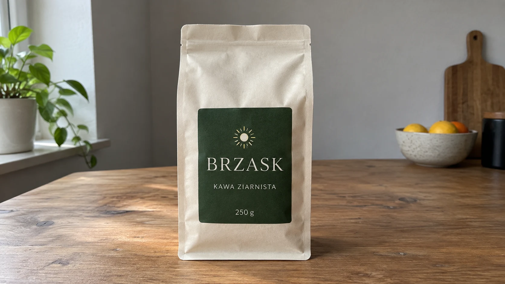
1. Daily Shelf
Attachments for this prompt, in order: BRZASK product.
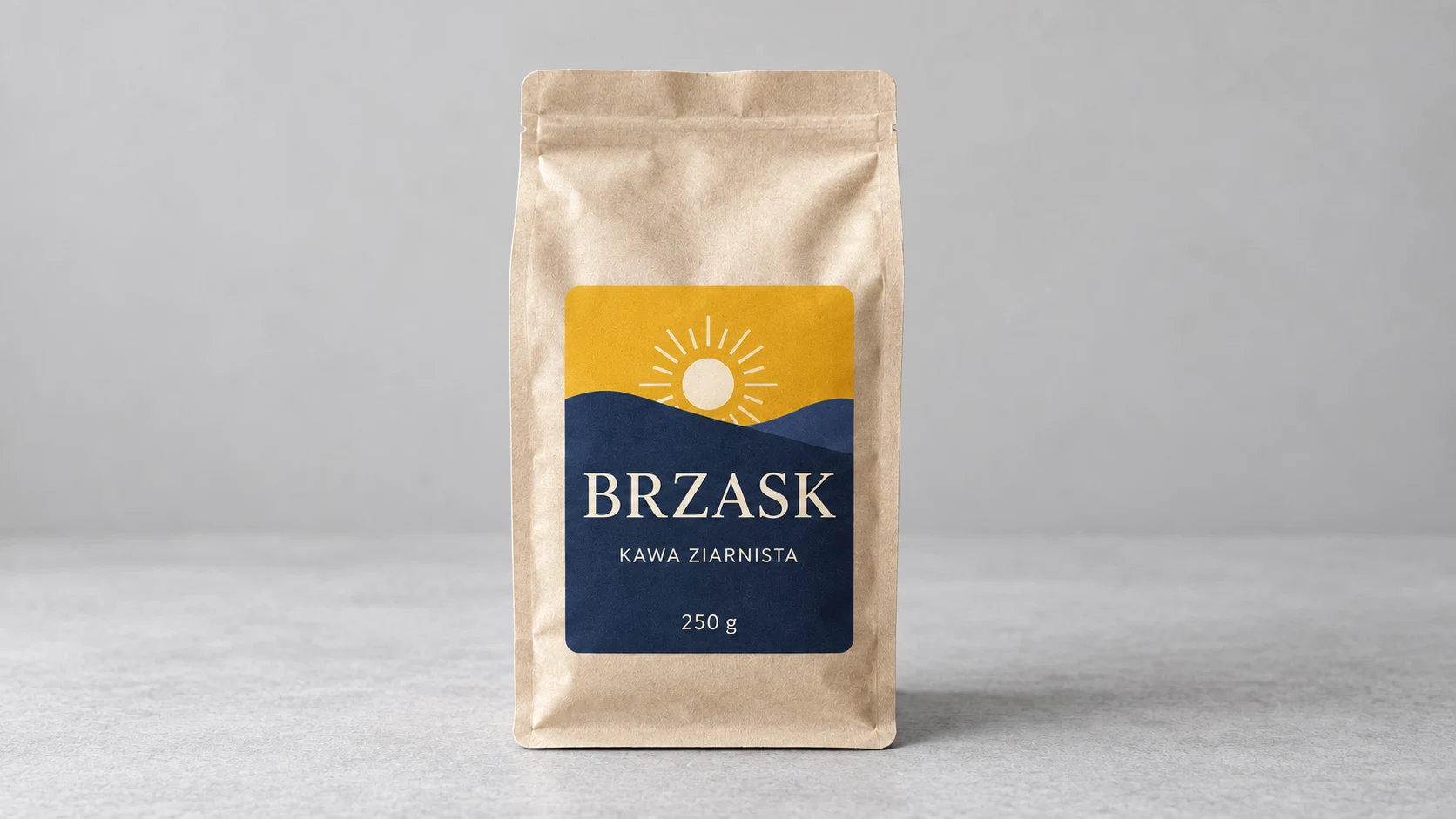
Large blocks of color and a clear brand name quickly organize the front. The sun illustration takes up more space than in the other versions.
Prompt to copy:
Based on the attached photograph, prepare a visualization of fictional coffee BRZASK. Keep the size and shape of the paper bag and the weight 250g. Change the label design, colors and finish according to the direction. Exact text: 'BRZASK', 'KAWA ZIARNISTA', '250 g'. One 16:9 photograph on a neutral light gray table and background, frontal view, soft light from the left, entire product. No other objects or additional text. Practical easy-to-read label, warm yellow and navy, large brand name, smaller information, plain uncoated paper. Appearance of an honest everyday product, no gold foiling.
2. Premium Shelf
Attachments for this prompt, in order: BRZASK product.
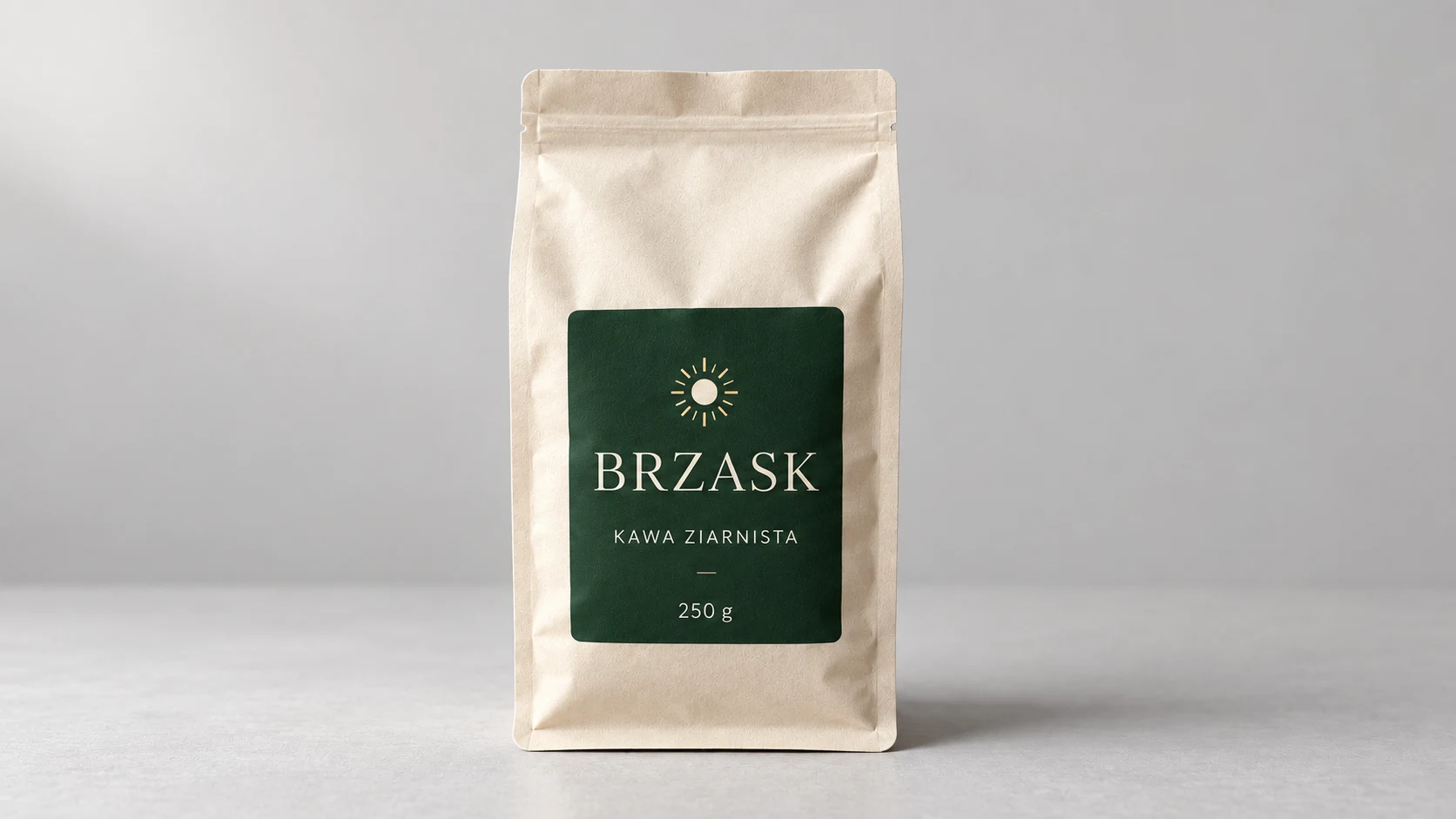
The green and smaller symbol remain close to the original brand. The difference relies on calm hierarchy and spacing, without elaborate decoration.
Prompt to copy:
Based on the attached photograph, prepare a visualization of fictional coffee BRZASK. Keep the size and shape of the paper bag and the weight 250g. Change the label design, colors and finish according to the direction. Exact text: 'BRZASK', 'KAWA ZIARNISTA', '250 g'. One 16:9 photograph on a neutral light gray table and background, frontal view, soft light from the left, entire product. No other objects or additional text. Warm ivory and deep green, restrained layout, carefully chosen serif brand name, small sun mark, thicker matte paper. Plenty of empty space.
3. Luxury Direction
Attachments for this prompt, in order: BRZASK product.
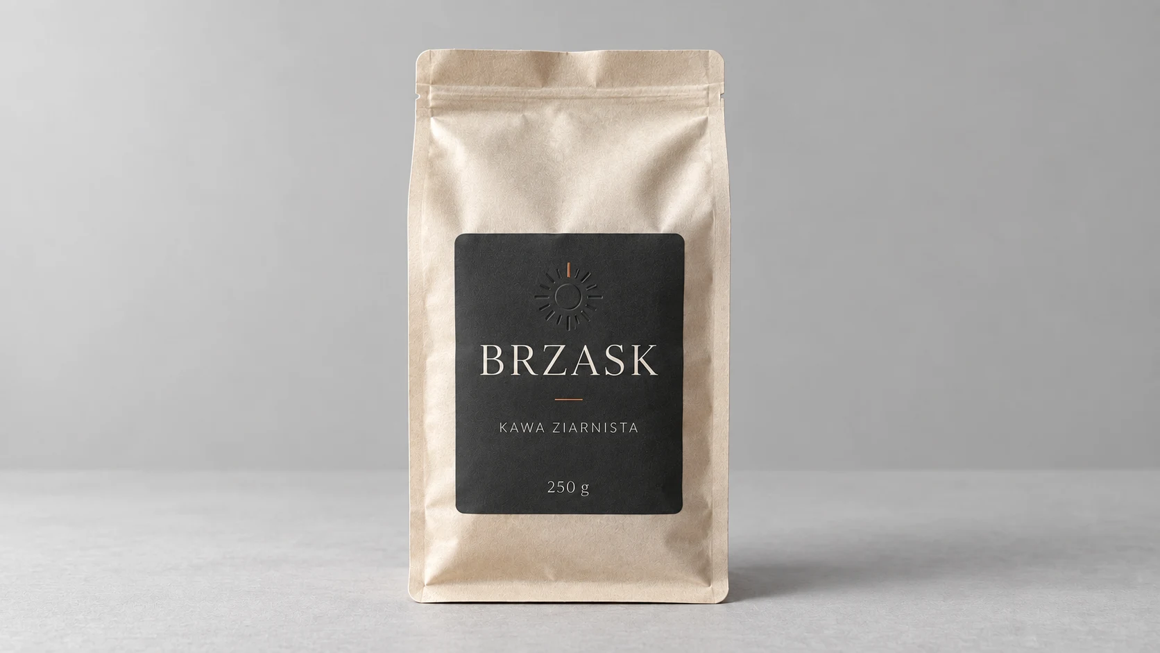
The charcoal background and suggested embossing give the label a more restrained character. The sun has low contrast - a detail to check at the target scale.
Prompt to copy:
Based on the attached photograph, prepare a visualization of fictional coffee BRZASK. Keep the size and shape of the paper bag and the weight 250g. Change the label design, colors and finish according to the direction. Exact text: 'BRZASK', 'KAWA ZIARNISTA', '250 g'. One 16:9 photograph on a neutral light gray table and background, frontal view, soft light from the left, entire product. No other objects or additional text. Charcoal and warm white, small precise typography, delicate embossed sun mark, very small copper detail, velvety matte paper. No marble, glitter, excess gold or ornaments.
What to Look for Beyond First Impression
First we look for the BRZASK name, the KAWA ZIARNISTA information and 250 g. Then we assess what we read first and whether the decoration competes with the product. If we need magnification to recognize the brand, an impressive detail doesn’t fix the problem.
We would also compare the variants as small thumbnails next to competing packages. You evaluate a single image on a large screen differently than a product in a row of a dozen proposals. These are two separate tasks for the design.
Google · Your sourcesQuantslant higher in your Google - one clickAdd to preferred sources →What Visualization Doesn’t Solve
Metallic sheen in the image is a suggestion of finish, not an instruction for the printer. Similarly, realistic paper doesn’t specify weight or printing technology. After choosing a direction, you need to establish actual materials, information layout and production files.
We would start with the simple daily variant as a reference point. Then we would add one premium feature and check whether it helps convey the product’s character. This way the design doesn’t turn into a collection of random “expensive” signals.
See also: Same Product, 10 Advertising Frames with AI. Prompts and Examples.

More on this from QUANTSLANT
 guides·One AI Campaign, 6 Ad Formats: Prompts and ExamplesHow to adapt one campaign across six formats while keeping the product, tagline and colors consistent despite changing aspect ratios.