One AI Campaign, 6 Ad Formats: Prompts and Examples
How to adapt one campaign across six formats while keeping the product, tagline and colors consistent despite changing aspect ratios.
👁 116 reads
Changing a horizontal ad into a vertical one is not just about cropping the sides. The product can fall out of frame and the tagline can become too small. We prepared six adaptations of one fictional coffee campaign for BRZASK to show the difference between preserving style and copying layout.
The common elements are a cream background, dark green, an ochre arc, a coffee bag and the tagline “START CALMLY”. We created the horizontal variant first. In the remaining attempts, we attached it as a campaign reference alongside the original product photo.
What We Lock and What We Allow to Move
We do not change the tagline content, brand colors or label. However, we allow the product to move, the empty field width to change and the text to break differently. A narrow vertical format needs a different hierarchy than a low banner.
The aspect ratios given in the prompts are compositional goals. Before using a file, you should check its actual dimensions and readability at the target size. The format name in the prompt is not confirmation of compliance with a specific ad placement.
Input Materials
1. Horizontal Ad 16:9
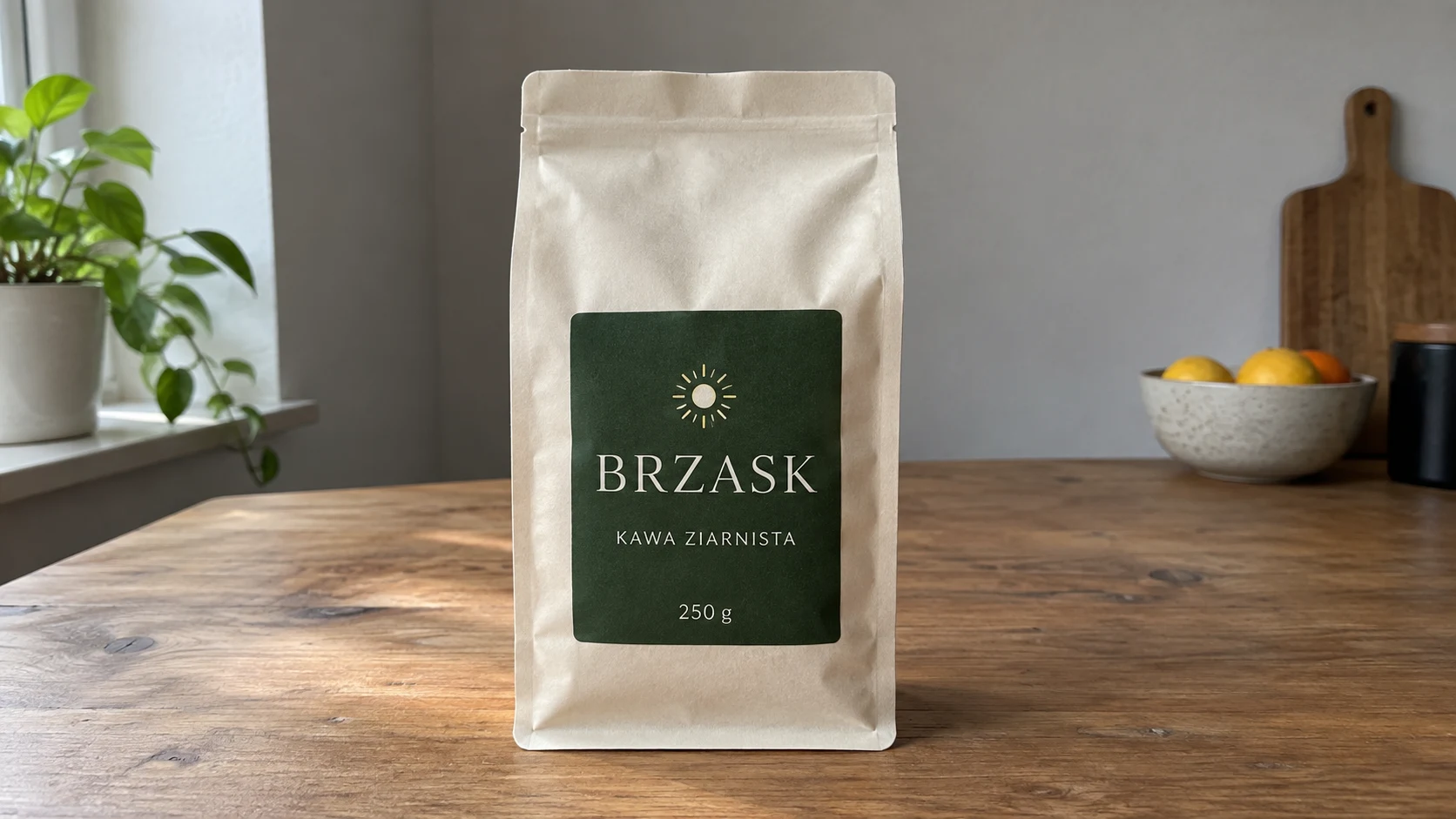
Attachments for this prompt, in order: BRZASK product.
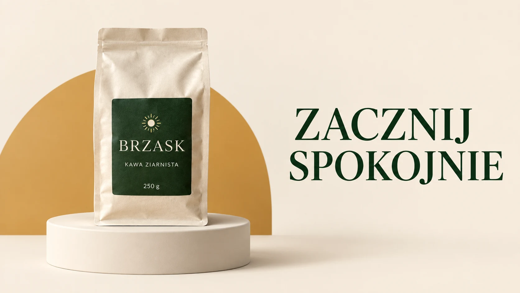
The product is on the left, the tagline on the right, and an ochre arc connects both areas. This is the master pattern to which we refer in subsequent adaptations.
Prompt to copy:
Use the attached product as an exact reference. Create a BRZASK coffee ad in horizontal 16:9 format. The cream bag with dark green label, sun symbol and text BRZASK, KAWA ZIARNISTA, 250 g must retain its appearance. Product on the left on a low simple cream podium, on the right large dark green tagline in two lines: START / CALMLY. Entire background cream, one flat ochre arc behind the product, natural soft shadow. Minimal contemporary composition, without additional text, frames, neons or small decorations. Leave safe margin from edges. Text as part of conscious typographic design.
2. Vertical Ad 9:16
Attachments for this prompt, in order: BRZASK product, horizontal campaign master.
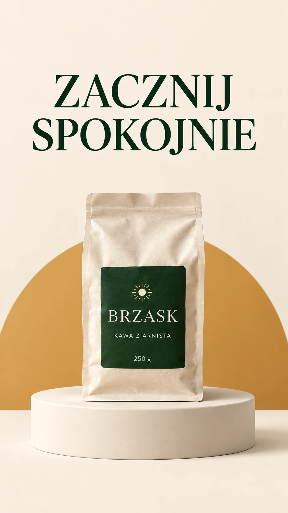
In the vertical format, the tagline is positioned above the product. The arc and color palette maintain campaign recognition, despite moving the text from the right side to the top.
Prompt to copy:
Create a campaign adaptation for 9:16 format. Reference 1 defines the exact BRZASK product, reference 2 is the ad style master. Maintain cream background, dark green typography, ochre arc, natural soft light and bag appearance with BRZASK / KAWA ZIARNISTA / 250 g label. The only additional tagline is exactly START CALMLY. Tagline at top in two large lines, product lower on podium, ochre arc behind it. Leave clear zone at top and bottom edges. Redesign layout for new proportions, do not squeeze or stretch elements. Maintain typeface from campaign reference. Without additional text, frames, icons or ornaments.
3. Square 1:1
Attachments for this prompt, in order: BRZASK product, horizontal campaign master.
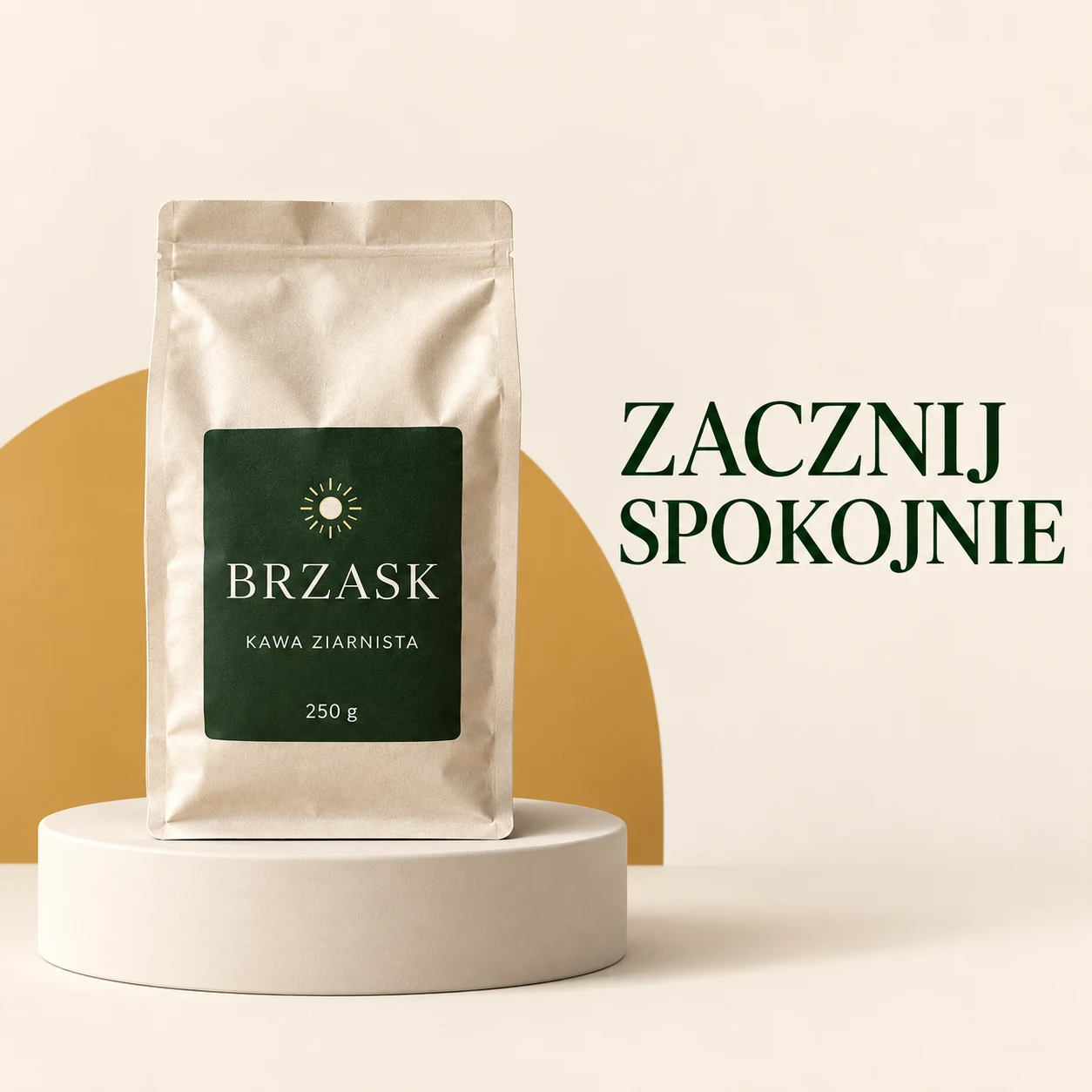
The square maintained the side-by-side layout of product and tagline. The text is smaller relative to the package than in the vertical version, so you should check readability as a thumbnail.
Prompt to copy:
Create a campaign adaptation for 1:1 format. Reference 1 defines the exact BRZASK product, reference 2 is the ad style master. Maintain cream background, dark green typography, ochre arc, natural soft light and bag appearance with BRZASK / KAWA ZIARNISTA / 250 g label. The only additional tagline is exactly START CALMLY. Product on the left, shorter text area on the right, tagline in two lines. Maintain readability without cropping product. Redesign layout for new proportions, do not squeeze or stretch elements. Maintain typeface from campaign reference. Without additional text, frames, icons or ornaments.
4. Low Banner 3:1
Attachments for this prompt, in order: BRZASK product, horizontal campaign master.
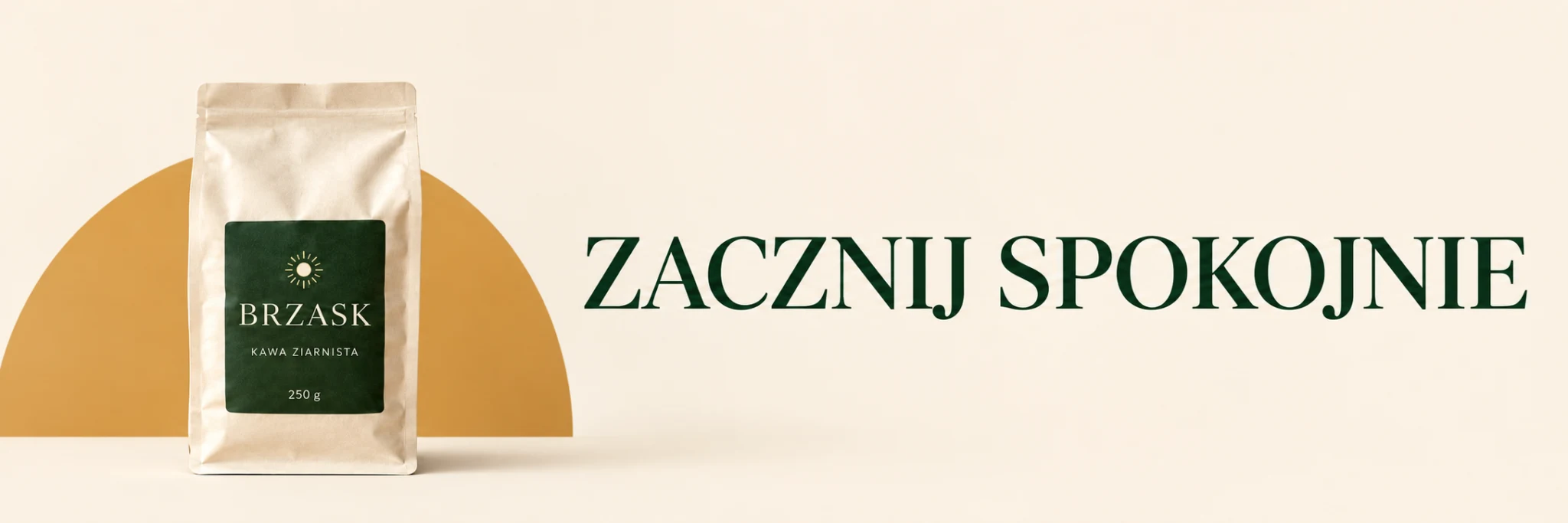
In the low banner, the tall podium disappeared and the tagline fits in one line. This is a compositional change, not a mechanical crop of the master.
Prompt to copy:
Create a campaign adaptation for 3:1 format. Reference 1 defines the exact BRZASK product, reference 2 is the ad style master. Maintain cream background, dark green typography, ochre arc, natural soft light and bag appearance with BRZASK / KAWA ZIARNISTA / 250 g label. The only additional tagline is exactly START CALMLY. Truly wide low banner. Product scaled down on the left and fully visible, tagline on the right in one large line, simple flat background. Eliminate tall podium. Redesign layout for new proportions, do not squeeze or stretch elements. Maintain typeface from campaign reference. Without additional text, frames, icons or ornaments.
5. Vertical Post 4:5
Attachments for this prompt, in order: BRZASK product, horizontal campaign master.
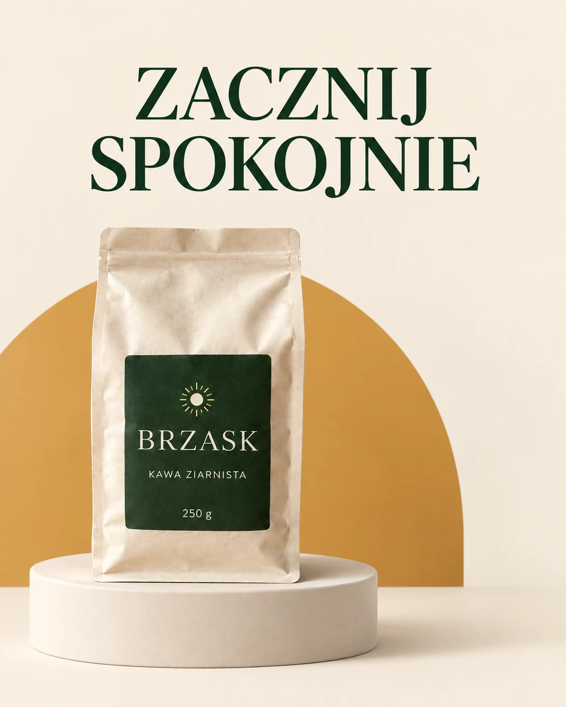
The 4:5 variant maintains a large product and two-line tagline. A bit more empty space remains on the right, which distinguishes it from the centered poster composition.
Prompt to copy:
Create a campaign adaptation for 4:5 format. Reference 1 defines the exact BRZASK product, reference 2 is the ad style master. Maintain cream background, dark green typography, ochre arc, natural soft light and bag appearance with BRZASK / KAWA ZIARNISTA / 250 g label. The only additional tagline is exactly START CALMLY. Tagline at top, product in lower half slightly left, arc fills middle. Clear spacing between product and text. Redesign layout for new proportions, do not squeeze or stretch elements. Maintain typeface from campaign reference. Without additional text, frames, icons or ornaments.
6. Poster 2:3
Attachments for this prompt, in order: BRZASK product, horizontal campaign master.
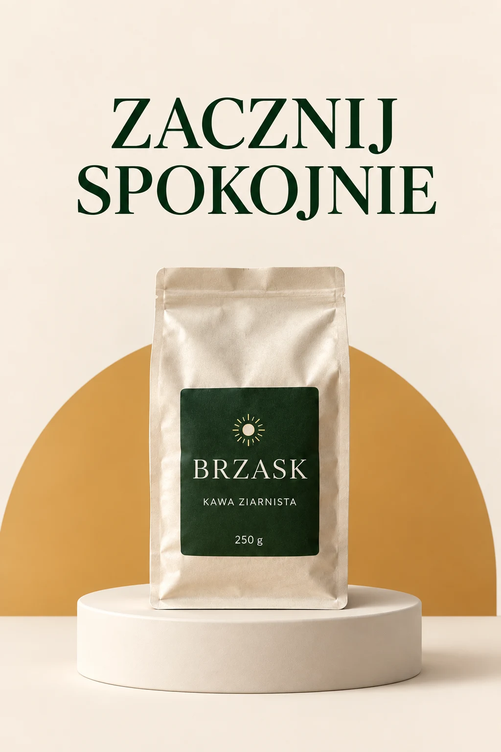
The poster builds a simple vertical hierarchy: tagline, package and base. The arc remains a readable motif common to the entire set.
Prompt to copy:
Create a campaign adaptation for 2:3 format. Reference 1 defines the exact BRZASK product, reference 2 is the ad style master. Maintain cream background, dark green typography, ochre arc, natural soft light and bag appearance with BRZASK / KAWA ZIARNISTA / 250 g label. The only additional tagline is exactly START CALMLY. Large product centered in lower part on low podium, tagline above it, ochre arc stretched behind product. Calm vertical hierarchy. Redesign layout for new proportions, do not squeeze or stretch elements. Maintain typeface from campaign reference. Without additional text, frames, icons or ornaments.
How We Assess Campaign Consistency
We arrange the variants side by side and check three things: whether we immediately recognize the same brand, whether the tagline sounds identical and whether the product maintains its structure. Different arc positions are acceptable; a different name on the label is not.
We do not try to cram the same amount of detail into every format. A banner should work through simplicity, and a taller design can use greater spacing between tagline and product. Empty space is part of the layout, not a gap to fill.
Google · Your sourcesQuantslant higher in your Google - one clickAdd to preferred sources →Corrections That Do Not Rebuild the Campaign
If the tagline is too close to the edge, we indicate its new position and ask to preserve the rest of the composition. If the label changes, we attach the original product reference again. Adding more general adjectives usually does not solve a local error.
We would choose one campaign master, then check subsequent adaptations against it. Building each ad from scratch makes it harder to maintain a repeatable visual language.
See also: The Same Product, 10 Advertising Frames with AI. Prompts and Examples.
More on this from QUANTSLANT
 guides·AI Product in Hand: Perfume, Can & Headphones (3 Prompts)How to generate a product held in hand without weird grips. Three examples with prompts that control anatomy, scale, and contact between hand and object.