AI Rebranding: 3 Directions for a Small Business
A new logo won't fix an inconsistent brand. We show three AI-generated rebranding directions for a fictional bike shop, from evolution to complete redesign.
👁 114 reads
A new logo doesn’t automatically solve the problem of an inconsistent brand. If your sign, business card, and social media post look like materials from three different companies, you need a unified system. That’s exactly the problem we set up in this example.
We created a fictional identity for a bike shop called OBRÓT: different colors, different typefaces, and several competing symbols. Then we generated three rebranding directions. This is a design exercise, not a description of a real project or sales results.
Three Scopes of Change Instead of Three Random Styles
The first direction preserves the yellow and red, keeping part of the existing look. The second builds a new system around a geometric mark. The third shifts the tone to warmer and more neighborhood-friendly. The differences concern recognition and character, not just color choice.
For each attempt, we include the starting state and the selected mark. The prompts below refer to these two references: the first shows the previous brand, the second defines the target logo. For your own project, it’s worth preparing a similar pair of materials.
Input Materials
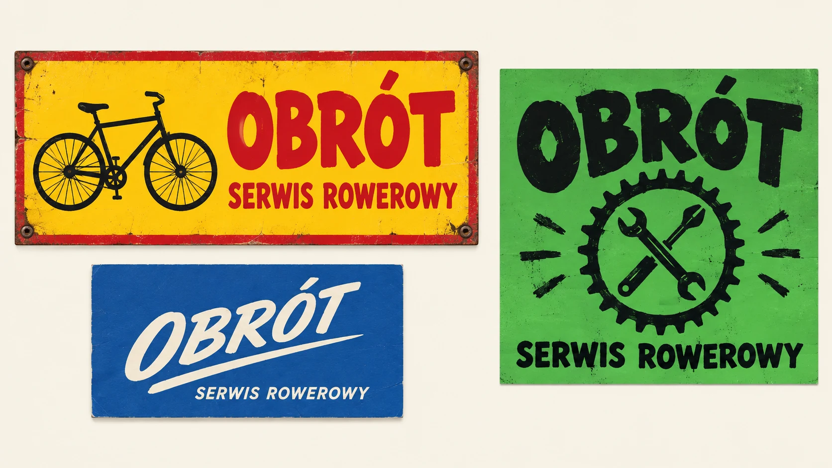
1. Evolution of a Recognizable Sign
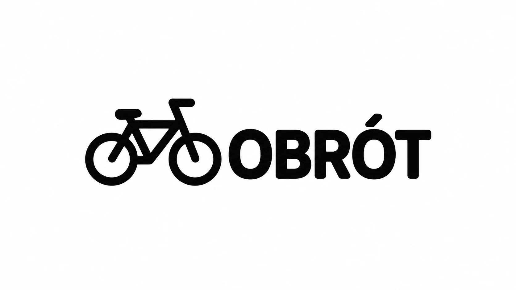
Attachments for this prompt, in order: previous identity, Illustrative mark.
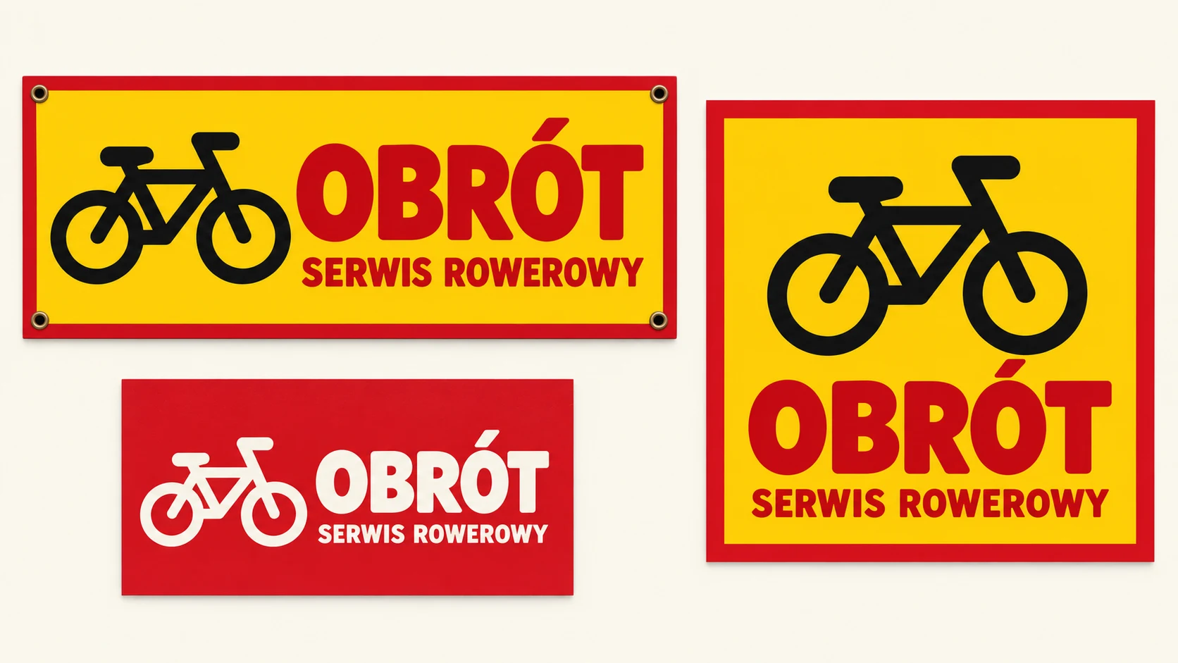
The colors of the previous brand remained, but the materials received a shared bicycle and legible name. This is the most direct reference to the starting state.
Prompt to copy:
Redesign the fictional bike shop brand OBRÓT from the first reference. The second reference suggests a simple bicycle mark, but don't copy the old chaos. 16:9 identity board, on cream background show three separate executions: wide sign, business card, and square post. Evolutionary direction: keep yellow and red, simplify bicycle to one legible mark, same simple bold typeface on all materials. The only text is OBRÓT and BIKE SHOP, without invented contact details. Equal margins, large presentation scale, flat realistic surfaces without decorative props, without gradients and aging effects. Each material must look like part of the same brand.
2. New System with Geometric Mark
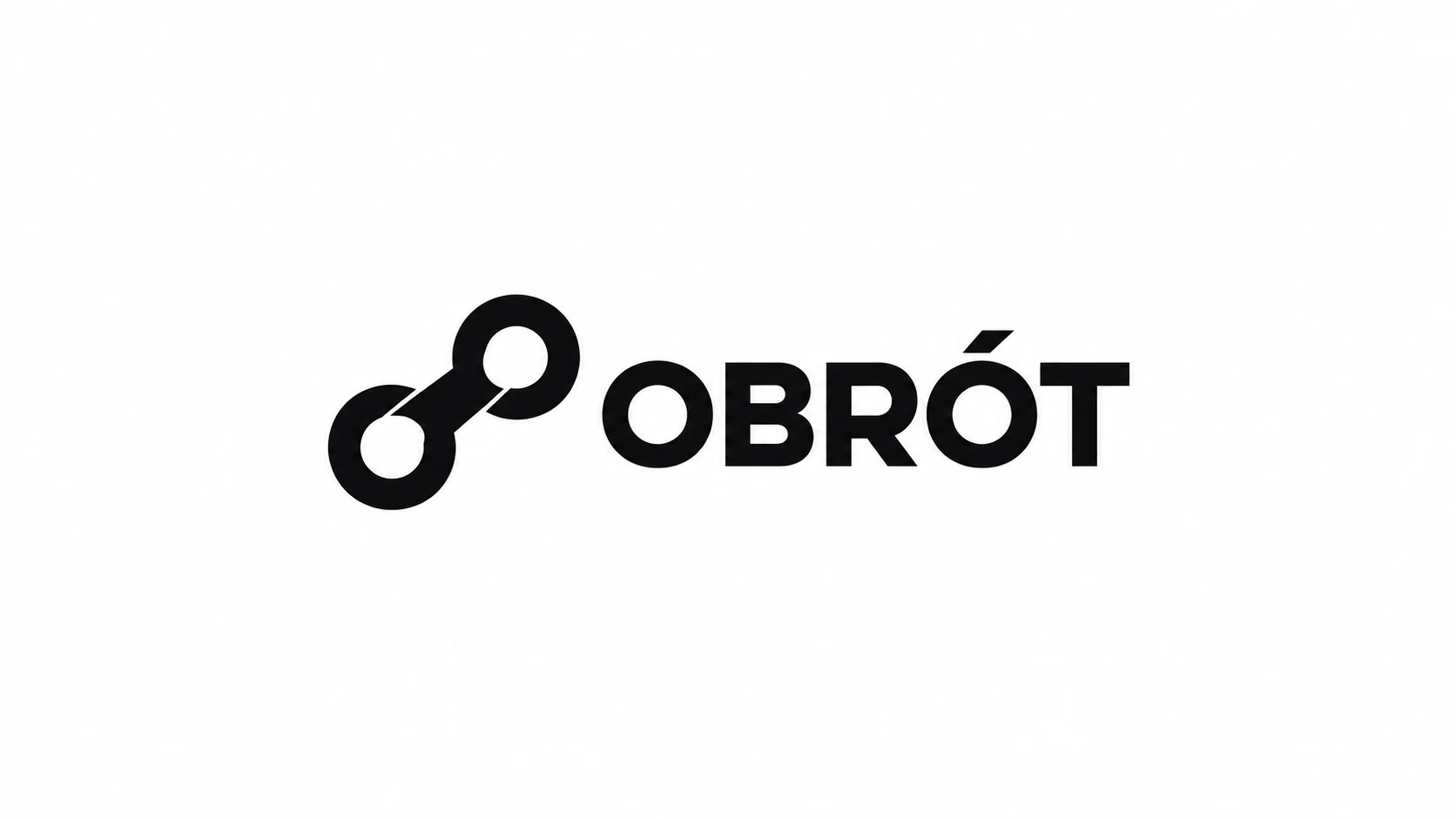
Attachments for this prompt, in order: previous identity, Geometric symbol.
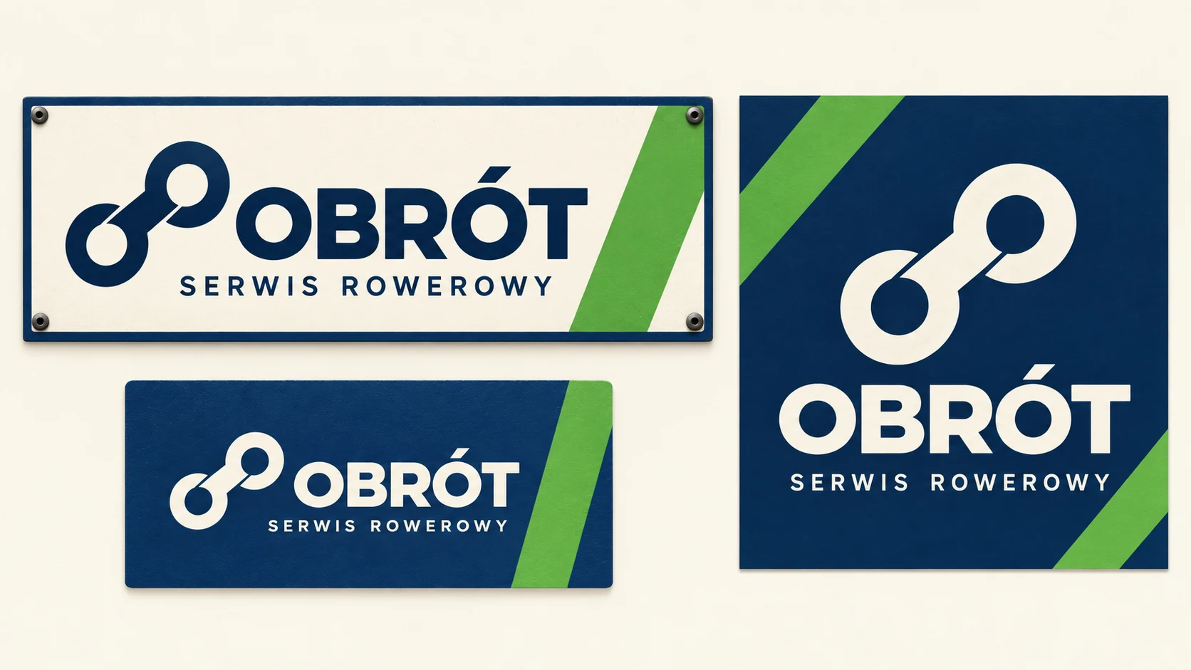
The same geometric mark repeats across three materials. Green works as an accent, while navy and cream create the main hierarchy.
Prompt to copy:
Create a modern identity for fictional bike shop OBRÓT. First reference is the state before change, second contains target geometric symbol and logotype, preserve their shapes. 16:9 board on cream background, three separate executions: wide sign, business card, square post. Palette navy, cream and small accent of grass green. Same symbol of two chain links and OBRÓT text on each material, simple consistent typography. Additional text only BIKE SHOP. Plenty of light, large legible elements, economical layout and clear hierarchy. Without gradients, without gold, without fictional data, without text describing the presentation.
3. Friendly Neighborhood Workshop
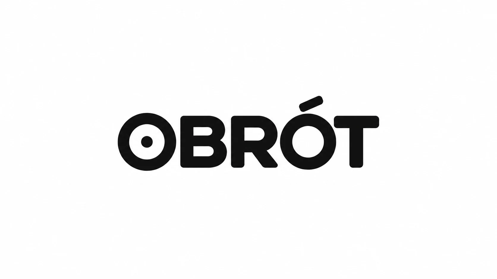
Attachments for this prompt, in order: previous identity, Typographic logotype.
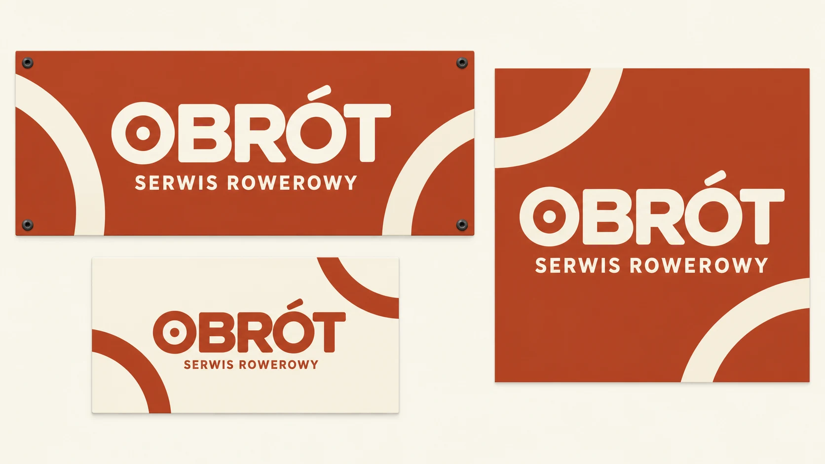
Repeating arcs and a logotype with a dot create a calmer, friendlier set. The character change results from several consistent decisions, not from a decorative mockup.
Prompt to copy:
Design a complete identity change for fictional workshop OBRÓT. First image is previous brand, second contains target logotype with dot in O: preserve its letters and proportions. 16:9 board, cream background, show wide sign, business card, and square post. Palette of fired terracotta and ivory, friendly typography, repeating motif of thick arc resembling a wheel. On all materials exactly the same logotype. Additional text only BIKE SHOP. Clean flat design, no artificial lights, gradients, old frames, random icons, contact data or board descriptions. Look of real small local business.
What We Compare on the Boards
All boards feature the same three materials. This lets us check whether the name has consistent hierarchy, the symbol maintains its shape, and the colors actually form a system. A beautiful business card isn’t enough if the sign requires a completely different design.
We wouldn’t judge a direction solely by which looks most modern. For a company with a recognizable yellow sign, gentle evolution might be a more sensible starting point. For a brand without a consistent history, a larger change gives more room to organize the whole.
Google · Your sourcesQuantslant higher in your Google - one clickAdd to preferred sources →How to Move from Proposal to System
After choosing one version, we write down specific rules: palette, logo layout, relationship of headline to supporting text, and repeating motif. Then we test ordinary materials, like a service price list or opening hours notice. Problems emerge faster there than on an impressive mockup.
AI boards here serve to compare directions. They don’t replace finished sign and business card files. We would refine one system and its applications, instead of mixing the prettiest elements from all three versions.
See also: Logo with AI: 6 directions for one brand and prompts to copy.
More on this from QUANTSLANT

 benchmarks·Can You Train a Language Model on Music and Cellular Automata?Researchers tested whether pre-training on non-linguistic data like music could reduce the need for text data when building language models.