AI Logo Design: 6 Directions for One Brand with Prompts
From typography to emblems: six distinct logo concepts for a single fictional brand. Complete prompts, examples, and criteria for choosing the right mark.
👁 114 reads
Asking for a “professional logo” often leads to a random symbol, an impressive mockup, and a nice background. That makes it hard to judge the mark itself. In this exercise, we prepared six specific directions for a fictional bicycle repair service called OBRÓT.
Each variant has the same name and business category. We change the way the mark is built: from pure typography to an emblem. We look at them primarily in black and white, because color easily distracts from weaker construction.
A Brief That Organizes Logo Work
The brand handles bicycle repair, aims to be local, accessible, and reliable. It does not need the look of a luxury car dealership. Its name contains the Polish letter Ó (o with an acute accent), so correct rendering of that diacritic is part of the evaluation, not a detail to skip.
In each prompt we specify the type of logo, weight of forms, number of elements, and presentation method. We do not ask for a logo, website, mug, and business card all at once. First we want to see the mark without staging.
1. Typographic Wordmark
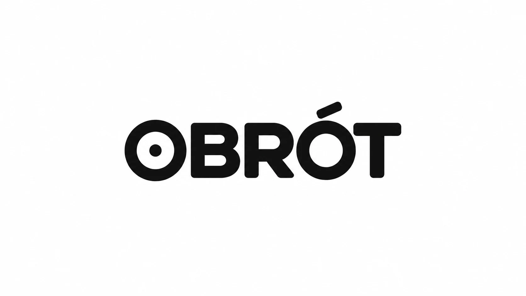
The letters play the main role, and the dot distinguishes the first O from a plain circle. This small device must later be preserved in small applications as well.
Prompt to copy:
Design a single logo concept for a fictional bicycle repair service OBRÓT. Horizontal 16:9 canvas, solid white background, only black mark and exact lettering 'OBRÓT'. No mockups, gradients, shadows, textures, additional words or ornaments. Plenty of margin, logo centered, clear idea suitable for simple redrawing. Just the OBRÓT lettering, custom bold sans-serif with slightly rounded corners, strong stroke, clear Ó. The letter O may subtly reference a wheel, without a separate symbol.
2. Monogram
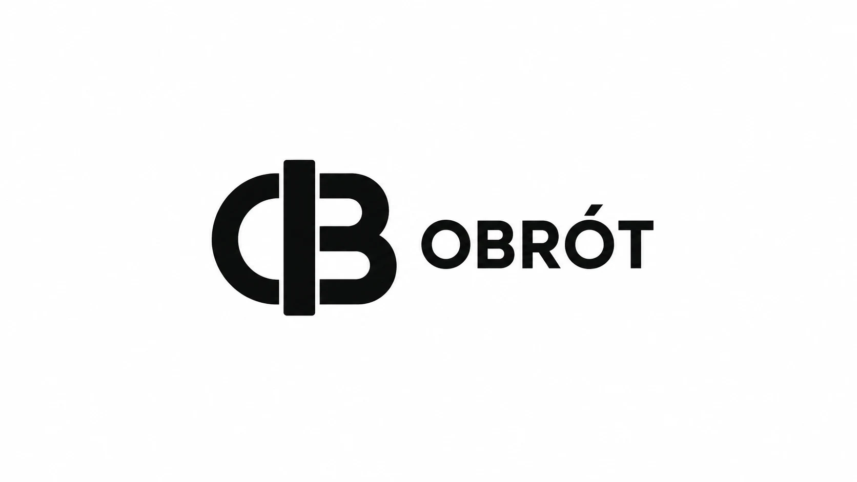
Combined forms create a compact symbol. However, reading the letters is not as direct as in a plain wordmark; this variant would require testing with someone who does not know the brief.
Prompt to copy:
Design a single logo concept for a fictional bicycle repair service OBRÓT. Horizontal 16:9 canvas, solid white background, only black mark and exact lettering 'OBRÓT'. No mockups, gradients, shadows, textures, additional words or ornaments. Plenty of margin, logo centered, clear idea suitable for simple redrawing. Simple compact monogram from letters O and B, shared thick vertical axis, next to it small legible OBRÓT lettering. Limit the number of shapes and avoid tangled thin lines.
3. Geometric Symbol
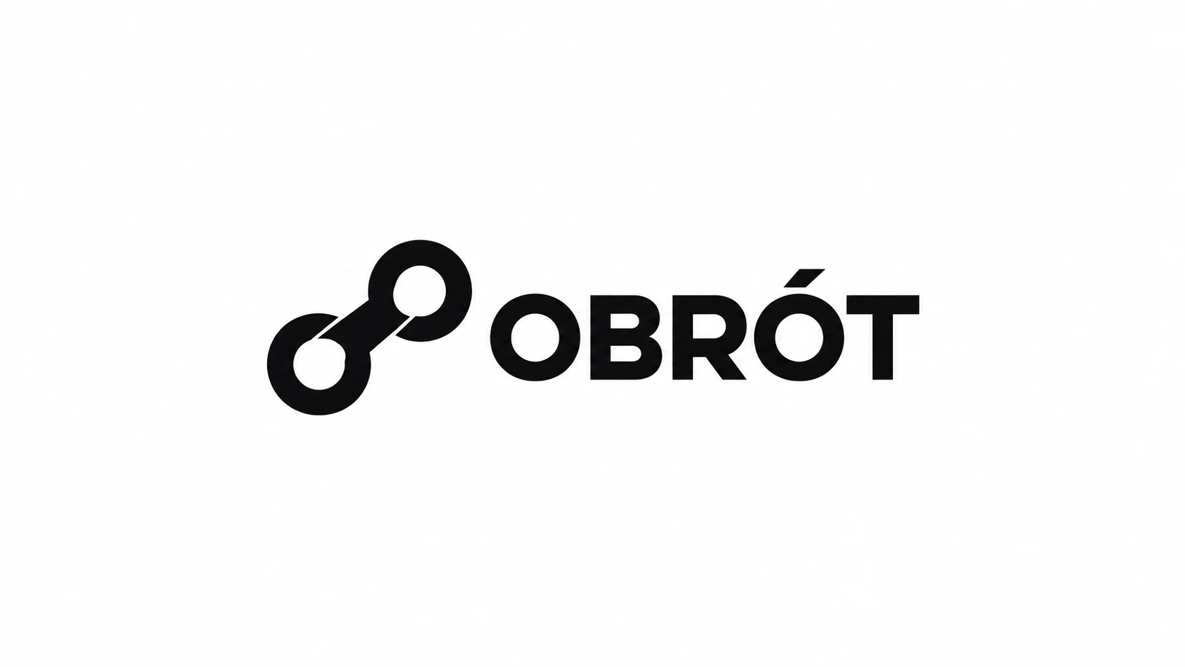
Two connected elements suggest mechanics and movement without a literal drawing of an entire bicycle. A simple form provides a clear starting point for identification.
Prompt to copy:
Design a single logo concept for a fictional bicycle repair service OBRÓT. Horizontal 16:9 canvas, solid white background, only black mark and exact lettering 'OBRÓT'. No mockups, gradients, shadows, textures, additional words or ornaments. Plenty of margin, logo centered, clear idea suitable for simple redrawing. Next to OBRÓT lettering a simple symbol of two thick circles connected by one diagonal element, association with movement and chain. Three simple forms, without a complete bicycle drawing.
4. Illustrative Mark
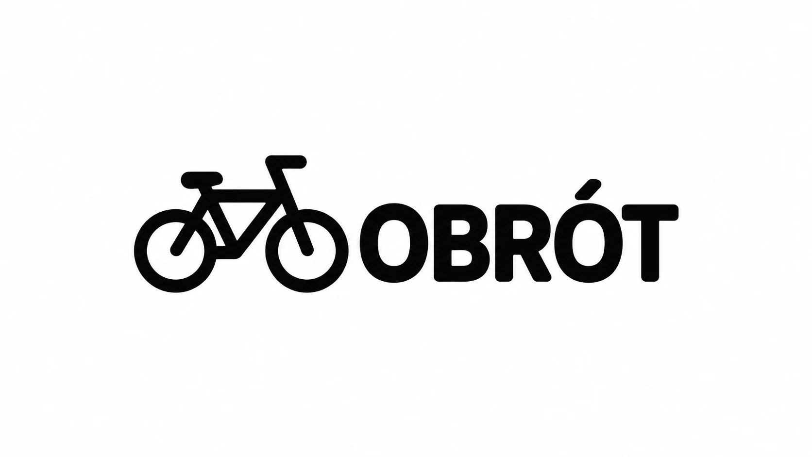
The industry is immediately readable. However, the mark is more literal than the other proposals, so its distinctiveness must also be built through typography and layout.
Prompt to copy:
Design a single logo concept for a fictional bicycle repair service OBRÓT. Horizontal 16:9 canvas, solid white background, only black mark and exact lettering 'OBRÓT'. No mockups, gradients, shadows, textures, additional words or ornaments. Plenty of margin, logo centered, clear idea suitable for simple redrawing. Next to OBRÓT lettering a simplified bicycle mark with two wheels and compact frame, thick uniform lines, legible without mechanical details. Character of a friendly workshop.
5. Badge
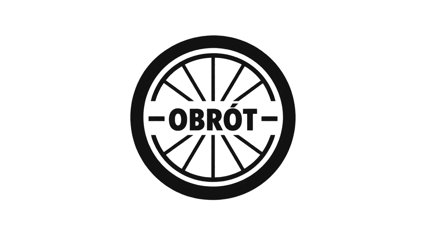
The enclosed form brings to mind a patch or workshop marking. We would test the finer wheel elements after strong reduction.
Prompt to copy:
Design a single logo concept for a fictional bicycle repair service OBRÓT. Horizontal 16:9 canvas, solid white background, only black mark and exact lettering 'OBRÓT'. No mockups, gradients, shadows, textures, additional words or ornaments. Plenty of margin, logo centered, clear idea suitable for simple redrawing. Compact circular badge, OBRÓT lettering horizontally in the center, two small strokes and one simplified wheel as the only motif. Few elements, clear hierarchy, thick outer rim.
6. Negative Space
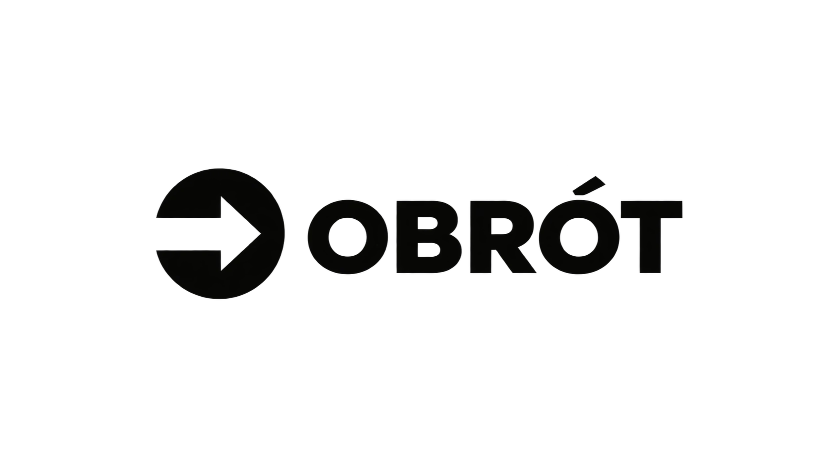
Here the shape is also created by what remains empty. When transferring to a dark background, you must preserve the legibility of both parts of the mark.
Prompt to copy:
Design a single logo concept for a fictional bicycle repair service OBRÓT. Horizontal 16:9 canvas, solid white background, only black mark and exact lettering 'OBRÓT'. No mockups, gradients, shadows, textures, additional words or ornaments. Plenty of margin, logo centered, clear idea suitable for simple redrawing. Symbol of a thick black circle with a cut-out white simple arrow pointing right, next to OBRÓT lettering. The arrow should result from empty space, not from an additional white object. Avoid similarity to known brands.
Which Direction We Would Develop Further
First we would test the simple wordmark and geometric symbol. They are easy to compare on a sign, stamp, and small sticker. The bicycle drawing communicates the industry faster, but the mere depiction of a bicycle does not yet provide a distinctive identity.
The monogram requires separate legibility testing: the viewer should not have to guess which letters were combined. The badge allows you to enclose the name in a compact form, but fine wheel elements may disappear after reduction.
Google · Your sourcesQuantslant higher in your Google - one clickAdd to preferred sources →Logo Image vs. Finished Mark
The results in this article are raster concepts generated by AI. An appearance resembling vector graphics does not mean the file contains editable curves. The chosen direction must be recreated and organized in a vector editor, spacing refined, and necessary variants prepared.
Before choosing, we reduce the mark to the size in which it will actually be used, and check it on light and dark backgrounds. If it only works in a large presentation, we return to a simpler construction. The next step would be to compare the two best versions on the same media.
See also: The Same Product, 10 Advertising Frames with AI. Prompts and Examples.

More on this from QUANTSLANT

 guides·Perplexity AI for Journalists: Fact-Checking Guide 2026How journalists and analysts use Perplexity AI for fact-checking in 2026. Learn Pro Search techniques, source verification, and detecting misinformation.