FLUX 3 JSON Layouts: 8 Design Templates with Prompts
FLUX 3 Image accepts JSON prompts with bounding boxes for each element. We tested 8 real-world layouts: magazine covers, comics, posters, and more.
👁 136 reads
FLUX 3 Image accepts JSON commands instead of plain descriptions, letting you assign each element its own bounding box on the canvas. We tested this on eight layouts designers create every day: a magazine cover, comic page, poster, recipe card, landing page, infographic, flat lay, and storyboard. In seven out of eight, elements landed exactly where we placed them.
Bounding boxes replace vague descriptions like “in the top left corner” that models treat loosely anyway. Below we explain the format, and for each image we overlay the requested boxes on the result so you can judge the precision yourself. Spoiler: boxes work better than text.
How JSON bounding box prompts work
You paste the entire JSON into the regular prompt field. It has two parts:
- caption - description of the whole: subject, style, palette, mood.
- elements - list of objects. Each has an
id(any name),bbox(bounding box), anddesc(what should appear in it). - bbox is four numbers
[y_min, x_min, y_max, x_max]on a grid from 0 to 1000, regardless of image aspect ratio. Vertical first, then horizontal - the reverse of most graphics programs. - Conversion: an element from 20 to 60 percent height and 10 to 50 percent width is
[200, 100, 600, 500]. - Text to render goes in
descin quotes, preceded by a backslash, because it’s a quote inside JSON.
In the previews below, white dashed rectangles with id labels show the boxes we specified.
How we tested this
- FLUX 3 Image model via
blackforestlabs/flux-3/text-to-imageendpoint at fal.ai, October 1, 2026. - Resolution
2k, aspect ratios matched to format (3:4 cover, 2:3 poster, 16:9 landing and storyboard), saved to PNG. - Prompt expansion disabled, one generation per prompt, no cherry-picking best versions.
- Descriptions in English, because FLUX understands multiple languages but English gives more repeatable results. We tested non-English text rendering in quotes.
- We measured box accuracy by overlaying boxes on the original at full resolution.
- Time: 74 to 125 seconds per image. Cost according to fal.ai pricing per megapixel (0.024 USD/Mpx promotional rate): about 0.10 USD per 2K image, about 0.80 USD for the set.
1. KOD magazine cover
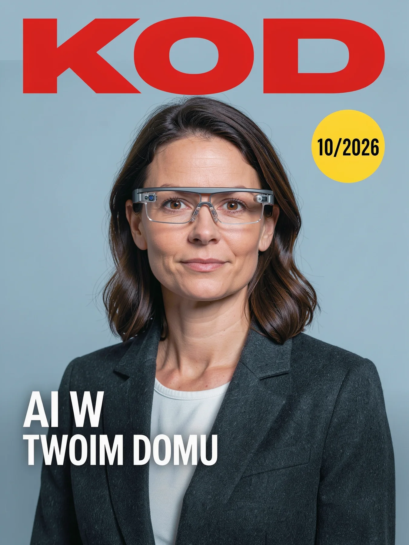 mastheadportraitheadlinebadge
{
  "caption": "Cover of a Polish technology magazine, clean modern design, photo of a woman wearing AR glasses",
  "elements": [
    {
      "id": "masthead",
      "bbox": [30, 60, 170, 940],
      "desc": "large magazine title text "KOD" in bold red letters"
    },
    {
      "id": "portrait",
      "bbox": [180, 150, 1000, 850],
      "desc": "portrait of a woman wearing AR glasses looking at the camera"
    },
    {
      "id": "headline",
      "bbox": [700, 50, 860, 520],
      "desc": "white headline text "AI W TWOIM DOMU""
    },
    {
      "id": "badge",
      "bbox": [200, 700, 330, 950],
      "desc": "yellow circular badge with text "10/2026""
    }
  ]
}- masthead - yes, “KOD” fills the box edge to edge.
- portrait - yes, arms extend beyond the sides, which is natural for a portrait.
- headline - yes, second line ends exactly at the right edge.
- badge - yes, circle pushed to the right side of the box.
All three text elements are correct: “KOD”, “AI W TWOIM DOMU” (“AI in your home”), and “10/2026”. The badge and portrait boxes overlap, and the model resolved it sensibly: the badge sits on the background next to the head and doesn’t cover the face. The AR glasses are regular glasses with two camera modules, so “AR” is indicated symbolically. Cover mockup ready in one attempt.
2. Robot baker comic
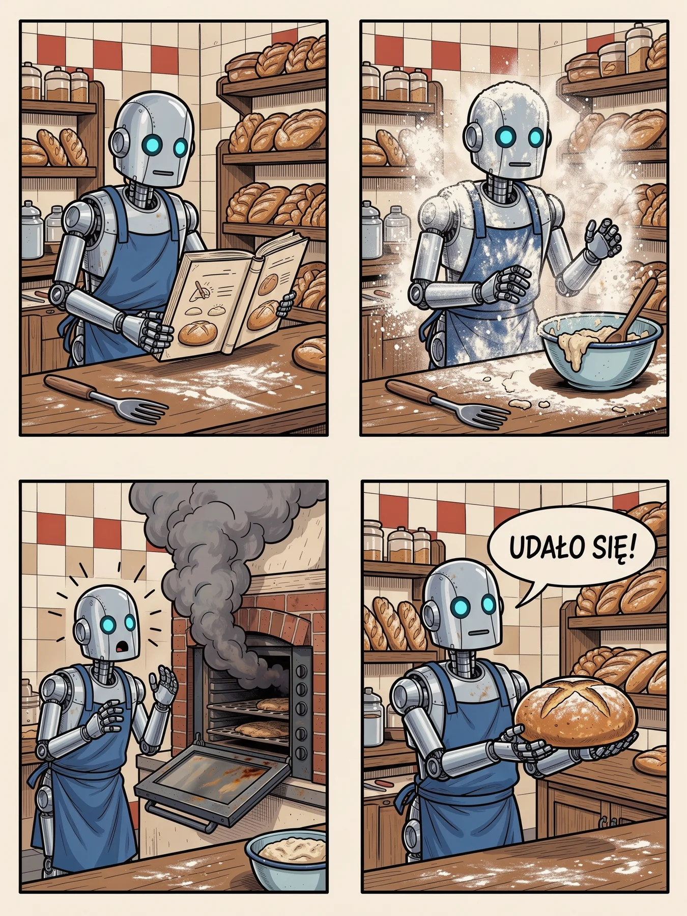 p1p2p3p4
{
  "caption": "Four-panel comic page in a clean ligne claire style about a robot learning to bake bread in a Polish bakery",
  "elements": [
    {
      "id": "p1",
      "bbox": [20, 20, 480, 480],
      "desc": "panel 1: robot reading a recipe book"
    },
    {
      "id": "p2",
      "bbox": [20, 520, 480, 980],
      "desc": "panel 2: robot covered in flour"
    },
    {
      "id": "p3",
      "bbox": [520, 20, 980, 480],
      "desc": "panel 3: smoke coming out of the oven, robot shocked"
    },
    {
      "id": "p4",
      "bbox": [520, 520, 980, 980],
      "desc": "panel 4: robot proudly holding a perfect loaf, speech bubble "UDAŁO SIĘ!""
    }
  ]
}- p1 - yes, robot reading a recipe book.
- p2 - yes, robot in a cloud of flour.
- p3 - yes, smoke from the oven and shocked robot.
- p4 - yes, loaf and speech bubble with text.
Four panels are exactly where we placed them, with even spacing. The story has continuity: same robot, same bakery, same tiles. The speech bubble “UDAŁO SIĘ!” (“I did it!”) has correct Polish diacritics. The style is more cartoon with hatching than pure ligne claire, and a giant fork appears inexplicably in the first two panels. For ligne claire, add to caption flat colors, uniform line weight, no hatching.
3. Jazz concert poster
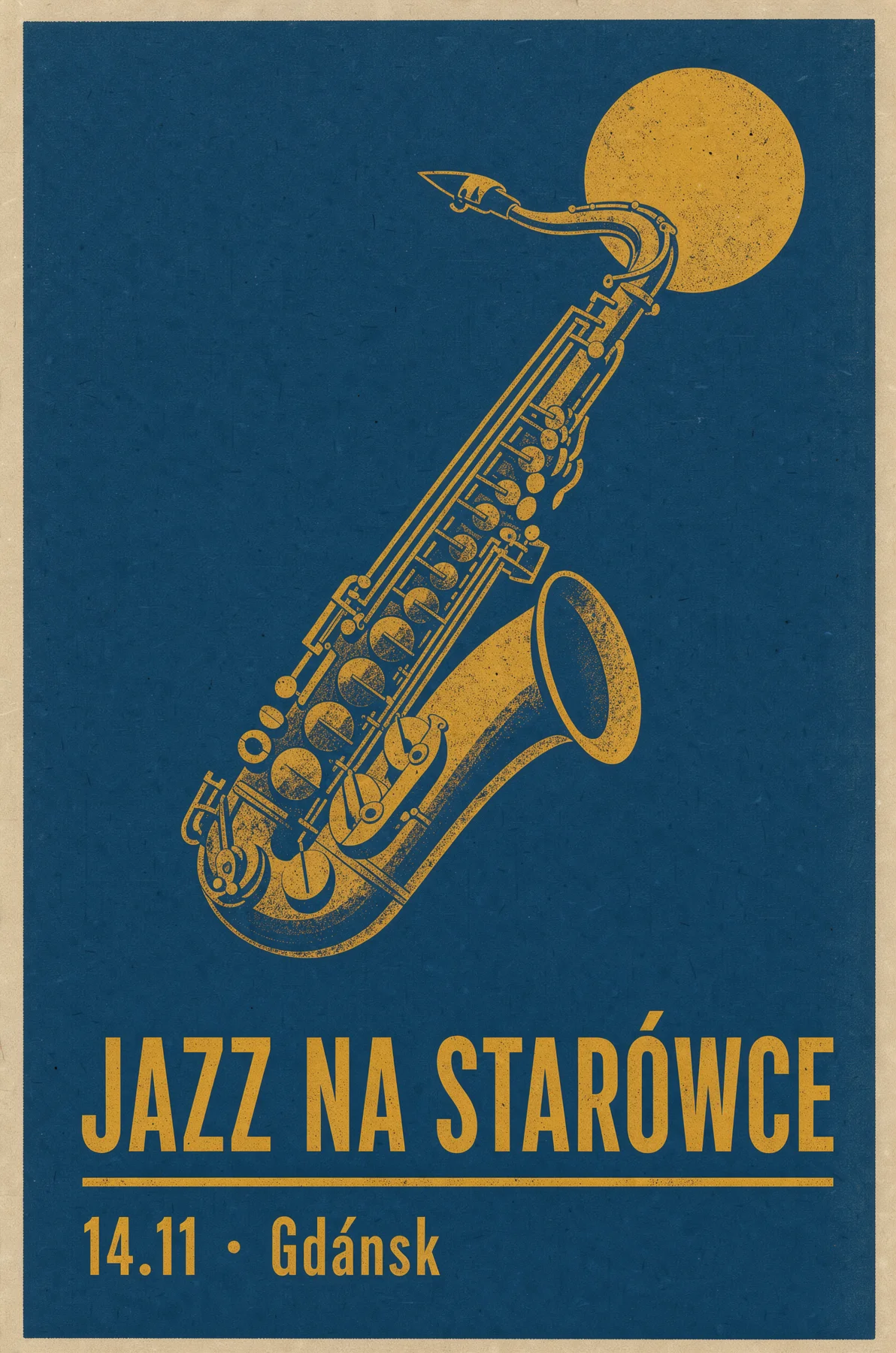 saxophonetitledatemoon
{
  "caption": "Jazz concert poster, mid-century modern style, deep blue and mustard",
  "elements": [
    {
      "id": "saxophone",
      "bbox": [120, 200, 700, 800],
      "desc": "stylized saxophone illustration"
    },
    {
      "id": "title",
      "bbox": [730, 80, 860, 920],
      "desc": "text "JAZZ NA STARÓWCE" in bold geometric letters"
    },
    {
      "id": "date",
      "bbox": [880, 80, 960, 500],
      "desc": "text "14.11 · Gdańsk""
    },
    {
      "id": "moon",
      "bbox": [40, 680, 220, 900],
      "desc": "a mustard yellow moon"
    }
  ]
}- saxophone - yes, bell extends a few percent below the bottom edge.
- title - yes, text fills the box full width.
- date - yes, but with an error in the city name.
- moon - yes, though the moon is pushed left, behind the saxophone neck.
The composition is precise, and the navy with mustard is pure mid-century. The title “JAZZ NA STARÓWCE” (“Jazz in the Old Town”) has correct Polish diacritics. The error is in the date: instead of “Gdańsk” the model wrote “Gdánsk”, with an accent over the a and no ń. This is the most insidious type of mistake because at first glance it looks correct. Before printing, read every text element letter by letter.
4. Pierogi recipe card
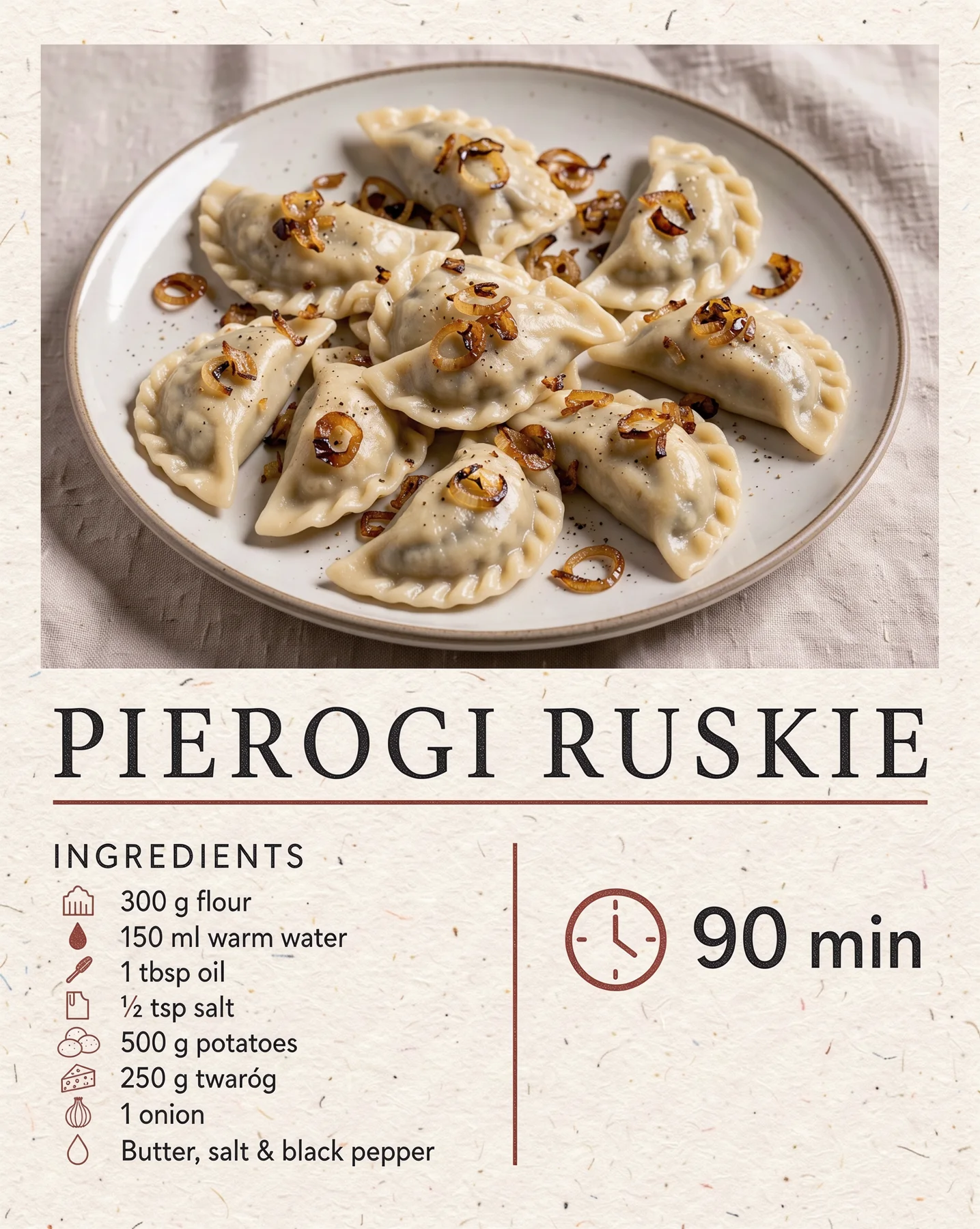 phototitleingredientstime
{
  "caption": "Recipe card for Polish pierogi, editorial food design on cream paper",
  "elements": [
    {
      "id": "photo",
      "bbox": [40, 40, 520, 960],
      "desc": "top-down photo of a plate of pierogi with fried onion"
    },
    {
      "id": "title",
      "bbox": [560, 40, 660, 960],
      "desc": "title text "PIEROGI RUSKIE""
    },
    {
      "id": "ingredients",
      "bbox": [680, 40, 960, 460],
      "desc": "small list of ingredients with icons"
    },
    {
      "id": "time",
      "bbox": [700, 560, 820, 960],
      "desc": "clock icon with text "90 min""
    }
  ]
}- photo - yes, photo extends about 2 percent below the box.
- title - yes.
- ingredients - yes, list with icons fits entirely.
- time - yes, clock and “90 min” centered in the box.
“PIEROGI RUSKIE” (a type of Polish dumpling) and “90 min” are correct, and the list has sensible quantities: 300 g flour, 500 g potatoes, 250 g cottage cheese. The list came out in English because the element description was in English; only the word “twaróg” (cottage cheese) stayed in Polish. If you want the list in another language, put the ingredients in desc in quotes. Some icons don’t match (salt as a box, butter as a drop), and the filling shows through dark green like spinach, not like potatoes with cottage cheese.
5. Budget app landing page
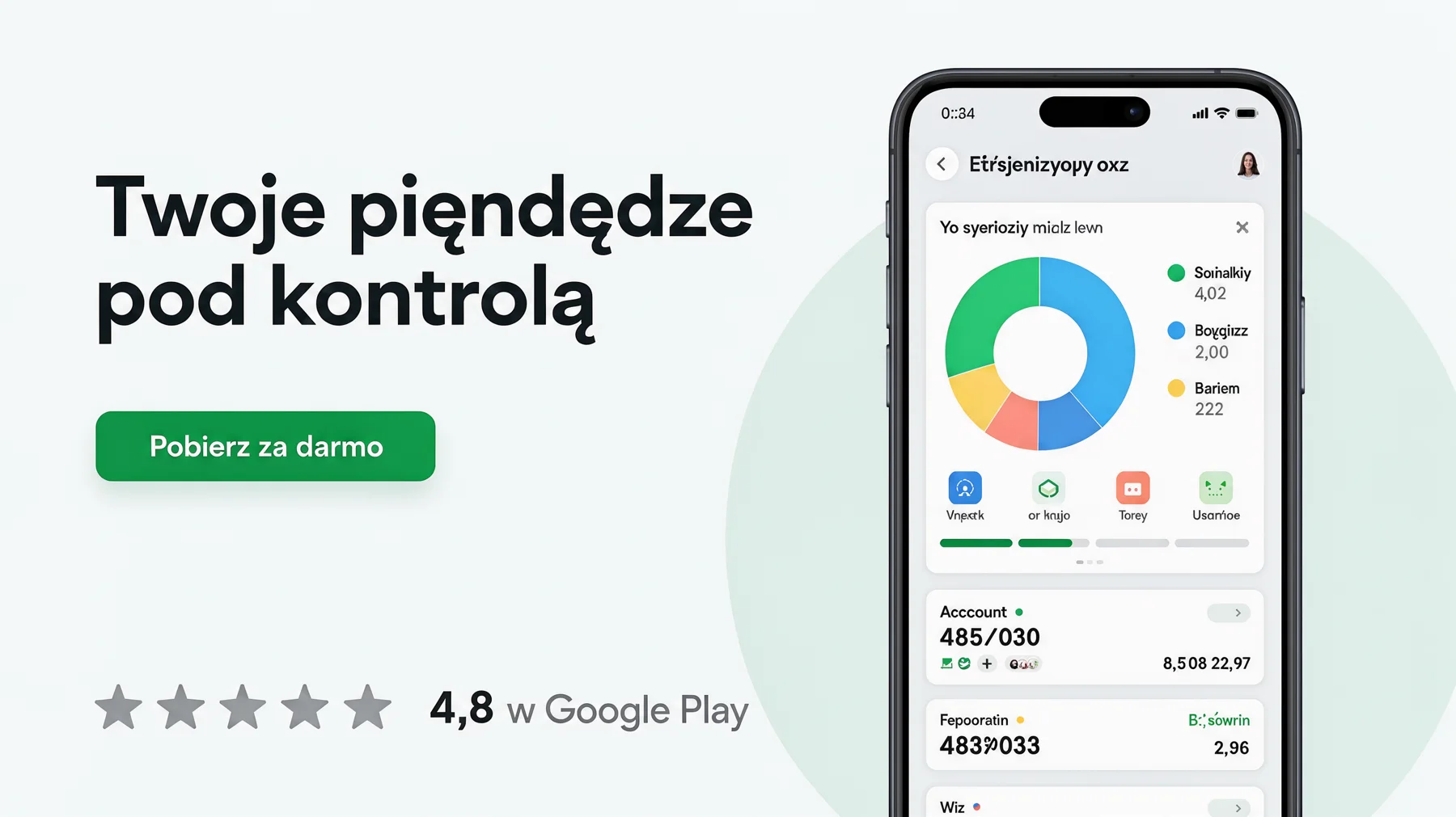 headlinebuttonphonelogos
{
  "caption": "Website hero section mockup for a Polish budgeting app, clean UI design, light theme",
  "elements": [
    {
      "id": "headline",
      "bbox": [200, 60, 420, 520],
      "desc": "headline text "Twoje pieniądze pod kontrolą""
    },
    {
      "id": "button",
      "bbox": [500, 60, 590, 300],
      "desc": "green button with text "Pobierz za darmo""
    },
    {
      "id": "phone",
      "bbox": [80, 600, 980, 900],
      "desc": "smartphone showing a colorful spending chart"
    },
    {
      "id": "logos",
      "bbox": [820, 60, 900, 520],
      "desc": "row of grey rating stars and text "4,8 w Google Play""
    }
  ]
}- headline - yes.
- button - yes, button fills the box.
- phone - yes.
- logos - yes, stars and rating in one line.
The button “Pobierz za darmo” (“Download for free”) and “4,8 w Google Play” (“4.8 on Google Play”) are correct, and the layout looks like a real design. The headline has a typo, though: “piendędze“ instead of “pieniądze“ (“your money under control”). The phone screen is gibberish (“Acccount”, “Etŕsjenizyopy oxz”). For a client mockup you’d need to fix the headline with editing and replace the app screen with a real screenshot.
6. Coast in 5 days infographic
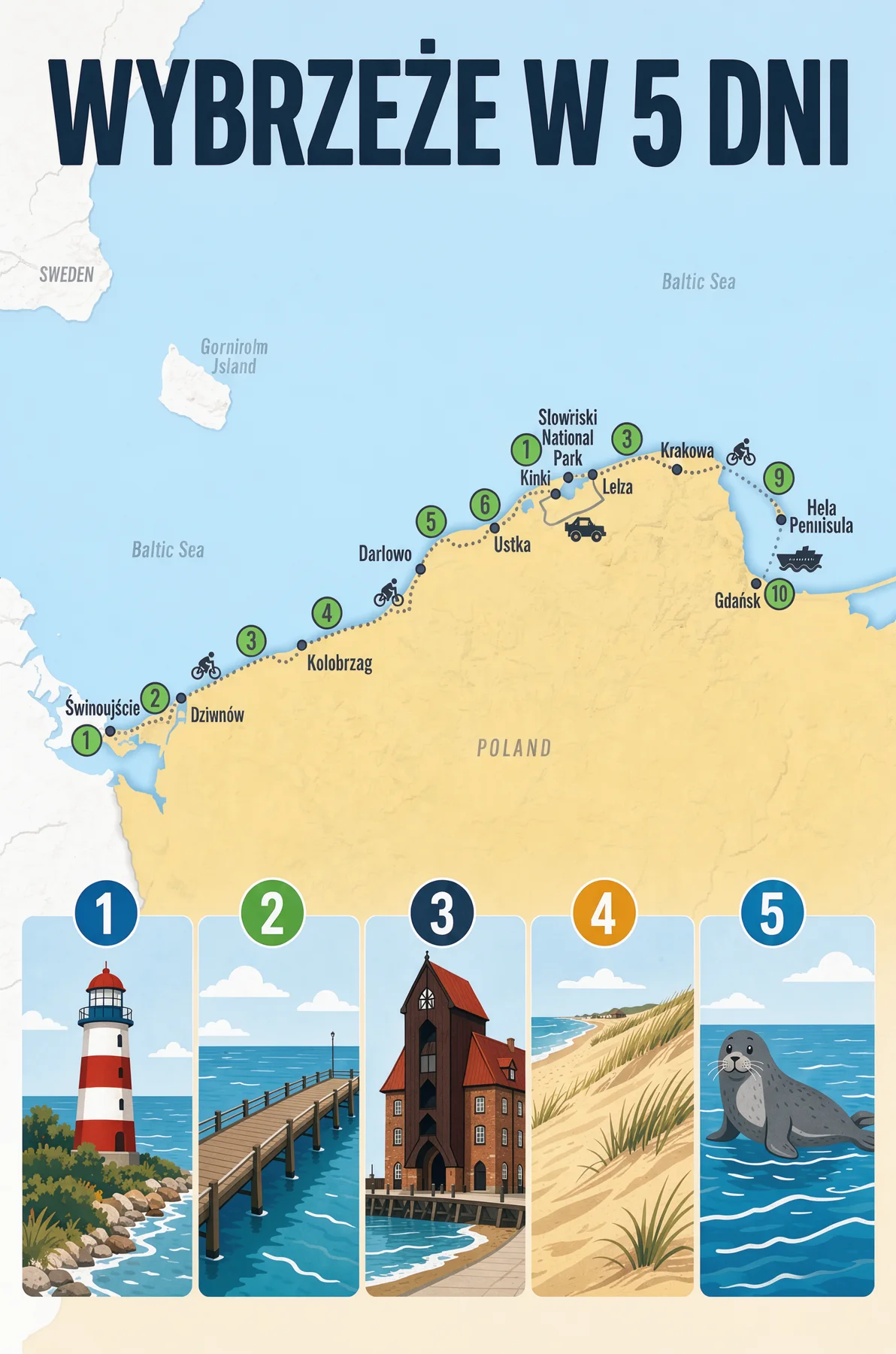 titlemapicons
{
  "caption": "Illustrated travel infographic of the Polish Baltic coast, flat vector style",
  "elements": [
    {
      "id": "title",
      "bbox": [30, 60, 140, 940],
      "desc": "title text "WYBRZEŻE W 5 DNI""
    },
    {
      "id": "map",
      "bbox": [170, 60, 600, 940],
      "desc": "simplified map of the coast from Świnoujście to Hel with a dotted route"
    },
    {
      "id": "icons",
      "bbox": [630, 60, 960, 940],
      "desc": "five small illustrated stops: lighthouse, pier, crane, dunes, seal, each with a day number 1-5"
    }
  ]
}- title - yes, text extends a few percent beyond the right edge.
- map - yes.
- icons - yes, but edge cards extend a few percent on both sides.
“WYBRZEŻE W 5 DNI” (“Coast in 5 days”) has correct Polish diacritics, and five cards with lighthouse, pier, crane, dunes, and seal are numbered 1 to 5. The crane even resembles the famous Gdańsk crane. The map is a disaster, though: “Gorniroim Island” instead of Bornholm, “Slowiriski National Park”, nonexistent “Krakowa”, “Kolobrzag” and “Hela Penilisula”, and numbering on the route jumps 1, 2, 3, 4, 5, 6, 1, 3, 9, 10. For infographics with maps, provide fewer names, each as a separate element with its own box and text in quotes.
7. Flat lay: traveler’s kit
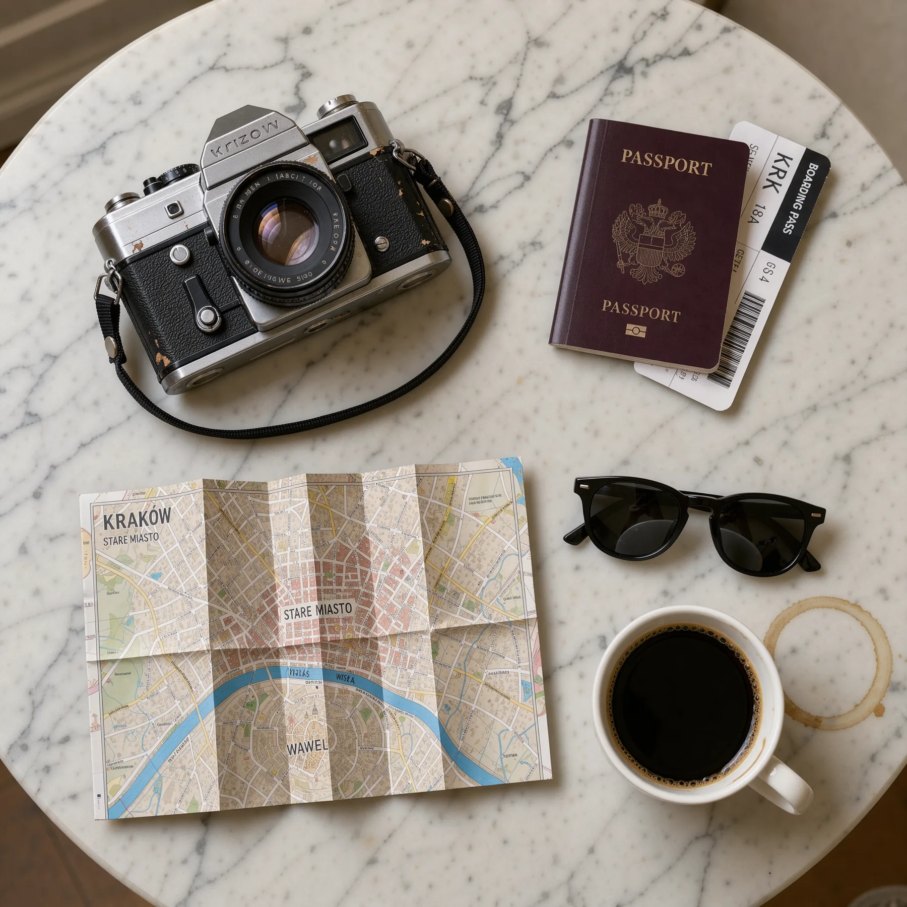 camerapassportmapcoffeesunglasses
{
  "caption": "Top-down flat lay on a white marble table, photographer's travel kit",
  "elements": [
    {
      "id": "camera",
      "bbox": [100, 100, 450, 500],
      "desc": "a vintage film camera"
    },
    {
      "id": "passport",
      "bbox": [120, 600, 400, 900],
      "desc": "a passport with a boarding pass"
    },
    {
      "id": "map",
      "bbox": [500, 80, 900, 600],
      "desc": "a folded paper map of Kraków"
    },
    {
      "id": "coffee",
      "bbox": [650, 650, 900, 900],
      "desc": "a cup of black coffee"
    },
    {
      "id": "sunglasses",
      "bbox": [520, 620, 640, 900],
      "desc": "sunglasses"
    }
  ]
}- camera - yes.
- passport - yes, boarding pass extends slightly downward.
- map - yes.
- coffee - yes, cup stain already lies outside the box.
- sunglasses - yes.
The model added accurate details on its own: the boarding pass has airport code “KRK”, and the map has labels “KRAKÓW”, “STARE MIASTO” and “WISŁA”. The geography is wrong, though: Wawel lies on the map south of the Vistula, but in reality it stands on its left bank, right next to the Old Town. The passport has a two-headed eagle resembling Russia’s coat of arms, and the camera has an invented brand “Krizow”. Add burgundy Polish passport with a single-headed eagle.
8. Storyboard: tram depot chase
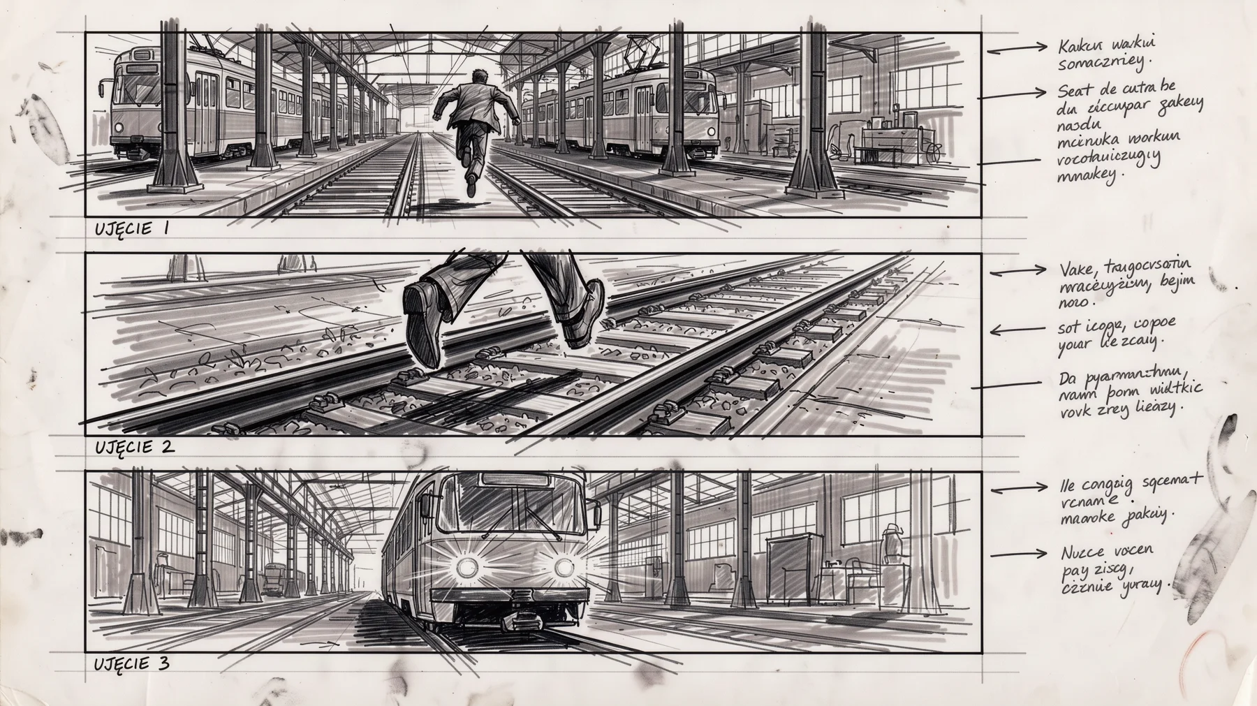 f1f2f3notes
{
  "caption": "Film storyboard sheet with three frames drawn in pencil and marker, scene of a chase through a Warsaw tram depot",
  "elements": [
    {
      "id": "f1",
      "bbox": [100, 30, 600, 320],
      "desc": "frame 1: wide shot of a man running between trams"
    },
    {
      "id": "f2",
      "bbox": [100, 350, 600, 650],
      "desc": "frame 2: close-up of his feet jumping over rails"
    },
    {
      "id": "f3",
      "bbox": [100, 680, 600, 970],
      "desc": "frame 3: tram lights blinding the camera"
    },
    {
      "id": "notes",
      "bbox": [660, 30, 950, 970],
      "desc": "handwritten Polish notes under the frames: "UJĘCIE 1", "UJĘCIE 2", "UJĘCIE 3""
    }
  ]
}- f1, f2, f3 - no, instead of three frames side by side there are three horizontal strips stacked vertically.
- notes - no, notes ended up in a column on the right instead of a strip at the bottom.
The frame content is correct: running man, feet over rails, blinding tram lights. The labels “UJĘCIE 1”, “UJĘCIE 2”, and “UJĘCIE 3” (“Shot 1”, “Shot 2”, “Shot 3”) have correct Polish diacritics but sit under the frames, and the actual notes are pseudo-Polish gibberish. We suspect the “storyboard sheet” pattern was stronger than the boxes. In this situation, add to caption three frames side by side in one row, notes in a strip below or remove the word that suggests a ready-made layout.
Summary: boxes and text
| Example | Rating 1-5 | Elements in boxes | Notes |
|---|---|---|---|
| KOD magazine cover | 5 | 4 of 4 | everything in boxes, text without errors |
| Robot baker comic | 5 | 4 of 4 | panels match boxes, speech bubble correct |
| Jazz concert poster | 4 | 4 of 4 | “Gdánsk” instead of “Gdańsk“ |
| Pierogi recipe card | 4.5 | 4 of 4 | list in English, dark filling |
| Budget app landing page | 3.5 | 4 of 4 | typo in headline |
| Coast in 5 days infographic | 3 | 3 of 3 | map full of invented names |
| Flat lay: traveler’s kit | 4.5 | 5 of 5 | Wawel on wrong side of Vistula |
| Storyboard: tram depot chase | 2 | 0 of 4 | layout ignored |
Average 3.9. Box accuracy is very high: in seven layouts out of eight, all elements landed in their places, with deviation usually 2 to 5 percent. Ratings drop due to text errors (typos, “Gdánsk”), invented names on the map, and one storyboard where the model imposed its own layout.
Most common errors
- Boxes hold, letters don’t always. Typo in landing headline and “Gdánsk” on poster.
- Text not specified literally is gibberish. App screen, storyboard notes, and map names.
- Slight overflow beyond box. Photo, saxophone, title, and infographic cards exceeded boundaries by a few percent.
- Strong genre pattern wins. “Storyboard sheet” produced classic layout with frames stacked vertically.
- Desc language determines text language. Ingredient list described in English came out in English.
- Geography on maps. Wawel on wrong side of Vistula, invented towns on coast.
Other FLUX 3 galleries and tests
- 4K wallpapers with FLUX 3: 12 wallpapers for desktop and phone
- Interior visualizations: 10 arrangements with prompts
- Ads and packshots: 10 product graphics
- 4K test under magnification: FLUX 3 versus six models
- Bounding box test: how precisely FLUX 3 holds composition
- Five changes with one command: editing in FLUX 3
- FLUX 3 Image - launch, pricing and first impressions
FAQ
Can bounding boxes in FLUX 3 overlap?
Yes. On the magazine cover, the badge box overlapped the portrait box, and the model placed the badge on the background next to the head, not on the face.
Why do coordinates start with y, not x?
That’s the format Black Forest Labs adopted: [y_min, x_min, y_max, x_max]. The most common mistake on first attempts is swapping the order, which rotates the layout.
Does the 0-1000 grid depend on image aspect ratio?
No. Both axes always go from 0 to 1000, so box [0, 0, 500, 500] is the top left quarter in both square and 16:9 formats.
Can I write desc and caption in other languages?
Yes, FLUX 3 understands multiple languages. We write in English for repeatability, but text that should appear in the image we always provide in the target language in quotes.
Google · Your sourcesQuantslant higher in your Google - one clickAdd to preferred sources →Sources
More on this from QUANTSLANT
 benchmarks·FLUX 3 Product Photography: 10 AI Ads & PackshotsWe generated 10 product images in FLUX 3: packshots, ads with slogans, and flat lays. Text came out perfect, but the model added real brand logos we didn't ask for.