AI Logo Generator: From Brand Brief to Final Design
How to prepare a brand description, evaluate AI-generated logo concepts, and choose a file you can actually edit. Includes ready-to-use prompts and Adobe sources.
👁 119 reads
You can use AI logo generators to explore directions and prepare initial sketches. Before you start generating, define the name, audience, and where the logo will appear. You’ll evaluate a symbol on packaging differently than a small profile icon. Don’t start with an elaborate business card visualization. First, see the mark itself and check whether it remains legible without decoration.
What to Expect from a Logo Generator
Separate the logo concept from a file ready for further work. An image showing a mark on a wall may help you evaluate mood. But it doesn’t answer whether you can change the shape of a letter or prepare a version without a background. Write down your expected result before generating.
In your first attempt, ask for a simple symbol without the company name. Choose the name treatment separately. This way you can evaluate both elements and not accept poor typography just because you like the illustration. Don’t ask for a mark similar to a specific existing brand’s logo either.
What Features to Check in Illustrator
Adobe describes the Text to Vector Graphic function in Illustrator. It generates scenes, objects, and icons. The documentation indicates the Icon type as a variant with limited detail, intended for marks among other uses. You might consider it as a starting point for your own project. Source: Adobe, generating scenes, subjects, and icons.
In a separate tutorial, Adobe shows that generated vector graphics can be edited further. This is an important difference from receiving only a preview. You want to be able to correct outlines and simplify elements. Don’t treat vector format alone as a guarantee of good design. Source: Adobe, creating editable artwork from text.
Before choosing an application, check access to the needed function and export options. Don’t buy access based solely on a gallery of examples. First determine whether you need concepts or also an independently editable file.
How to Prepare a Brand Description
If at the start you only need an image of a concept, compare this stage with the work described in the guide AI photo generator. When receiving a logo, however, you have separate requirements: you want to get a mark without surroundings, be able to correct it, and check the name treatment. An image of an idea alone doesn’t close the project.
- Write the name exactly as it should appear in the logo, including any special characters.
- Describe the business and audience without generalities about being modern.
- Choose a characteristic the mark should communicate, for example precision or calm.
- Indicate places of use and the smallest planned presentation.
- List motifs you want to avoid and prepare evaluation criteria.
Don’t try to fit the entire company history into a symbol. If the description contains many different associations, choose the most important. The rest can go into photos, texts, or the color scheme of materials. A logo doesn’t have to explain the entire offering by itself.
Ready-to-Use Prompts
Direct the first and last prompts to a text assistant. You can paste the middle one into an image generator. It describes a fictional workshop, so it lets you start a test without adding your own data.
Conversation Before Designing
Help me prepare a logo description. First ask about the name, business, audience, and places where the mark will be used. Wait for an answer. Then suggest visual directions and explain the differences between them. Don't invent company history. Don't reference marks of existing brands. At the end, prepare a short description of the direction I choose.Simple Symbol Test
Design a simple black symbol on white background for a fictional bookbinding workshop. Combine the motif of an open book with visible stitching. Use clear shapes and limit fine details. Show just the mark, without text, package mockups, shadows, textures, or spatial effects. The symbol should be suitable for further simplification in a vector editor.Evaluation Before Selection
Help me evaluate a logo design. Ask for an image of the mark and description of its application. After receiving the material, check outline legibility, excess detail, spacing, and performance on light and dark backgrounds. Separate observations from your own preferences. Don't declare uniqueness or trademark registration possibilities. Suggest specific corrections without changing the entire concept.What Not to Expect
- Don’t expect confirmation of mark uniqueness based on the generator’s response.
- Don’t treat an attractive mockup as proof of the logo’s legibility.
- Don’t assume correct name spelling without checking every letter.
- Don’t assume every generated image will have elements that can be edited separately.
- Don’t let AI independently decide which design best describes your business.
How to Check Your Chosen Direction
View the mark without color and reduce it to the size of planned use. Check whether open spaces are still visible. Then test it with the name. If the logo only works in a large illustration, go back to simplification.
Also prepare a test on light and dark backgrounds. Compare spacing, line weight, and how the symbol behaves next to regular text. Don’t evaluate only the largest version displayed in the generator. Those are different conditions than actual use in a header or icon.
Develop further materials according to principles described in guides about AI for product photography and AI for social media. There you’d use the approved mark as a fixed element, instead of generating it anew for each image.
You’d choose AI for logo work to develop concepts and variants you can later correct. Consider a mark finished only after checking it in real applications, with the correct name and a file suitable for further editing.
Six Directions for One Brand
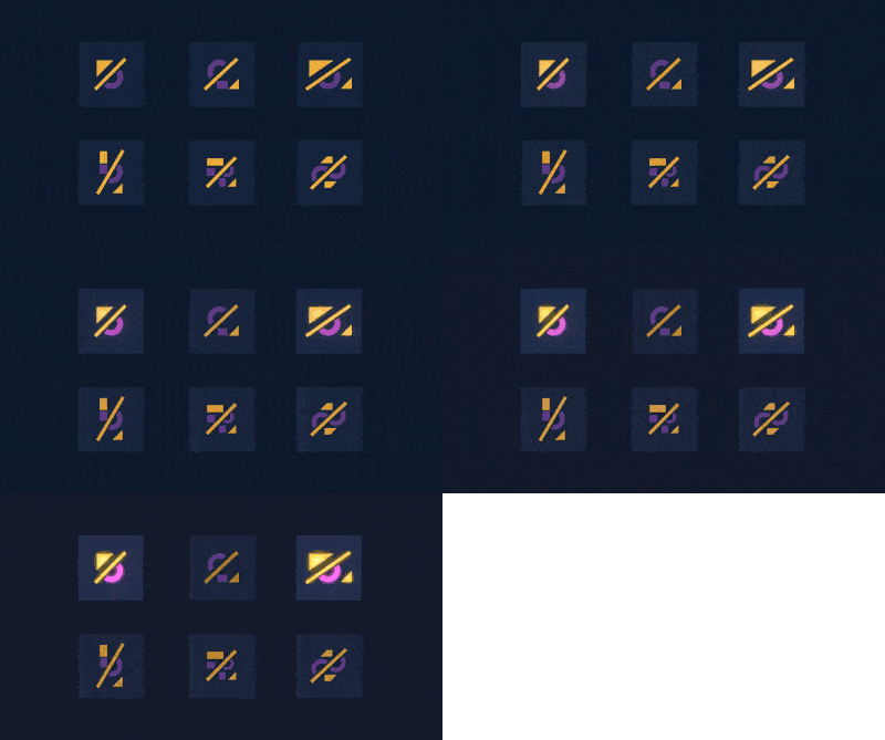
Method is one thing, and seeing different directions side by side is another. We showed this in one example: six logo directions for one brand, and when changing an existing mark: rebranding in three directions and the same logo on five materials.
Google · Your sourcesQuantslant higher in your Google - one clickAdd to preferred sources →How It Looks on Real Brands
Theory is one thing, specific brands another. We ran several recognizable marks through this process: rebranding real brands with AI.
More on this from QUANTSLANT


 guides·AI Voiceover: How to Prepare Text and Check PronunciationWe show you how to prepare a script for AI narration, check pronunciation, and match the voice to your video. Includes ready-to-use prompts and ElevenLabs tips.