Ideogram 4.5 for Social Media & Print: 10 Projects with Prompts
We created 10 social media and print designs in Ideogram 4.5: YouTube thumbnail, Instagram carousel, wedding invite, business card, and more. Prompts and ratings included.
👁 124 reads
We created ten social media and print projects in Ideogram 4.5: a YouTube thumbnail, Instagram carousel cover, wedding invitation, business card, menu, concert poster, infographic, wine label, podcast cover, and shop banner. Five out of ten were ready to use immediately, and errors appeared only where the model had to generate longer text on its own. The average rating was 4.4 out of 5, and 8 out of 10 projects had error-free text.
This is a set closest to everyday work: a short headline, a few lines of information, a specific format. We tested whether each design could be sent to a printer or posted on a profile without opening a graphics editor. Each image is the first and only generation from a given prompt.
How We Tested Ideogram 4.5
- Model: Ideogram 4.5 (released September 30, 2026), via fal.ai API, endpoint
ideogram/v4.5. - Quality: “high”, prompt expansion disabled.
- One generation per prompt, no cherry-picking the best version.
- Formats matched to use case:
landscape_16_9for thumbnail and banner,square_hdfor Instagram and podcast,portrait_4_3for print. - Date: October 1, 2026.
- Cost: On fal.ai, Ideogram 4.5 is billed per image by quality: very_low $0.008, low $0.03, medium $0.06, high $0.22. We used high, so 10 projects cost $2.20.
We wrote prompts in English to make the test reproducible. Text that should appear in the design is provided in quotes within the prompt.
1. YouTube Thumbnail
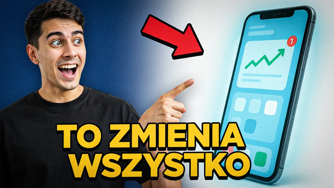
YouTube thumbnail: shocked young man pointing at a giant glowing smartphone, bold yellow text "TO ZMIENIA WSZYSTKO", high contrast, red arrow, clean backgroundEverything you expect from a thumbnail: exaggerated expression, arrow, thick yellow text with black outline, high contrast. The hand and pointing finger are correct, which still isn’t the rule with gestures. The text covers the bottom part of the phone, but that doesn’t matter on a thumbnail. If you want space for YouTube’s timestamp, add keep bottom right corner empty.
2. Instagram Carousel Cover
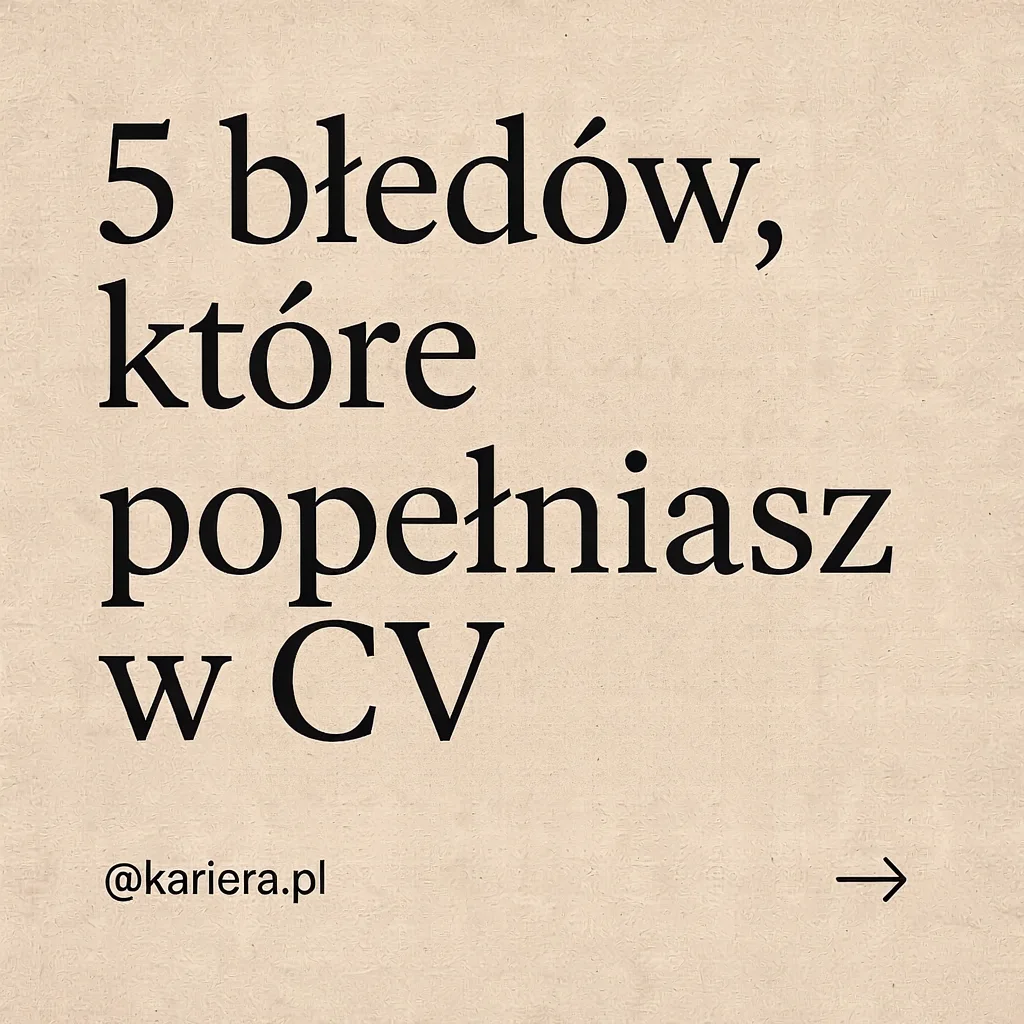
Instagram carousel cover slide, minimal editorial design, beige background, big serif headline "5 błędów, które popełniasz w CV", small handle "@kariera.pl" and a right arrowFlawless. The serif headline has correct diacritics, a comma after “błędów” (errors), and good line breaks, while the handle and arrow sit in the bottom corners. This is what a carousel cover looks like from a profile that pays a designer. Generate subsequent slides with the same style description and changed headline, and the entire carousel stays consistent.
3. Wedding Invitation
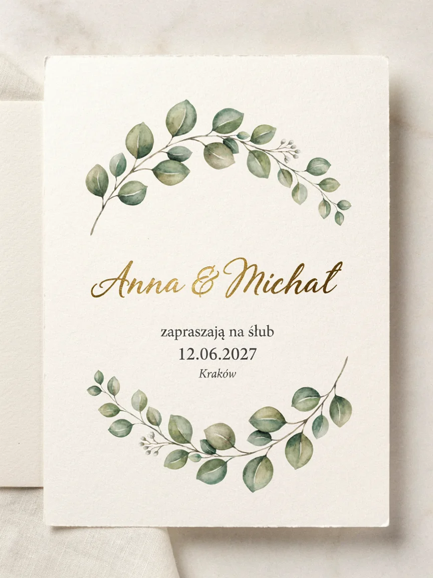
Elegant wedding invitation card, botanical watercolor eucalyptus, gold foil script "Anna & Michał", text "zapraszają na ślub 12.06.2027, Kraków", on textured paper, photographed flatWatercolor branches, paper with deckled edges, and all words in the right places - the model broke the text into three lines on its own. The “ł” in “Michał” in script font has a horizontal stroke, so at first glance it reads like “Michat”. The gold is flat, without foil shine. Add clearly slashed ł and shiny embossed gold foil catching light.
4. Business Card
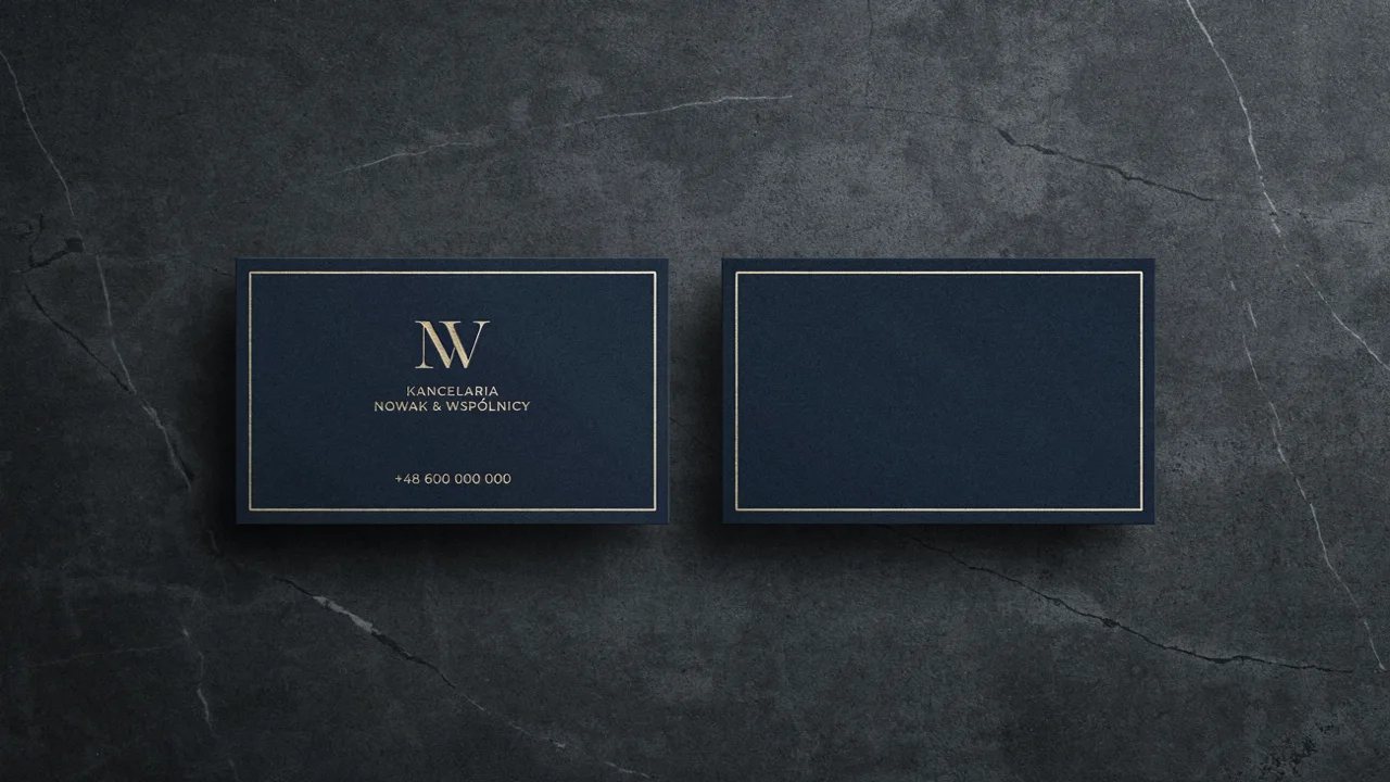
Business card mockup front and back for "Kancelaria Nowak & Wspólnicy", navy and gold, minimal serif logo, phone "+48 600 000 000", on dark stoneThe front is elegant: NW monogram, “WSPÓLNICY” with correct “Ó”, phone number without error. The back, however, is an empty navy card with a border - the model didn’t know what to put there. For a law firm, that’s not enough, because the reverse usually has contact details or just the logo. Describe the reverse explicitly: back side: large gold monogram "NW" centered, nothing else.
5. Restaurant Menu
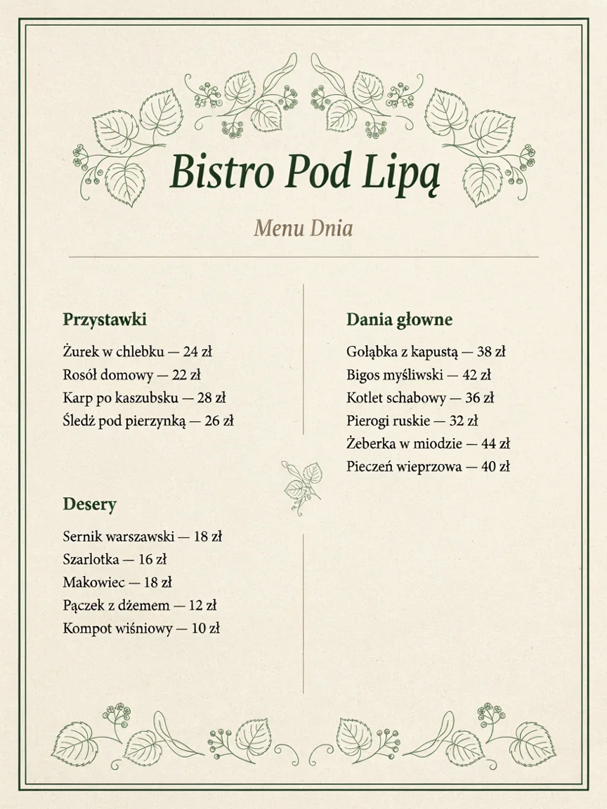
Restaurant menu design for "Bistro Pod Lipą", two columns, sections "Przystawki", "Dania główne", "Desery" with Polish dishes and prices in zł, botanical line art, cream paperWe tested this in Polish. Fifteen items, all prices listed, correct “Żurek”, “Śledź pod pierzynką”, “Pieczeń”, and linden leaves in the ornament. But there are two errors a guest would catch immediately: the heading “Dania głowne” without “ó” (should be “główne”), even though the prompt had it correct, and “Gołąbka z kapustą” (singular) instead of “Gołąbki” (plural). Dishes the model invented itself need to be read word by word. Better to provide the full list of items in the prompt.
6. Concert Poster
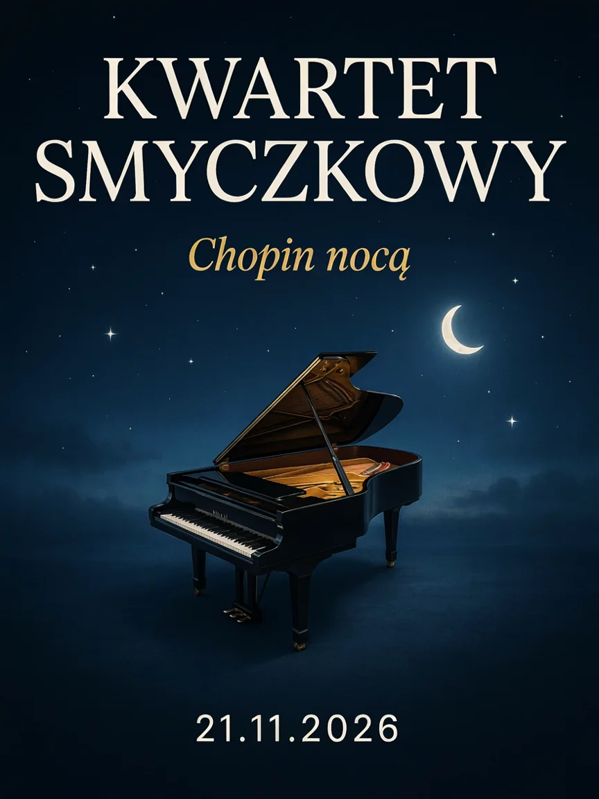
Concert poster "Kwartet Smyczkowy - Chopin nocą", dark blue night sky with a grand piano floating among stars, elegant typography, date "21.11.2026"The typography is elegant, the model split the title into the ensemble name and subtitle “Chopin nocą“ (Chopin at night) in gold italics on its own, and the “ą” is in place. The piano, however, doesn’t float among the stars but stands on a misty floor. The model also didn’t notice a contradiction in the prompt: a string quartet with a piano isn’t a quartet. That’s actually my error, not the model’s. For a levitation effect, add piano levitating high in the sky, no ground visible.
7. Infographic
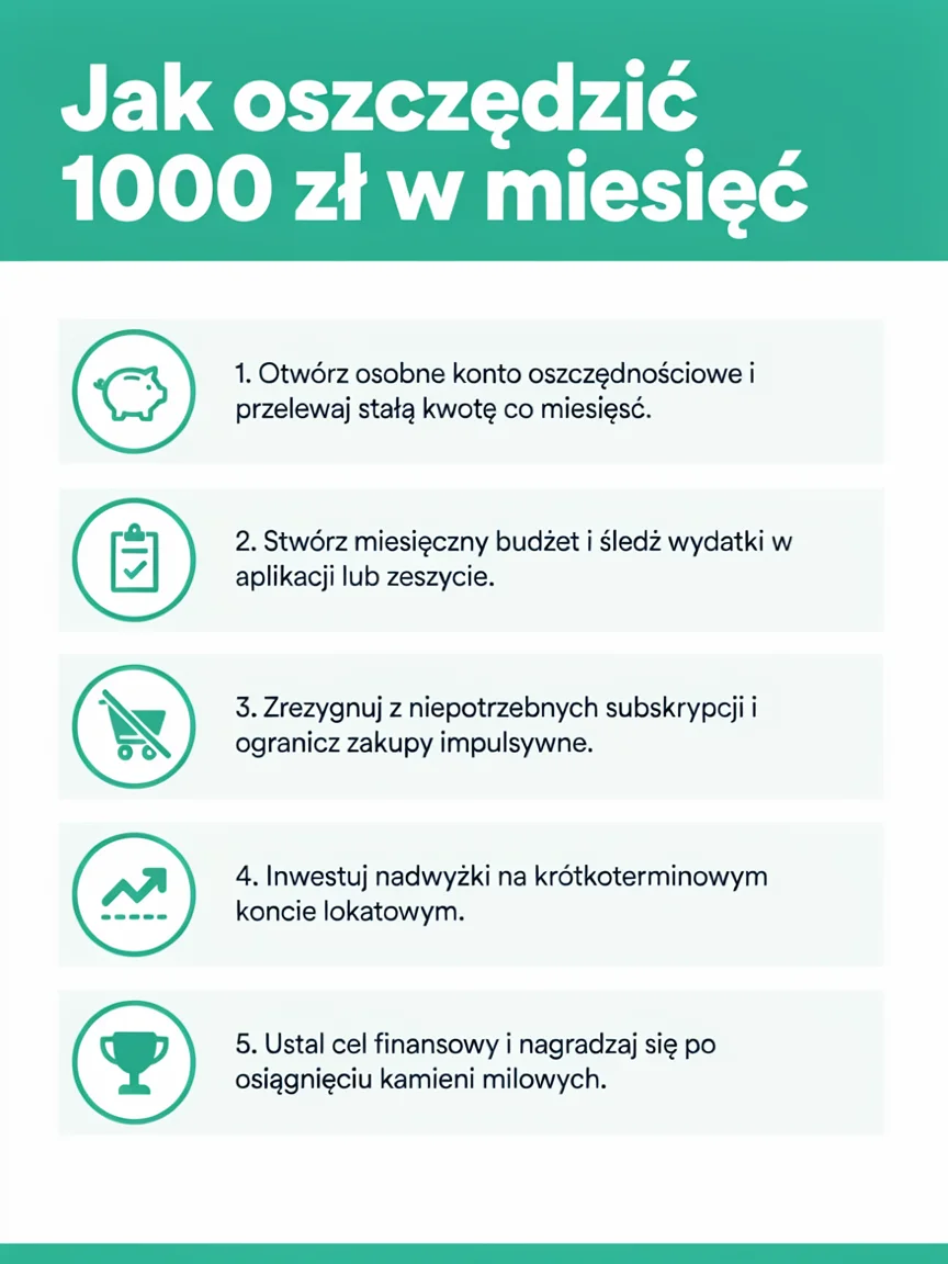
Clean infographic poster "Jak oszczędzić 1000 zł w miesiąc" with 5 numbered steps and simple flat icons, teal and white, readable layoutWe tested this in Polish. The layout is readable, icons match the steps, and the model wrote five sensible tips in Polish on its own. In the headline, however, instead of “w miesiąc” (per month) it says “w miesięć”, and in the first step “co miesięść” - meaning in a word provided directly in the prompt, the model confused the diacritic. Step four sounds unnatural. Write the infographic content yourself and provide it in the prompt line by line.
8. Wine Label
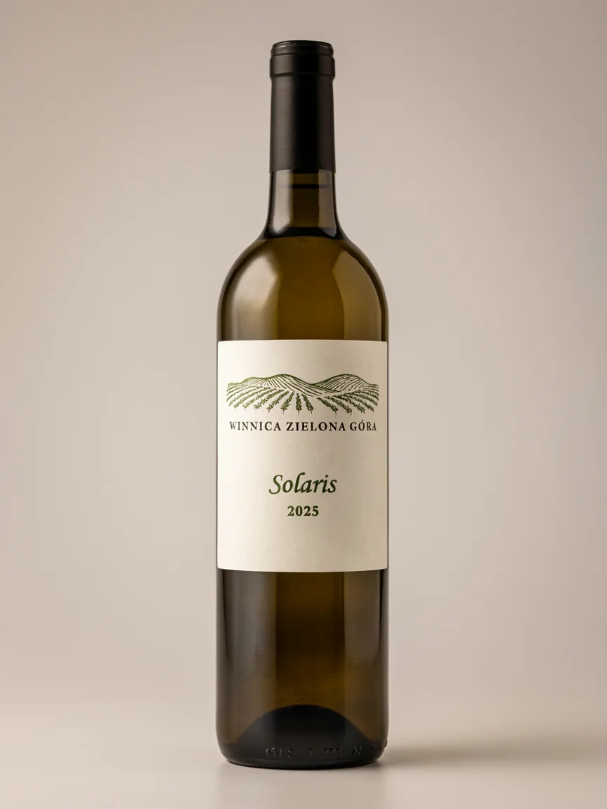
Wine bottle label design "Winnica Zielona Góra - Solaris 2025", line drawing of vineyard hills, minimal typography, bottle photographed in studioReady visualization for a catalog: rows of vines on hills, “GÓRA” with correct “Ó”, variety in italics, and vintage. The model sensibly omitted the hyphen from the prompt and broke the name into three levels. Embossed text at the bottom of the bottle is illegible characters, but at this scale no one will notice. For a print-ready label, add flat label artwork only, no bottle.
9. Podcast Cover
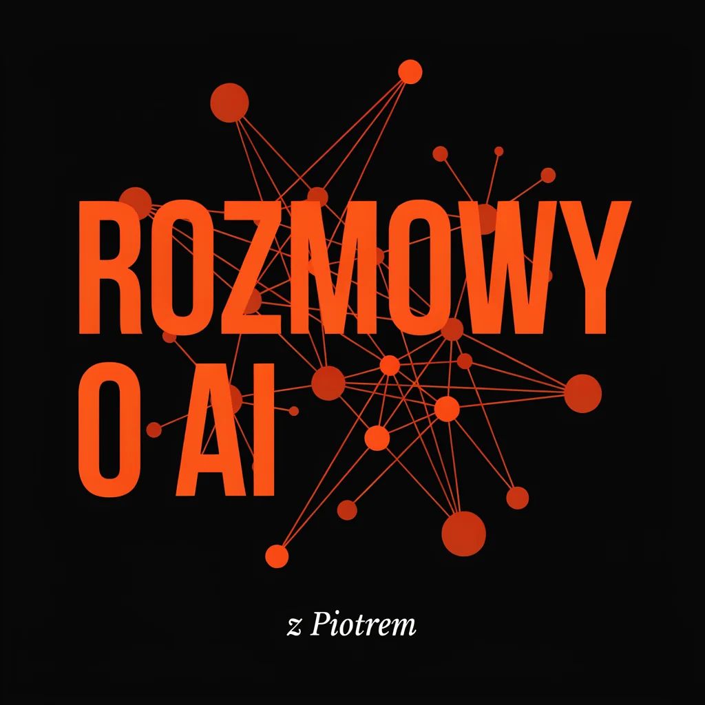
Podcast cover art "Rozmowy o AI" bold typography, abstract neural network shapes in orange and black, host name "z Piotrem" smallReadable even at icon size in an app: thick condensed sans-serif, network of nodes and lines passing behind letters, small serif credit. Everything error-free. The design is correct but fairly predictable - this kind of neural network adorns half of AI-related covers. If you want to stand out, change the metaphor, for example two speech bubbles made of circuit lines.
10. E-commerce Banner
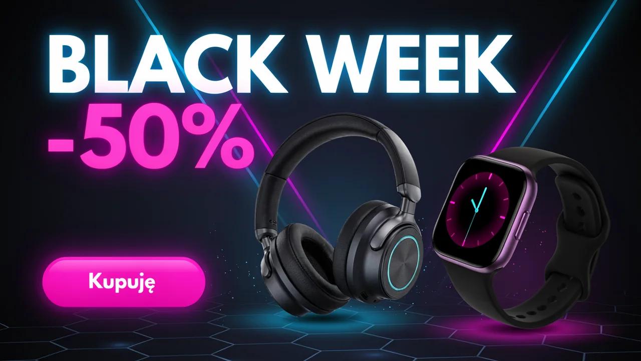
E-commerce sale banner "BLACK WEEK -50%" for an electronics shop, headphones and smartwatch on dark background, neon accents, button "Kupuję"Neon text, products with reflection on hexagonal floor, and pink button with correct “ę“. The headphones and watch have no logos or invented brands. We later translated this banner to German via editing, so you’ll find the comparison in the article about edits.
Summary: Ratings for 10 Projects
| Project | Rating 1-5 | Error-free text | Notes |
|---|---|---|---|
| YouTube thumbnail | 5 | yes | ready to use |
| Instagram carousel | 5 | yes | professional profile level |
| Wedding invitation | 4.5 | yes | “ł” similar to “t”, flat gold |
| Business card | 3.5 | yes | empty reverse |
| Restaurant menu | 3.5 | no | “głowne“, “Gołąbka“ |
| Concert poster | 4.5 | yes | piano doesn’t levitate |
| Infographic | 3 | no | “miesięć“, “miesięść“ |
| Wine label | 5 | yes | ready visualization |
| Podcast cover | 5 | yes | readable but predictable |
| Shop banner | 5 | yes | no invented brands |
Common Errors and How to Avoid Them
- Text invented by the model. The menu and infographic had errors in sentences the model composed itself. Provide every line that should go to print in the prompt.
- Diacritics in words you typed correctly. “Miesiąc” (month) turned into “miesięć”. With longer texts, check every character with diacritics, and correct erroneous words with editing instead of regenerating everything from scratch.
- Empty elements. The business card reverse was left empty because the prompt didn’t say what should be on it. Describe every side and every panel.
- Material effects. Gold foil and embossing come out flat. Describe how the material reflects light.
- Contradictions in the prompt. The model won’t flag that a string quartet doesn’t play piano. Read the prompt before sending.
FAQ
Are Ideogram 4.5 designs suitable for print?
For digital printing in small format yes, if the text is correct. The image is about 1 megapixel (for example 1280 x 720 or 1024 x 1024 px), so for an A2 poster you need to upscale it, and text is best set as vectors in layout software anyway.
Which format works best?
Short forms with one headline: thumbnail, carousel, banner, podcast cover, and label all got 5 out of 5. Forms with lots of text - menu and infographic - require proofreading.
How does the cost compare to hiring a designer?
On fal.ai, an image in high quality costs $0.22, so 10 projects cost $2.20. This doesn’t replace a designer for branding or layout, but for quick social media materials and client proposals it’s more than sufficient.
How do you fix a typo in a finished design?
Through editing ideogram/v4.5/edit in precise mode: you provide the image and write which word to replace, with the note change nothing else. We raised prices in the menu from this article that way, and the result with errors is described in editing examples. A detailed test of non-English text rendering is in the Polish text test.
More About Ideogram 4.5
More on this from QUANTSLANT
 benchmarks·Ideogram 4.5 Photography Test: 12 Shots with PromptsWe generated 12 photographic shots in Ideogram 4.5: portrait, macro, drone, packshot, flat lay, street, and more.