Qwen-Image-2.1 Rebrands Coca-Cola, IKEA & 8 More Brands
We asked Qwen-Image-2.1 to rebrand ten well-known brands with perfect spelling. Ten out of ten names came out flawless - the sharpest typography test yet.
👁 118 reads
We asked Qwen-Image-2.1 to rebrand ten brands everyone knows by heart - five global and five from Poland. One condition: the new wordmark had to be spelled exactly as the name reads. This is the sharpest typography test we could think of, because in a corporate mark, one misplaced letter ruins the entire job.
Verdict in One Paragraph
Ten out of ten names spelled flawlessly - including the apostrophe in McDONALD’S and the Ż in ŻABKA (a Polish convenience store chain). This is where the model’s typography performs best: short, well-known name, large type, as the only text in frame. And this is the exact opposite of what we saw with posters, where fine print turned into gibberish. Practical takeaway: the model works for sketching visual direction, not for designing an identity system - you get a picture, not a vector file or a set of guidelines.
Why We’re Not Showing the Originals Side by Side
We’ll say this plainly, because the question will come up: we’re not publishing the actual marks of these companies here. They are registered trademarks and reproducing them on a commercial site is unnecessary risk. Instead, we describe in words what each original has - and everyone has it in their head anyway. Everything below is concepts generated by the model, not reproductions of existing marks and not proposals submitted to anyone.
Global Brands
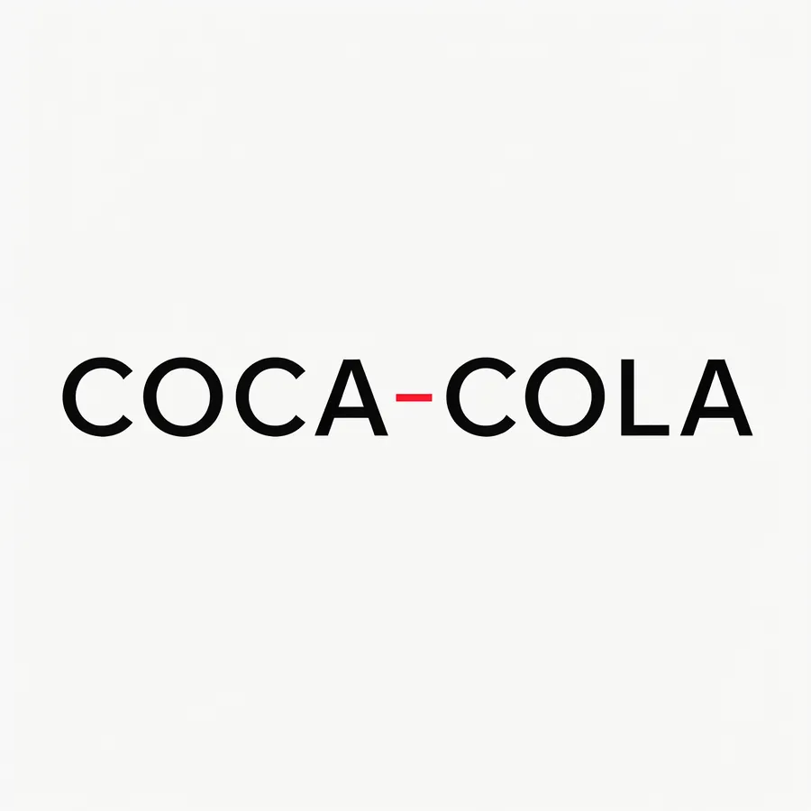
Coca-Cola in strict Swiss typography: black sans-serif small caps, one thin red line, lots of white space.
The original has red calligraphy from the 1880s - one of the most recognizable typefaces in the world. The model got the opposite assignment: turn calligraphy into a Swiss grid. It came out cold, technical and completely against the brand - exactly as we asked. Red was reduced to one line between the words.
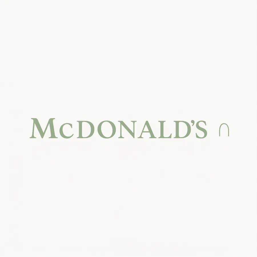
McDonald's in Scandinavian minimalism: muted sage green, serif typeface, small abstract arc instead of golden letter.
The original has a golden arch and red background. The model swapped it for sage green and a delicate serif, and turned the arch into a tiny mark at the end of the word - barely a suggestion instead of a dominant. Apostrophe in the right place, which is not at all obvious when generating text.
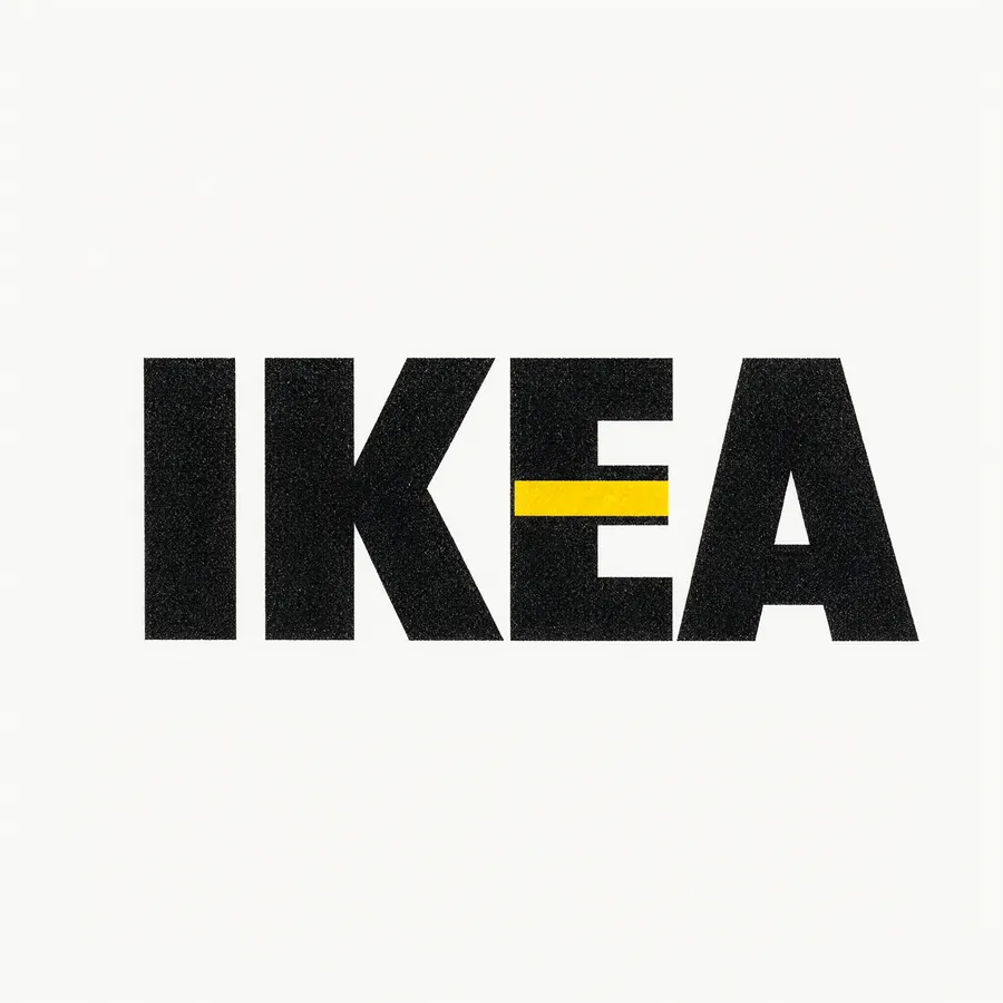
IKEA in brutalist style: heavy condensed capitals filling the frame, photocopy grain, one yellow stripe.
Here the model did something clever: it embedded the yellow stripe into the letter E, instead of placing it alongside. This is a design decision, not decoration - exactly the kind of idea you reach for when sketching.
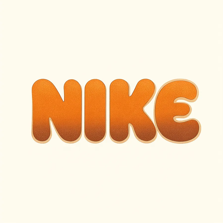
Nike in 1970s sportswear aesthetic: cream background, rounded letters in orange and brown, subtle halftone.
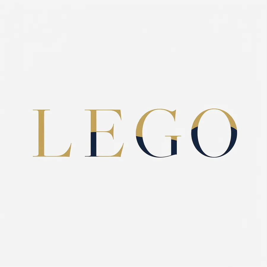
Lego as fashion house: thin gold serif capitals with wide leading on navy, zero ornaments.
Lego in luxury fashion house style is our favorite frame of the entire set. This is opinion: thin gold capitals with generous white space turn a children’s brand into something that would fit on a boutique bag - and precisely that contradiction is what makes it interesting.
Polish Brands
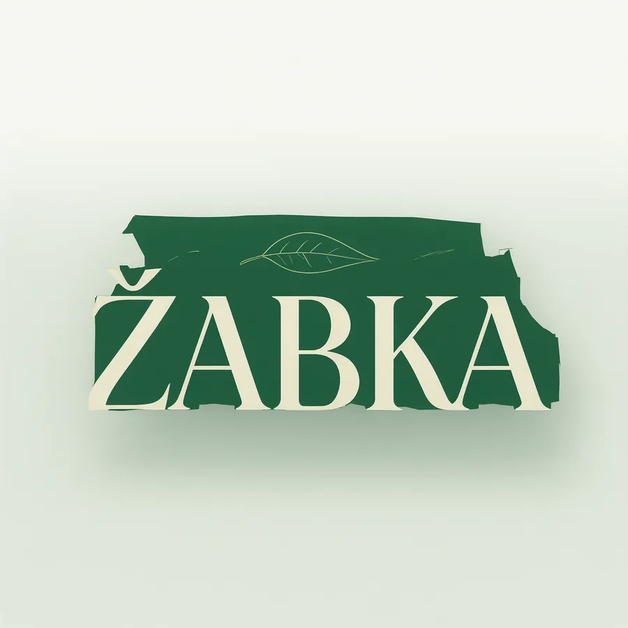
Żabka as premium delicatessen: dark green, cream serif capitals, one subtle leaf drawing. Ż with dot in place.
This is the most important frame in this test - not because of the design, but because of one dot. Ż was spelled correctly, with a dot, not as Z or Ź. In our test of Polish signage, the model could confuse Ż with Ź in longer words - in a short brand name it got it right.
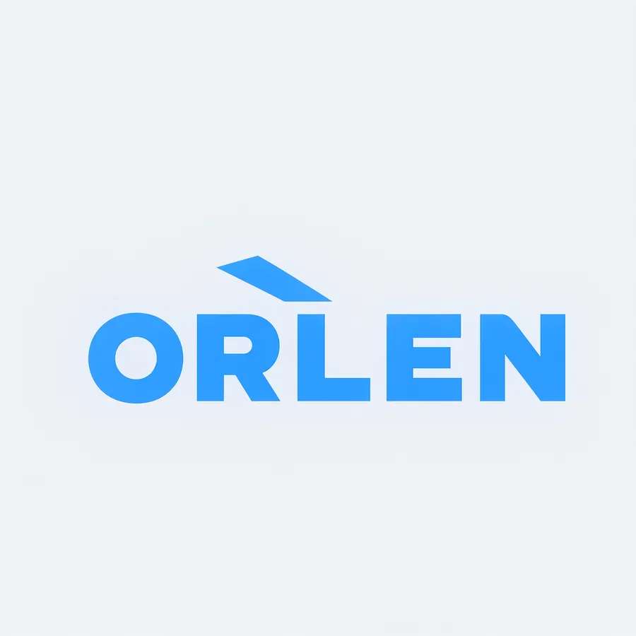
Orlen in clean energy style: light gray background, geometric sans-serif in electric blue, one angular mark.
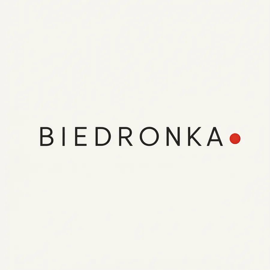
Biedronka in Japanese minimalism: paper background, thin letters, one red dot.
Biedronka is the second moment where the model did more than execute the instruction. We asked for “one small red dot” as a minimalist element. The model placed it at the end of the name - and it came out as a ladybug’s dot. We don’t know if it’s coincidence, but it works.
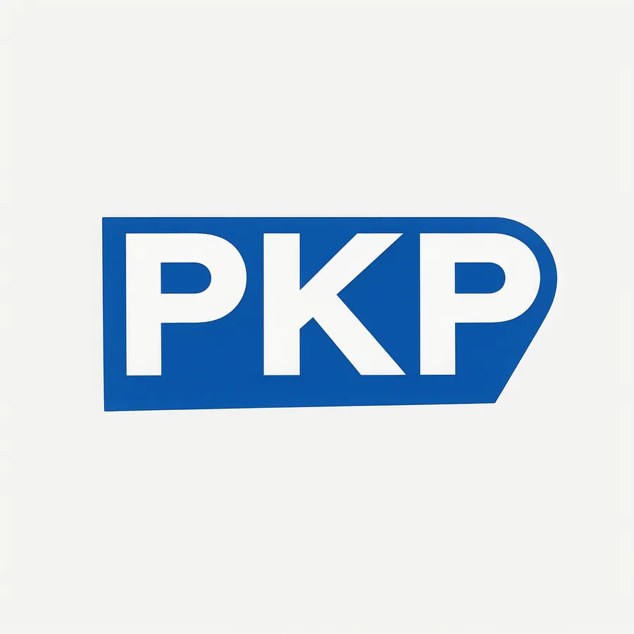
PKP in mid-20th century transport signage style: navy, white geometric capitals, one horizontal speed line.
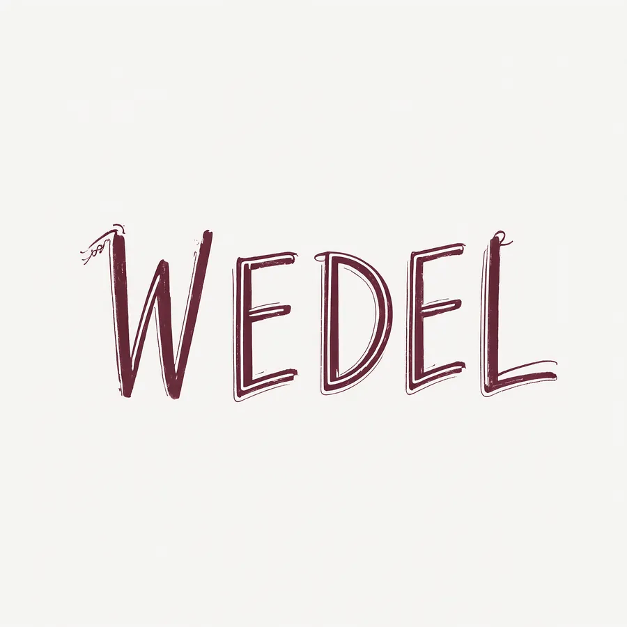
Wedel as artisan chocolate: matte burgundy background, hand-drawn ink capitals, thin decorative frame.
Table: What the Original Has, What the Model Did
| Brand | Original is based on | Direction from model | Spelling |
|---|---|---|---|
| Coca-Cola | red calligraphy | Swiss sans-serif | correct |
| McDonald’s | golden arch, red | sage serif | correct |
| IKEA | yellow and blue, sans-serif | brutalism, photocopy grain | correct |
| Nike | graphic mark without name | rounded 70s letters | correct |
| Lego | red square, playful | gold serif, fashion house | correct |
| Żabka | green, animal mark | premium delicatessen | correct, with Ż |
| Orlen | red eagle | clean energy blue | correct |
| Biedronka | red and black, insect | Japanese minimalism | correct |
| PKP | navy, monogram | 1950s signage | correct |
| Wedel | historic signature | artisan ink | correct |
Why Typography Works Here
Comparing with our earlier tests gives a fairly clear picture:
- Posters: headline correct in 7 out of 8 cases, fine print illegible in 8 out of 8.
- Polish signage: 3 out of 5 flawless, errors in long and rare words.
- Wordmarks: 10 out of 10 flawless.
One pattern emerges: the shorter and more familiar the word, and the larger portion of the frame it occupies, the better. A brand name is the most favorable possible setup - a few letters, huge type size, no competition in frame.
What You Can’t Do With This
- This is not a vector file. You get a raster image. For print and scaling you need to redraw from scratch.
- This is not an identity system. The mark is a few percent of the work. The rest is usage guidelines, variants, supporting typography and how the whole thing behaves in twenty places at once.
- You can’t use this commercially - the model’s license permits only research and evaluation, and regardless of that, registered trademarks have their owners.
- You can’t reproduce this exactly. Different seed means different result. Good enough for presenting direction, not for production.
This is opinion: the real value of this tool in brand work lies in the first hour of a project, when you need to show a client five different directions before deciding which to develop. The ten above took ten minutes and cost seven cents in electricity.
Frequently Asked Questions
Does the model spell brand names correctly?
In this test, ten out of ten, including the apostrophe and Polish Ż.
Are these the actual logos of these companies?
No. These are concepts generated by the model. We’re not publishing the original marks - they are registered.
Can you use this commercially?
No. The model’s license covers research and evaluation, and trademarks have owners.
Why do wordmarks come out better than text on posters?
Because they’re short, familiar and occupy most of the frame. Fine print is the hardest case for the model.
How long did this take?
42 to 68 seconds per frame, ten pieces in about ten minutes on RTX 4090.
Does the model understand design school names?
Yes. Swiss typography, brutalism, Japanese minimalism and transport signage gave clearly different results.
Sources and Date Verified
We generated all ten concepts ourselves on September 22, 2026 locally on RTX 4090, using Qwen-Image-2.1 in int8 variant through ComfyUI: 25 steps, euler, cfg 1.0, one seed for the entire series, one attempt per brand, no retouching and no picking the best from multiple tries. These are outputs of the model, not trademarks of the mentioned companies - they are not associated with or proposed to them in any way. Descriptions of originals are verbal descriptions from common memory, without reproduction. Design assessments are ours and subjective.
More on this from QUANTSLANT

 magazine·iPhone 18 Pro Max 1TB Uses Different Storage Than 512GB ModelTests show the 1TB iPhone 18 Pro Max uses QLC memory while the 512GB variant has TLC. Here's when it actually matters and how to choose the right capacity.