Qwen-Image-2.1 Posters: 8 Styles, 1 Conclusion
Seven out of eight posters got the headline right. Zero out of eight produced readable fine print. The truth about AI image models and poster design.
👁 116 reads
We ordered the same poster from Qwen-Image-2.1 in eight different graphic design styles - from Swiss grid to Polish poster school. One prompt, one text: “JAZZ NAD WISŁĄ” (Jazz on the Vistula). The results answered the question you should ask before any AI graphic design project: what can the model actually do in a poster, and what can’t it do at all.
Verdict in One Paragraph
Seven out of eight posters have a correct headline with Polish diacritics. Zero out of eight have readable fine print. That’s the whole truth about posters from image models in one sentence: large letters work, small text turns into decorative gibberish that looks like text from a distance but isn’t text at all up close. This means the model is suitable for the visual layer of a poster, not for a finished poster. Stylistically, however, it performs surprisingly well - it recognizes and reproduces specific graphic design schools, including the Polish one.
How We Tested It
One sentence about the theme, one about style, the same text and the same seed for all eight. Format 1696×2528, a vertical 2:3 poster. Time: 46 seconds per piece, all eight in six minutes.
What Worked Best: Polish Poster School
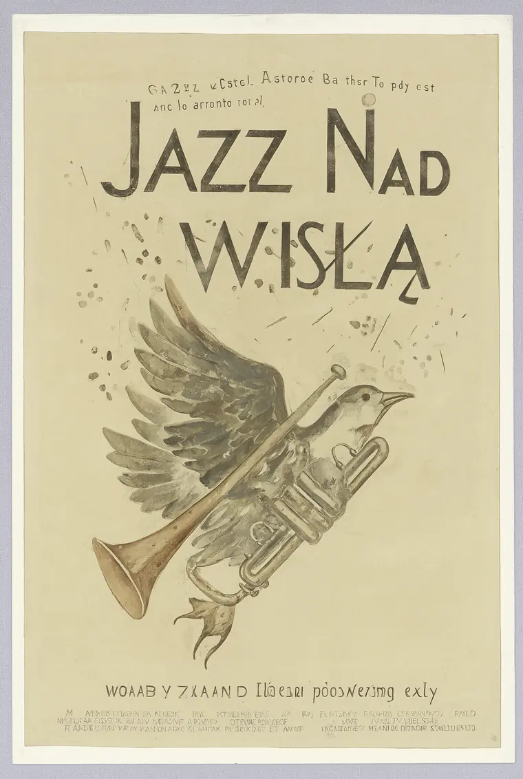
Polish poster school: trumpet morphing into a bird, painted in gouache, hand-lettered title with correct diacritics. Fine print below the illustration is illegible.
We asked for “trumpet morphing into a bird, gouache, muted earthy palette” - and got something that looks like a scan of a poster from the sixties. The title “JAZZ NAD WISŁĄ” is correct, with diacritics. Metaphorical illustration instead of literal, paper texture, muted colors.
This is an opinion: of all eight, this one would be ready for print after adding the text. The model recognizes “Polish Poster School” as a specific convention, not as a generality.
Two That Nailed the Style Perfectly
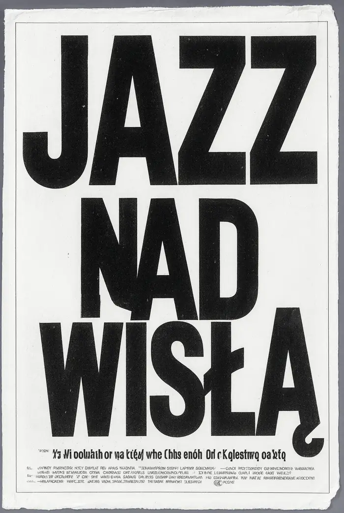
Brutalist style: huge cropped letters, sharp contrast, photocopy texture. Headline flawless, entire block below it is gibberish.
Brutalism came out textbook-perfect: huge, cropped typography, photocopy grain, ragged edges. Headline perfect, complete with diacritics. The entire text block below - completely illegible.
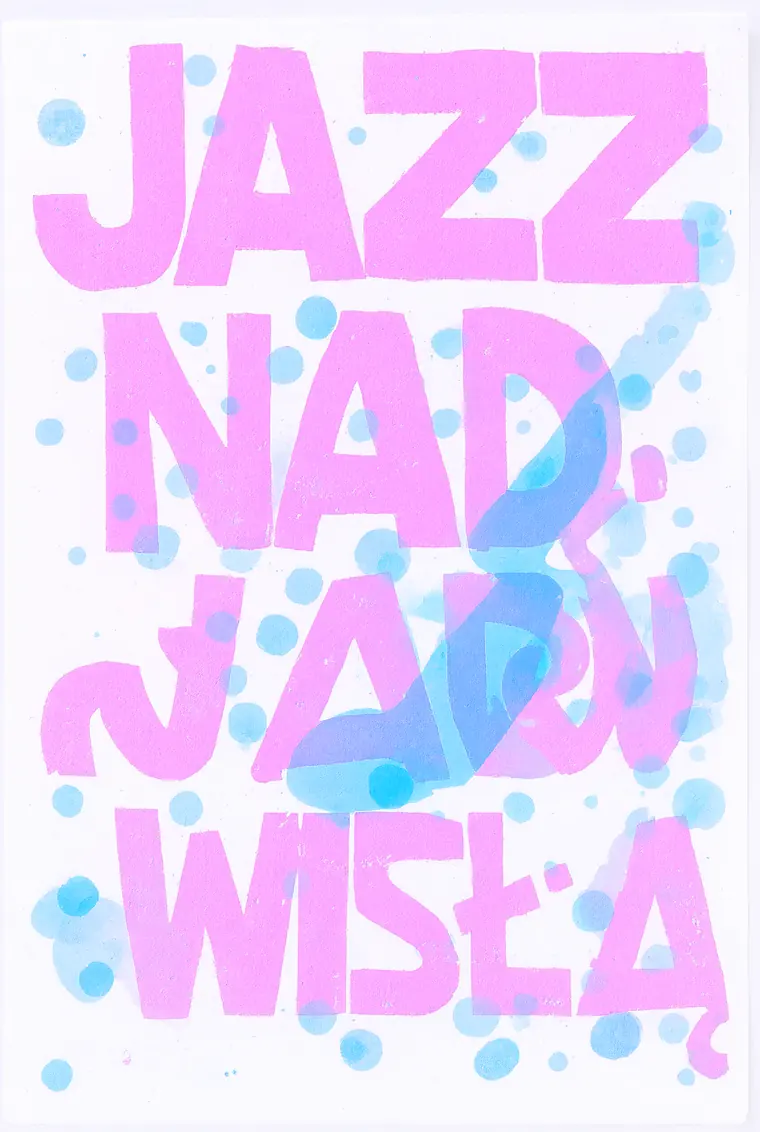
Risograph: two ink colors, visible misregistration, paper texture. Text correct despite deliberately imprecise printing.
Risograph is difficult because it relies on controlled imprecision - the ink should be shifted, but the letters still readable. The model played it right: pink and blue offset by a few millimeters, and the text still correct.
Where It Failed
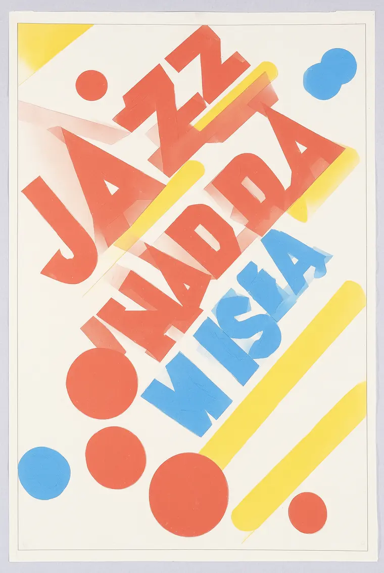
Bauhaus: colors and geometry flawless, but the text came out as JAZZ NADDA WISŁA - duplicated syllable and missing diacritic.
Bauhaus is the only one of the eight with an error in the headline: instead of “JAZZ NAD WISŁĄ“ it came out as “JAZZ NADDA WISŁA“. Duplicated syllable and missing diacritic. Colors and geometry - flawless.
Our hypothesis: with strongly diagonal composition, letters are stretched and rotated, and the model more often loses track of the sequence. We didn’t test this on a series, so treat it as a guess.
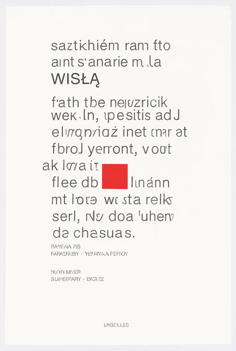
Swiss style: grid, whitespace and red rectangle in place, but the entire text column is meaningless characters.
Swiss style exposed the problem most painfully, because this school is based on text. The grid, proportions and red accent are correct, but instead of content there’s a column of meaningless letters. A poster whose entire content was supposed to be typography doesn’t have a single readable sentence.
The Other Three
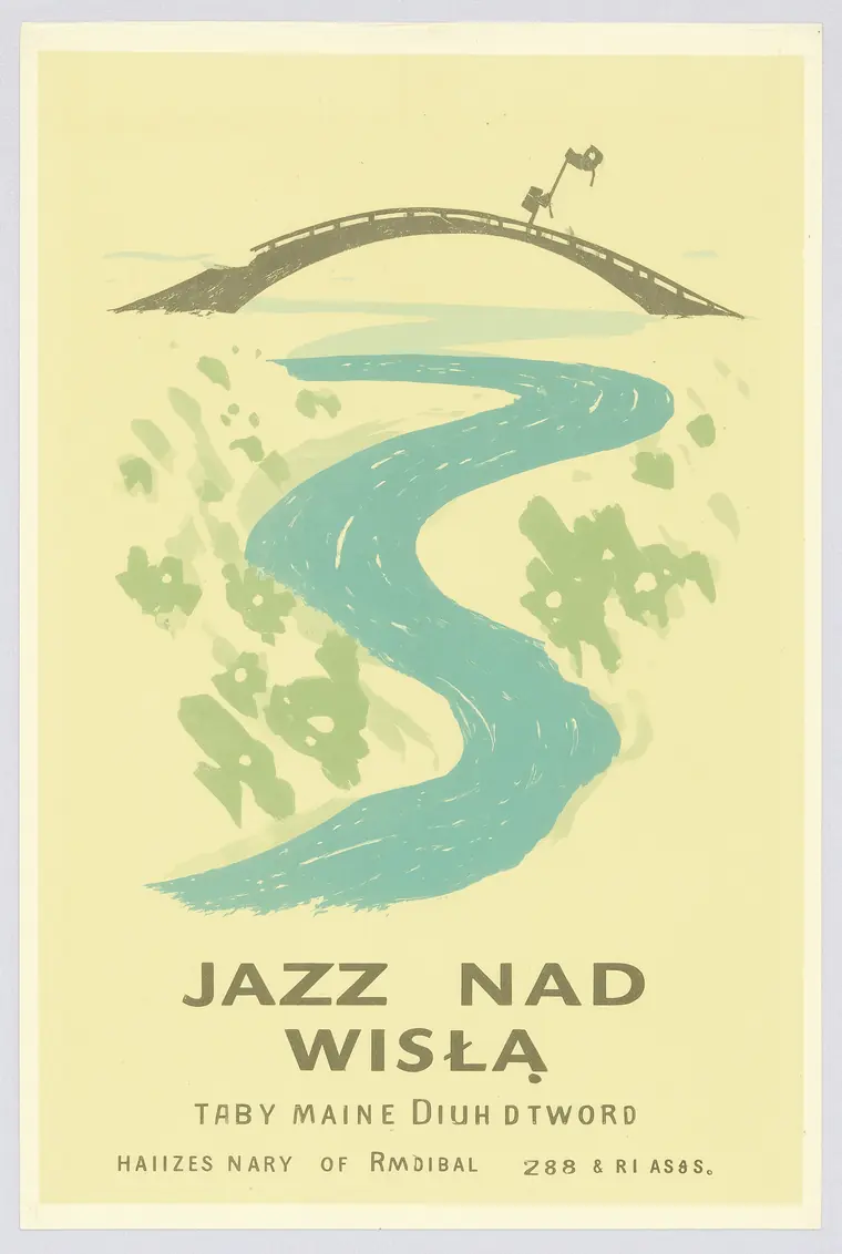
1950s travel poster: flat color blocks, river and bridge, correct headline, caption below illegible.
The travel poster and minimalist saxophone drawing hit the convention and the text. Art deco made a beautiful fan pattern, but pushed the title to a tiny strip at the bottom - technically correct, design-wise off target.
Results Table
| Style | Headline | Fine Print | Style Accuracy |
|---|---|---|---|
| Polish poster school | correct | gibberish | very good |
| Brutalism | correct | gibberish | very good |
| Risograph | correct | none | very good |
| 1950s travel poster | correct | gibberish | good |
| Minimalism | correct | none | good |
| Art deco | correct | gibberish | good, poor layout |
| Swiss style | partial | gibberish | good |
| Bauhaus | error | none | good |
How to Use This in Practice
- Treat the model as an illustrator, not a compositor. Take the background, illustration and color scheme from it, and add text in a graphic program. This isn’t a workaround - it’s the proper division of labor.
- Order one text element, not four. Each additional text block is another place for gibberish. All our correct headlines were text ordered as the only text on the poster.
- Name the school by name. “Polish Poster School”, “Risograph”, “Brutalist” give a completely different result than “nice jazz poster”. The model knows these names.
- Don’t order text-based styles. Swiss style without readable text loses its point. Choose conventions where the illustration carries the message.
- Retry on headline errors. One error in eight means a second attempt usually works. It costs 46 seconds.
More on how the model handles text itself - we tested it with character-by-character measurement - in a separate test of signs with diacritics. How to set all this up yourself is described in the installation guide.
Common Questions
Can you make a finished poster in Qwen-Image-2.1?
Ready for print - no. In our test, none of the eight posters had readable fine print. Headlines work, the rest doesn’t.
Does the model understand specific graphic styles?
Yes, and surprisingly well. It recognized Polish poster school, risograph, brutalism and Swiss style as separate conventions.
How long does it take to generate a poster?
46 seconds in 1696×2528 format on RTX 4090, int8 variant at 25 steps.
Do headlines with diacritics come out correctly?
In this test, seven out of eight, complete with diacritics. The error appeared with a strongly diagonal composition.
What format should you choose?
For posters 2:3, which is 1696×2528. The model supports seven aspect ratios, all around 2K.
Sources and Test Date
We generated all eight posters ourselves on September 22, 2026 locally on RTX 4090, using Qwen-Image-2.1 in int8 variant through ComfyUI: 25 steps, euler, cfg 1.0, one seed for the entire series, one attempt per style, no retouching. The ratings in the table are our reading of the generated files. Eight attempts is too few for statistical conclusions - this is the result of one test, not a measurement of the model’s capabilities. The hypothesis about diagonal compositions is clearly marked as a guess and was not tested on a series.

More on this from QUANTSLANT


 benchmarks·Qwen-Image-2.1 Tested: Ten Frames from Ten Different WorldsFrom product photography to vector illustration. Where the model excels and where it shows its limits - with ratings and ten examples.