AI Mockups: One Logo on 5 Different Materials
One logo on a mug, box, bag, shirt and window. Five AI mockup prompts and how to control letters and surfaces.

👁 112 reads
A mockup should show how a finished design behaves on an object. When AI draws a new logo in the process, you lose the ability to evaluate the same mark across applications. In this exercise, we transfer one logotype - OBRÓT (rotation) - onto five different surfaces.
We chose a mug, cardboard box, cotton bag, shirt and window. Each surface presents a different challenge: curvature, texture, folds or reflections. We attach the same flat mark as a reference for every generation.
What an AI Mockup Prompt Should Include
First, we specify that the design is finished. We list the elements that must be preserved: the word OBRÓT (rotation), the accented Ó, the dot in the first O, and the spacing between letters. Only then do we describe the object, print location and lighting.
The reference has a white background, but only the mark itself should appear on the object. That’s why we separate the graphic from the background in the prompt. Without this instruction, the model may treat the whole thing as a rectangular sticker.
Input Materials
1. Logo on a Mug
Attachments for this prompt, in order: Typographic logotype.
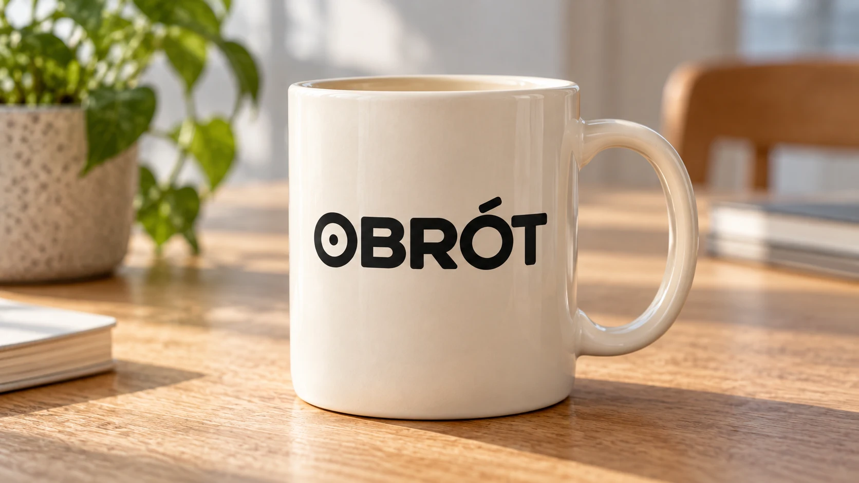
The logo adapts to the mug’s curvature. The dot and accent are visible, and the white background of the reference wasn’t transferred as a rectangular sticker.
Prompt to copy (translated from the Polish original we tested):
Create a photographic mockup in 16:9 format using exactly the attached flat black logotype OBRÓT. Preserve the Ó, the dot in the first O, letter shapes and spacing. Remove the white background from the reference, transfer only the mark. One cream ceramic mug with handle on the right, logo printed in black ink centrally on the surface, print curvature matching the mug's curvature. One main carrier, clear logo. Soft daylight. No additional letters, symbols, watermarks, gradients or decorative gold. This is a visualization of a finished mark, not a new logo design.
2. Logo on a Box
Attachments for this prompt, in order: Typographic logotype.
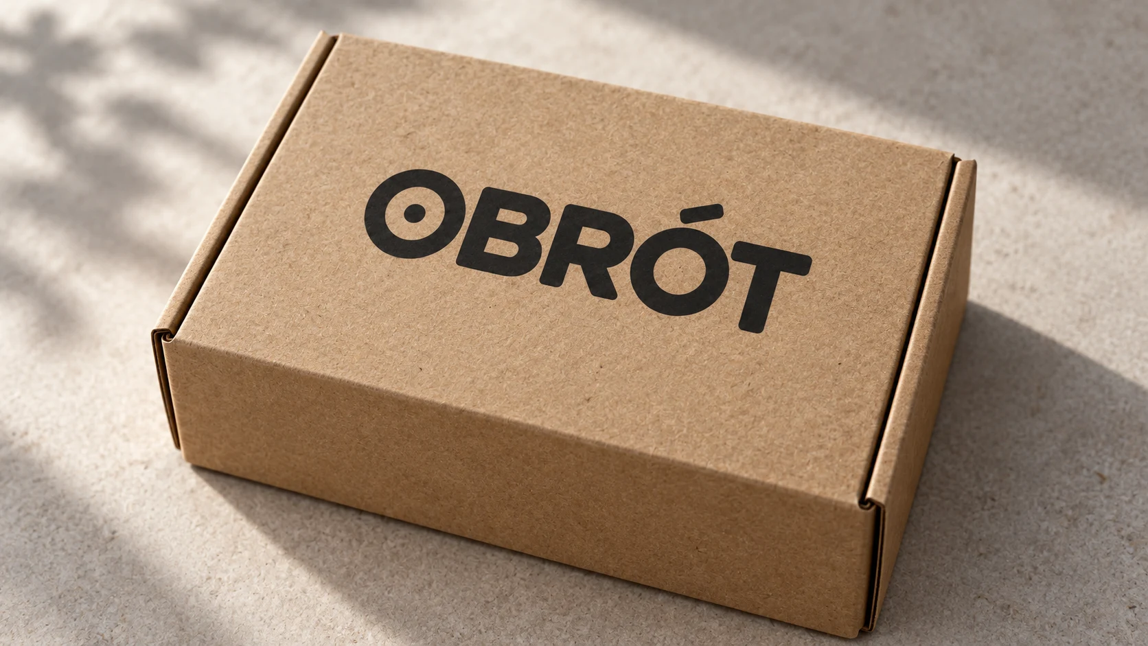
The flat print on the lid preserves the readable name and the mark in the O. The box’s perspective gives the letters a natural foreshortening, without adding the white background.
Prompt to copy (translated from the Polish original we tested):
Create a photographic mockup in 16:9 format using exactly the attached flat black logotype OBRÓT. Preserve the Ó, the dot in the first O, letter shapes and spacing. Remove the white background from the reference, transfer only the mark. Closed small box made of brown kraft cardboard, black print on the flat lid, three-quarter view from above, preserve paper fibers. One main carrier, clear logo. Soft daylight. No additional letters, symbols, watermarks, gradients or decorative gold. This is a visualization of a finished mark, not a new logo design.
3. Logo on a Bag
Attachments for this prompt, in order: Typographic logotype.
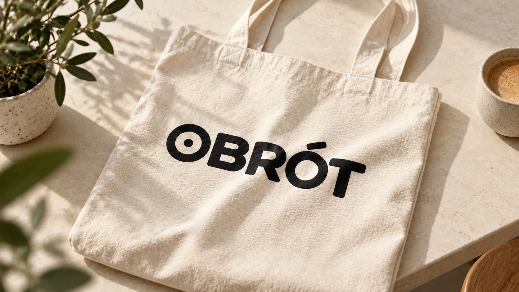
The print flows across the fabric folds, and the bag remains the main carrier. The background is slightly richer than in the minimal brief: a plant and cup appeared.
Prompt to copy (translated from the Polish original we tested):
Create a photographic mockup in 16:9 format using exactly the attached flat black logotype OBRÓT. Preserve the Ó, the dot in the first O, letter shapes and spacing. Remove the white background from the reference, transfer only the mark. One natural cotton bag with two handles, lying on a cream table, black print in the center, small folds realistically distort the print without changing the letters. One main carrier, clear logo. Soft daylight. No additional letters, symbols, watermarks, gradients or decorative gold. This is a visualization of a finished mark, not a new logo design.
4. Logo on a Shirt
Attachments for this prompt, in order: Typographic logotype.
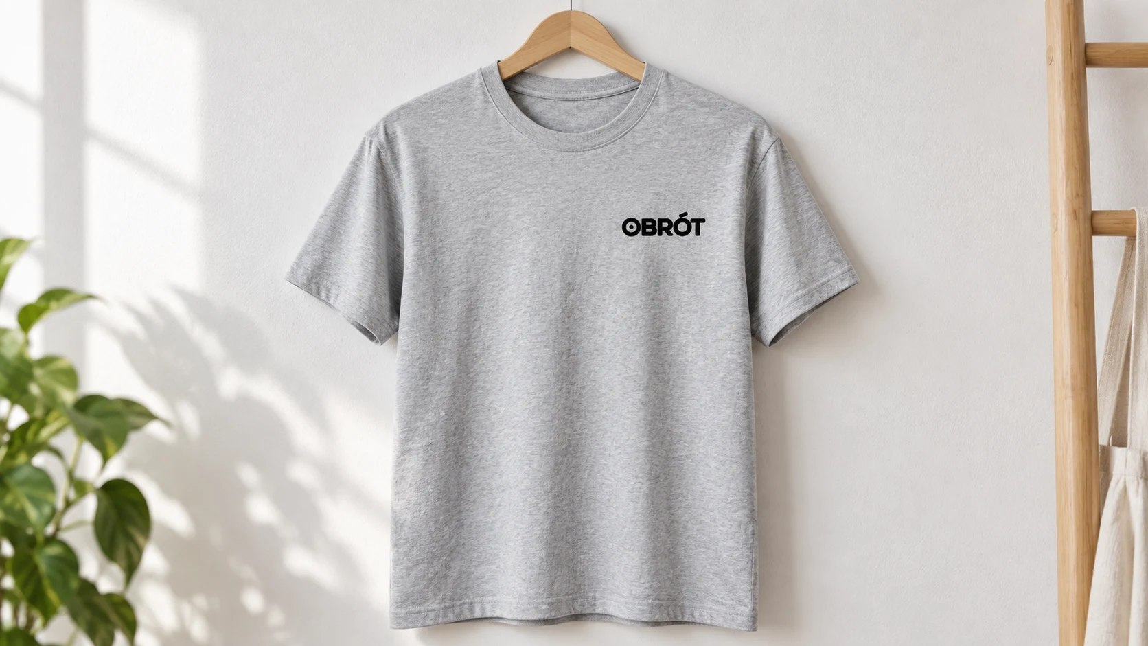
The small logo sits on the left chest. This is a useful contrast to large prints: here, legibility of the mark at small scale matters.
Prompt to copy (translated from the Polish original we tested):
Create a photographic mockup in 16:9 format using exactly the attached flat black logotype OBRÓT. Preserve the Ó, the dot in the first O, letter shapes and spacing. Remove the white background from the reference, transfer only the mark. One light gray cotton shirt on a hanger, entire front visible, small black print on left chest, no person, realistic knit fabric. One main carrier, clear logo. Soft daylight. No additional letters, symbols, watermarks, gradients or decorative gold. This is a visualization of a finished mark, not a new logo design.
5. Logo on a Window
Attachments for this prompt, in order: Typographic logotype.
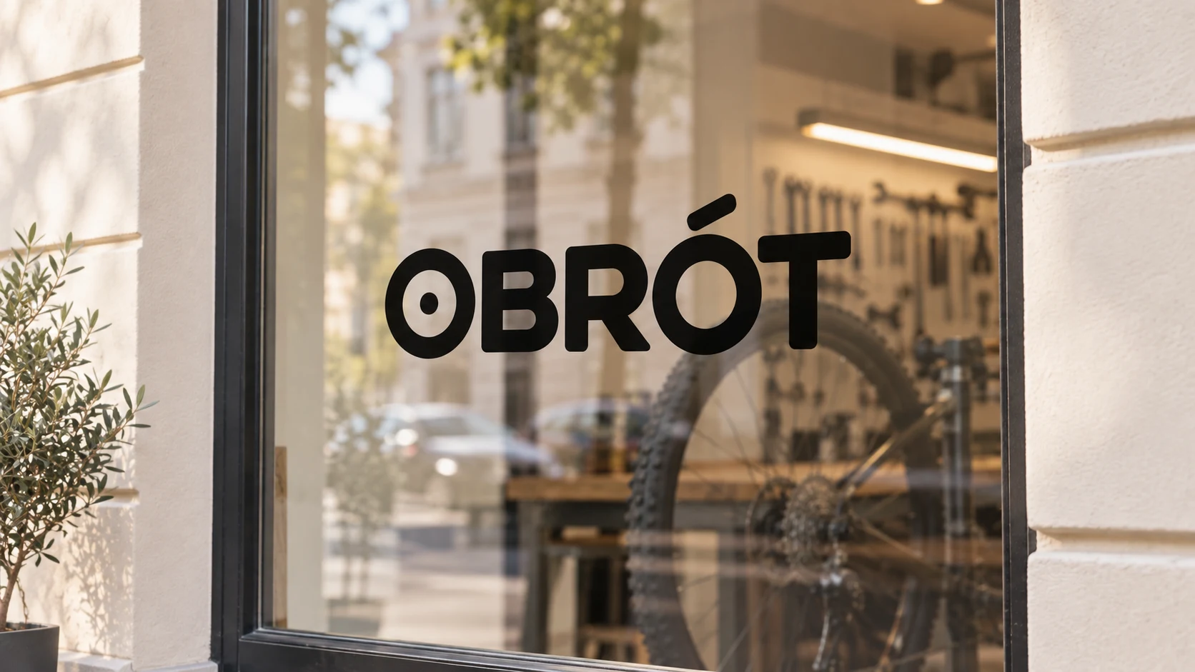
Behind the text you can see the workshop interior and street reflections. The logo preserved the dot and accent, and the dark letters require a sufficiently bright window setting.
Prompt to copy (translated from the Polish original we tested):
Create a photographic mockup in 16:9 format using exactly the attached flat black logotype OBRÓT. Preserve the Ó, the dot in the first O, letter shapes and spacing. Remove the white background from the reference, transfer only the mark. Window of a small bicycle repair shop, black mark applied to the glass at eye level, behind the glass a slightly blurred bicycle wheel, calm cream facade, subtle street reflections. One main carrier, clear logo. Soft daylight. No additional letters, symbols, watermarks, gradients or decorative gold. This is a visualization of a finished mark, not a new logo design.
How We Evaluate Mark Consistency
We compare more than just the spelling of the name. We look at the shape of the O, the weight of the letters, the position of the accent and the proportions of the entire logotype. A legible text can look credible yet still differ from the input design.
The curvature of the mug and the fold of the bag should affect the appearance of the print. So we don’t expect an identical flat outline on every surface. We look for deformation resulting from the material, not random redrawing of letters.
Google · Your sourcesQuantslant higher in your Google - one clickAdd to preferred sources →Mockup for Presentation and File for Production
A realistic visualization helps you choose the scale and position of the mark. However, it doesn’t specify the print size in centimeters, its technology or ink color. We would establish those parameters separately based on the actual design.
To compare two logotypes, we would use an identical mug and lighting. Then the difference is the mark. In this article, the goal is the opposite: we test one logo on different materials, so the surfaces and their behavior in light change.
See also: Logo with AI: 6 directions for one brand and prompts to copy.
More on this from QUANTSLANT
 guides·AI Lookbook: Same Jacket in 4 ShotsFront, back, motion and detail of the same jacket. We show you the prompts for an AI lookbook and check what helps preserve pockets, buttons and cut.