Same Photo, 6 Cameras: AI Photography Style Prompts
Sony, Fujifilm, Ricoh, Leica, Nikon and Polaroid: 6 prompts to style one photo. We explain what AI mimics and what it doesn't measure.
👁 125 reads
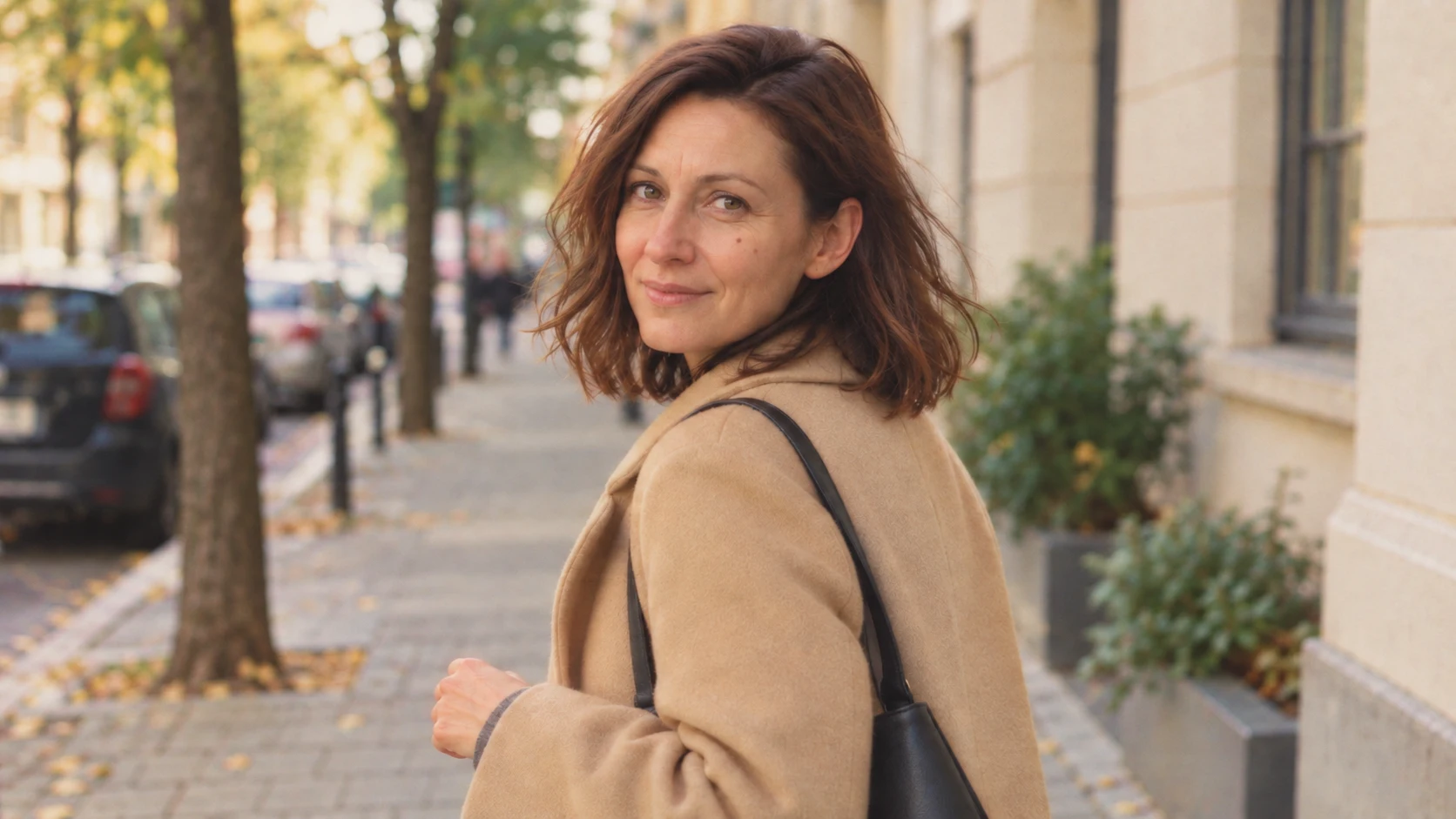
A camera name in your prompt can be a convenient starting point for talking about an image. But it doesn’t turn a generated illustration into a real photograph taken with that equipment. We prepared six stylizations of one frame, inspired by specific cameras and selected processing approaches.
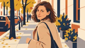
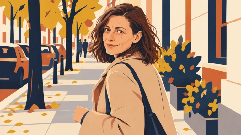
In all examples we keep the same street scene with the same fictional woman. We mainly change color, contrast, grain and softness. This is a comparison of AI interpretations, not a test of camera, lens or RAW file quality.
What camera names really mean in these prompts
The Sony α7 IV is a full-frame camera with a sensor around 33 MP. In our prompt it serves as a starting point for neutral, contemporary color; this look is not the only possible output from this body. Equipment data: Sony α7 IV specifications.
The Fujifilm X100VI has an APS-C sensor and a built-in 23 mm F2 lens; it also offers Classic Chrome film simulation. The Ricoh GR III uses an 18.3 mm F2.8 lens, corresponding to a field of view around 28 mm in the small frame. This is the GR III, not the GR IIIx. Sources: Fujifilm X100VI and Ricoh GR III.
The Leica M11 Monochrom captures monochrome images. The Nikon F3 is a 35 mm film camera, so in this example we add a specific film stock: black-and-white Kodak Tri-X 400. In analog photography the body alone doesn’t determine grain character and color. Sources: Leica M11 Monochrom, Nikon F3 history and Kodak Tri-X 400.
We associate the Polaroid SX-70 here with soft instant photography. The original SX-70 film has ISO 160 sensitivity, but our wide image without a white border is a loose adaptation of the look, not a reconstruction of a physical print. Source: SX-70 usage instructions.
Why we add image characteristics
“Like a Leica” or “like analog” doesn’t unambiguously say what the result should be. So we add whether we want calm midtones, strong blacks, visible grain or muted color. You can remove the camera name and still get a concrete description of the aesthetic.
Keeping the same composition limits what can be compared. We don’t interpret these examples as faithful simulations of different focal lengths. Real field of view, perspective and blur depend on the entire photographic system.
Source material
1. Sony α7 IV - neutral color
Attachments for this prompt, in order: street scene.
Color remains close to natural, and facial details are sharp. This is an interpretation of neutral processing, not proof of this specific camera’s file character.
Prompt to copy:
Use the attached photo of a woman on the sidewalk as the source for the figure and composition. Keep the face, age, expression, coat, bag, person's position and visible street. One 16:9 photo, no borders, text, retouching or added objects. Change only the interpretation of tones, color, contrast and texture according to the description. This is an image stylization inspired by a photographic setup. Reference point: Sony α7 IV, FE85mm F1.8 lens. Neutral digital photography with natural skin tones, delicate texture, soft highlight transitions and moderate contrast. No artificial grain and no HDR. Keep the existing perspective and blur.
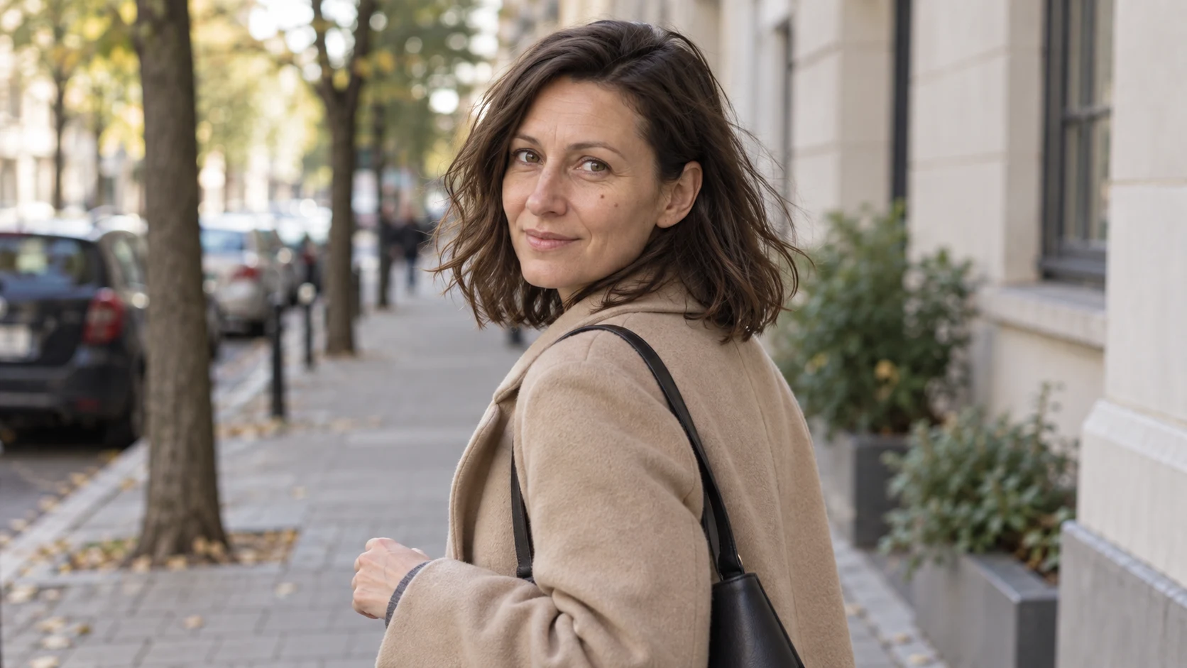
2. Fujifilm X100VI - Classic Chrome
Attachments for this prompt, in order: street scene.
This version has calmer colors and darker shadow areas. The difference from the neutral variant is more subtle than the transition to black and white.
Prompt to copy:
Use the attached photo of a woman on the sidewalk as the source for the figure and composition. Keep the face, age, expression, coat, bag, person's position and visible street. One 16:9 photo, no borders, text, retouching or added objects. Change only the interpretation of tones, color, contrast and texture according to the description. This is an image stylization inspired by a photographic setup. Reference point: Fujifilm X100VI, built-in 23mmF2, Classic Chrome simulation. Muted palette, calmer reds, slightly cool shadows, natural skin, moderate contrast and very subtle texture. Don't change the perspective, pose or depth of field of the source.
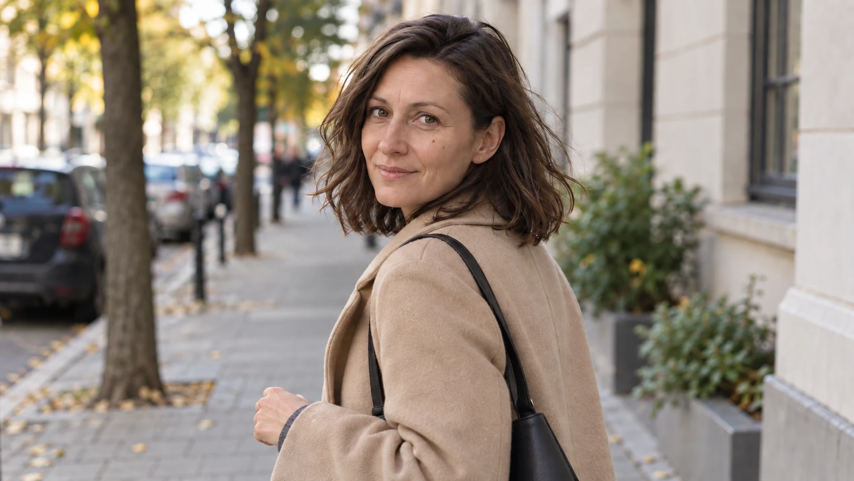
3. Ricoh GR III - contrasty snapshot
Attachments for this prompt, in order: street scene.
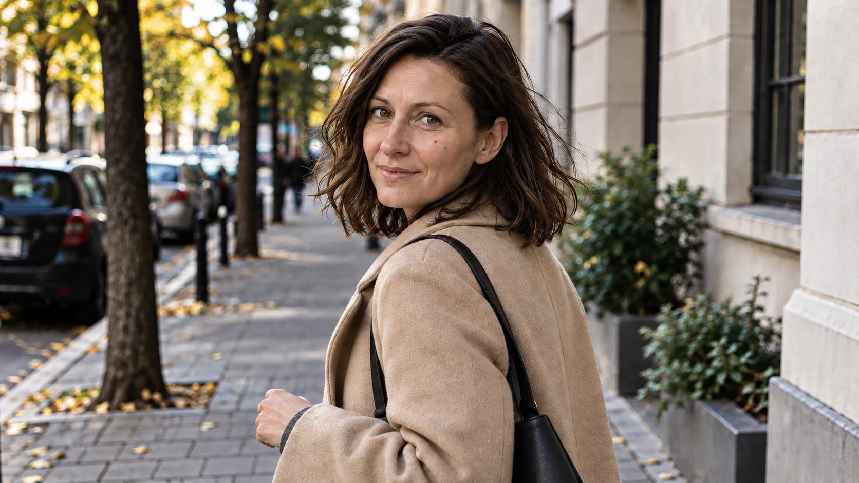
Stronger contrast and sharp fine details give the scene the character of quick street photography. This is a commissioned interpretation of an aesthetic, not a measurement of the GR III camera’s performance.
Prompt to copy:
Use the attached photo of a woman on the sidewalk as the source for the figure and composition. Keep the face, age, expression, coat, bag, person's position and visible street. One 16:9 photo, no borders, text, retouching or added objects. Change only the interpretation of tones, color, contrast and texture according to the description. This is an image stylization inspired by a photographic setup. Reference point: Ricoh GR III, built-in 18.3mmF2.8. Personal interpretation of an everyday snapshot: slightly harder contrast, sharp but natural edges, neutral color, no beauty retouching. Don't add analog grain, don't change the frame or perspective.
4. Leica M11 Monochrom - midtones
Attachments for this prompt, in order: street scene.
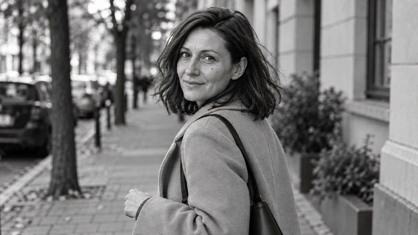
You can see clear midtones on the skin and coat. This example shows the intended calm blacks and whites, without pretending to be a file from a Monochrom sensor.
Prompt to copy:
Use the attached photo of a woman on the sidewalk as the source for the figure and composition. Keep the face, age, expression, coat, bag, person's position and visible street. One 16:9 photo, no borders, text, retouching or added objects. Change only the interpretation of tones, color, contrast and texture according to the description. This is an image stylization inspired by a photographic setup. Reference point: Leica M11 Monochrom with 50mm lens. Black and white only, wide smooth midtones, clear coat and skin details, subtle local contrast. No sepia, heavy grain, blown highlights or composition changes.
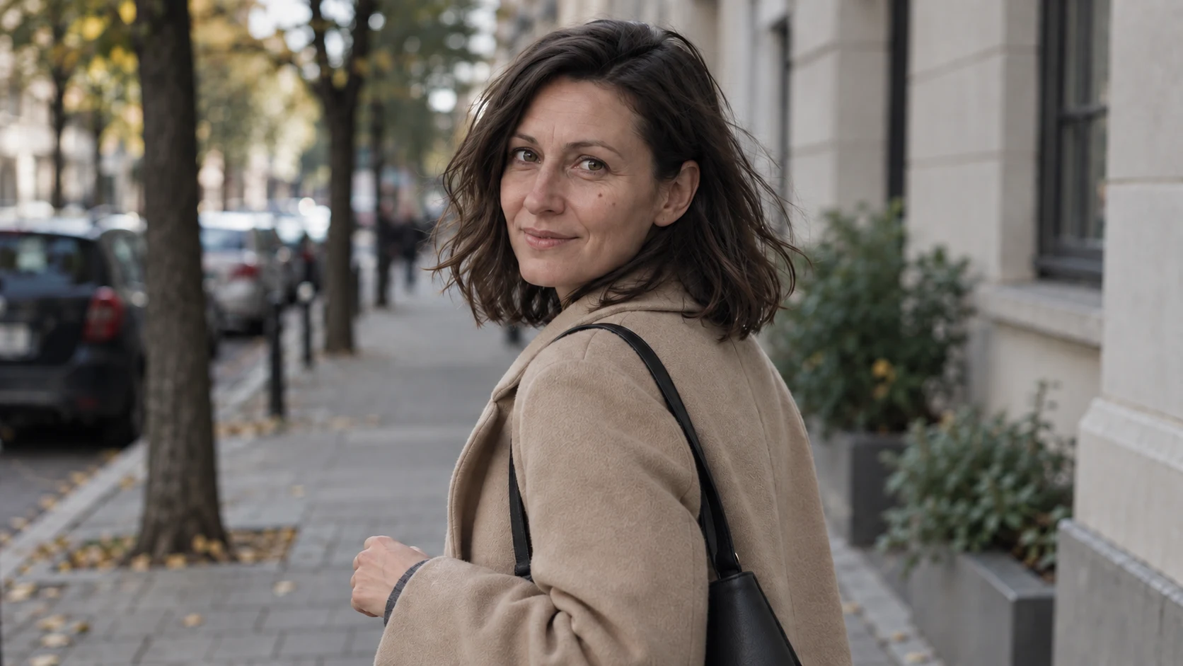
5. Nikon F3 + Kodak Tri-X 400
Attachments for this prompt, in order: street scene.
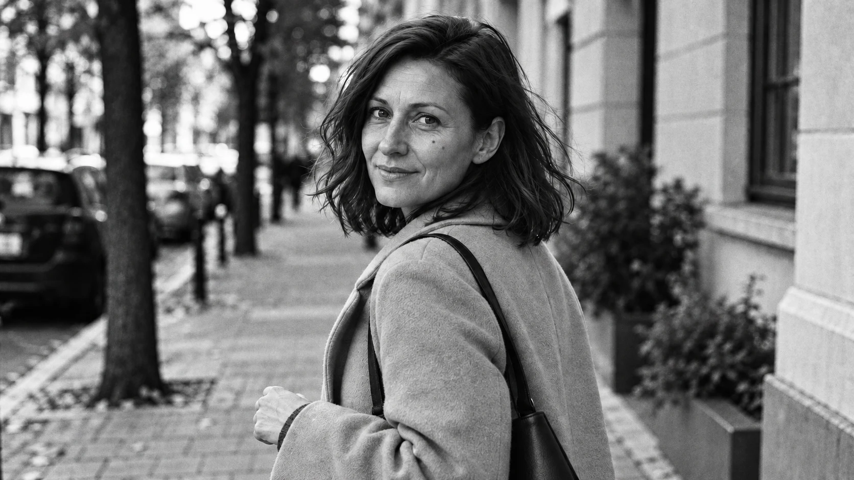
Grain and stronger blacks are more noticeable than in the previous version. The effect comes from the look description in the prompt, not from using actual film.
Prompt to copy:
Use the attached photo of a woman on the sidewalk as the source for the figure and composition. Keep the face, age, expression, coat, bag, person's position and visible street. One 16:9 photo, no borders, text, retouching or added objects. Change only the interpretation of tones, color, contrast and texture according to the description. This is an image stylization inspired by a photographic setup. Reference point: Nikon F3 with 50mm lens and black-and-white Kodak Tri-X400 film. Interpretation of a classic reportage print: visible irregular fine grain, stronger blacks, punchy contrast, natural face. No scratches, dust, border or perspective changes.
6. Polaroid SX-70 - soft color
Attachments for this prompt, in order: street scene.
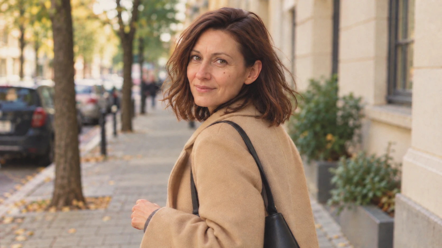
Warm palette and softness distinguish this version from the others. We kept the wide frame, so the similarity concerns the image mood, not the print format.
Prompt to copy:
Use the attached photo of a woman on the sidewalk as the source for the figure and composition. Keep the face, age, expression, coat, bag, person's position and visible street. One 16:9 photo, no borders, text, retouching or added objects. Change only the interpretation of tones, color, contrast and texture according to the description. This is an image stylization inspired by a photographic setup. Reference point: Polaroid SX-70 and color SX-70 film. Stylization of the image itself: slightly warm whites, gentle contrast, softer fine details, subtle color unevenness. Keep the wide 16:9 frame of the original as a conventional adaptation, without white border, sepia, scratches or heavy aging.
What you can see in these six interpretations
The most direct difference concerns color versus black and white. The monochrome variants let you compare mainly contrast and texture, while the SX-70 stylization shifts the image toward a warmer, softer look. We don’t attribute these differences to equipment measurements.
We wouldn’t choose a camera based on such images. But we would choose a processing direction for our own illustration: neutral color, muted palette, calm black and white, or stronger grain.
Google · Your sourcesQuantslant higher in your Google - one clickAdd to preferred sources →How to adapt the prompt for your own photo
Attach one clear file and keep the same reference in each attempt. If you want to compare color alone, remove depth-of-field changes and lens instructions from the prompt. If the face matters, state explicitly not to change age, expression and features.
We’d first choose two strongly different versions. When the difference is clear, you can move on to more subtle changes in midtones and saturation. Adding several camera names to one instruction makes it harder to establish what look you’re actually ordering.
See also: AI Lookbook: same jacket in 4 shots.
More on this from QUANTSLANT

 guides·Cartoon Style Photo: 6 AI Prompts for Different Animation LooksOne photo transformed into six different cartoon and comic styles. Complete prompts, examples, and how to preserve facial features while changing line work and color.