From Sketch to AI Ad: 3 Ways to Control Composition
Text description, sketch, or style reference? We compare three ways to brief an AI image model for product advertising and show you the prompts.

👁 114 reads
When you know where the product should sit, describing every gap in a long prompt becomes tedious. A simple sketch can communicate layout faster: bag on the left, pedestal underneath, empty space on the right. We tested three ways to deliver that brief.
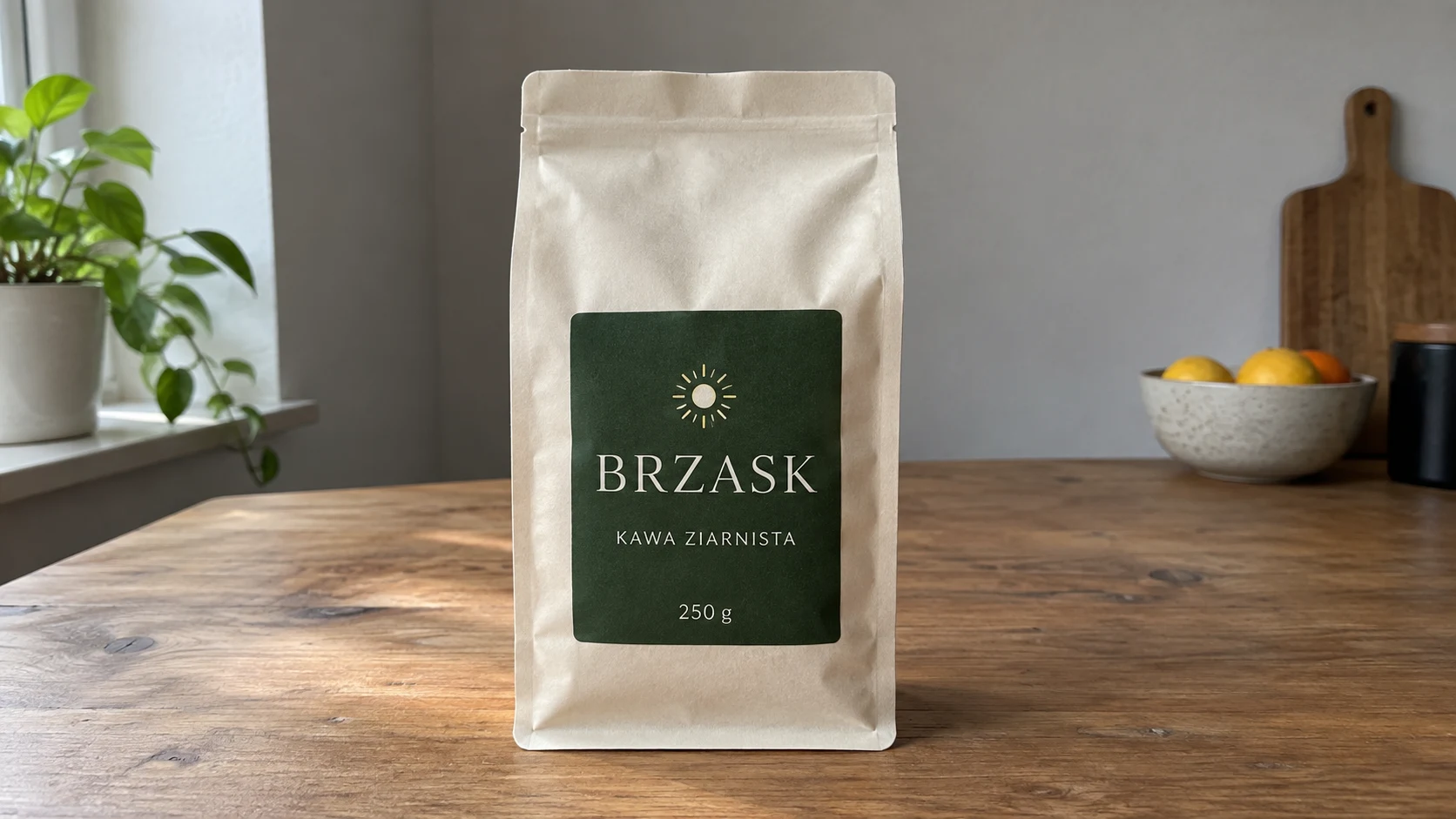
In all attempts we keep the same reference for BRZASK coffee. The first uses a composition description, the second adds a sketch, the third also includes a lighting and material reference. We’re not comparing an image with no attachments to one with references - the product is shared from the start.
How We Prepared the Input Materials
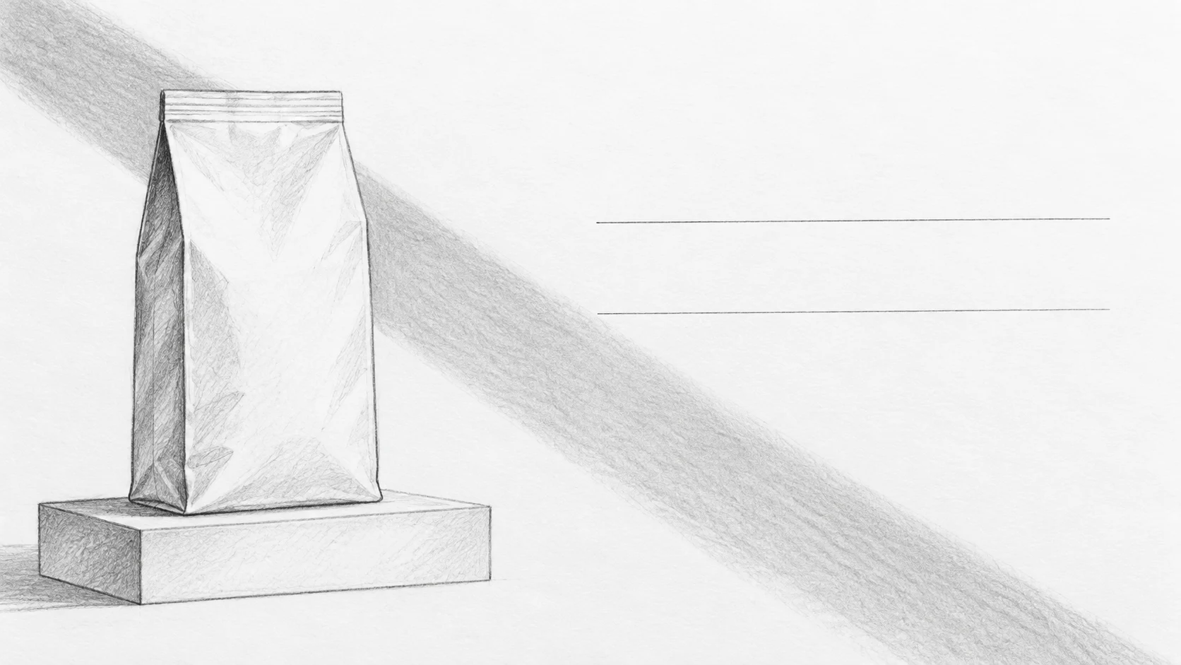
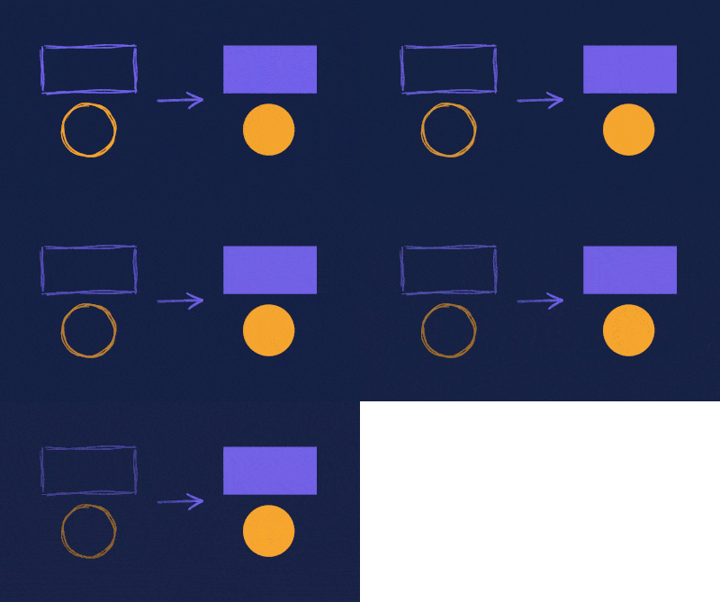
The sketch contains large shapes and a shadow line. Two horizontal marks on the right indicate space for later text, not lettering to reproduce. We explain this in the prompt so the AI doesn’t turn working marks into an ad element.
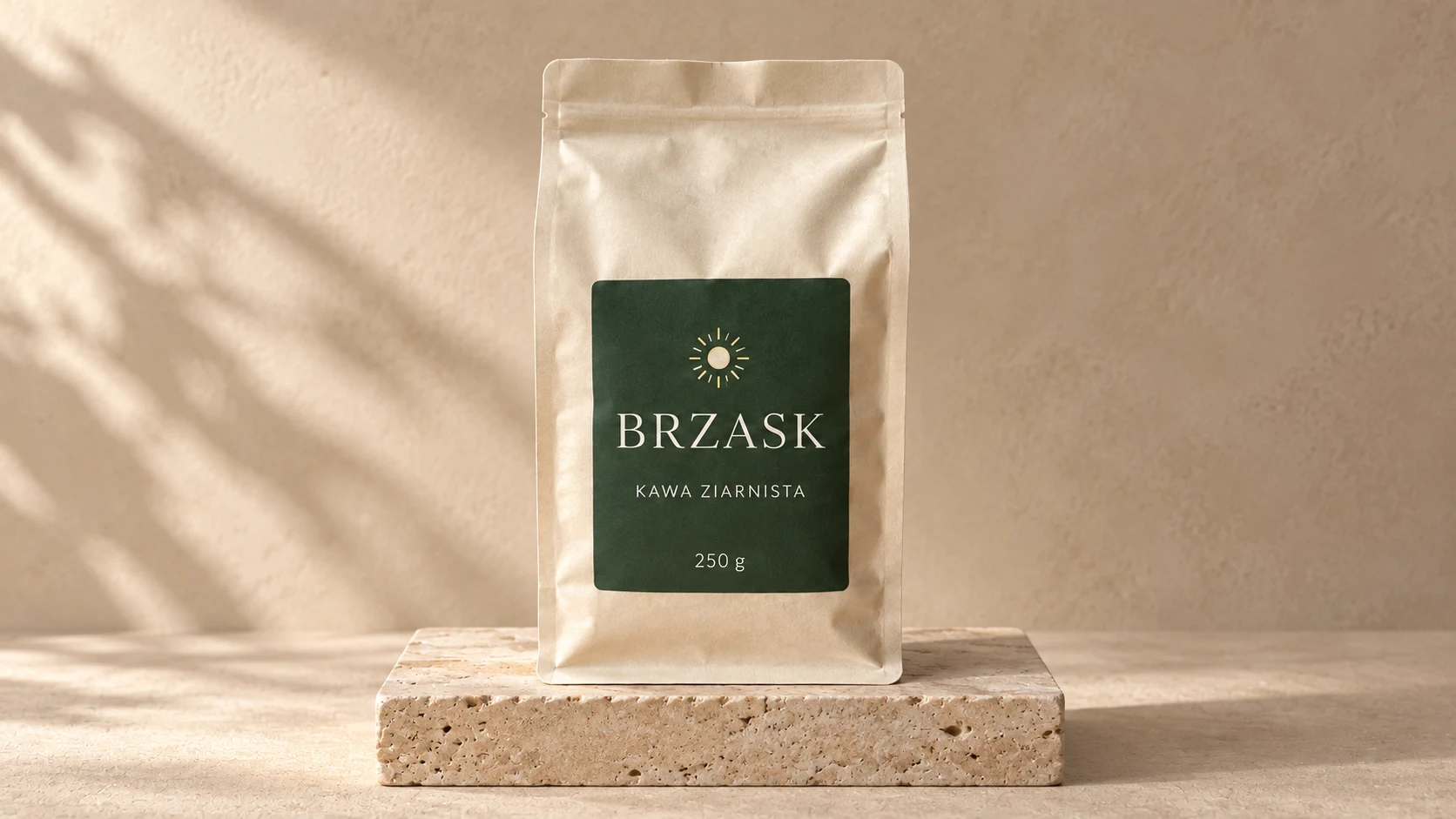
The third reference shows warm beige, stone, and soft light. It shouldn’t dictate object placement. We assign each image one role: product, composition, style. Without that, the model may pick the wrong reference for what matters.
Input Materials
1. Composition Description and Product
Attachments for this prompt, in order: BRZASK product.
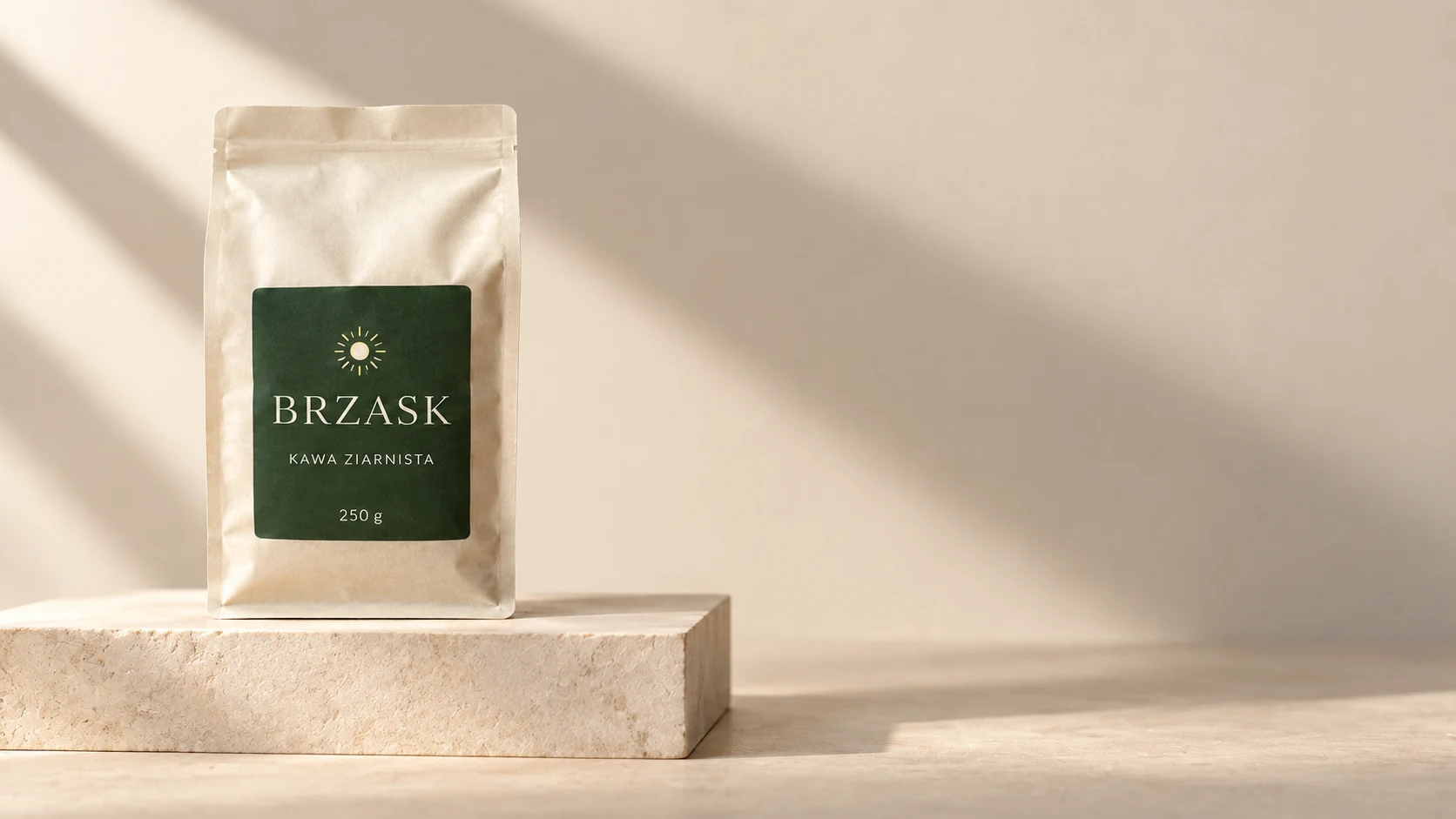
The description alone was enough to place the product on the left and leave empty space. However, shadows resembling plants appeared, even though the brief called for one diagonal streak.
Prompt to copy:
Create a realistic 16:9 advertising photograph. Keep the product from the first reference: cream BRZASK bag, dark green label with sun, text KAWA ZIARNISTA and 250 g. The bag stands in the left third of the frame on a low rectangular pedestal, the right half remains empty for a later headline. One diagonal shadow streak runs from upper left to lower right corner. Cream background, natural side lighting, matte materials, no decorations or additional text.
2. Product and Sketch
Attachments for this prompt, in order: BRZASK product, composition sketch.
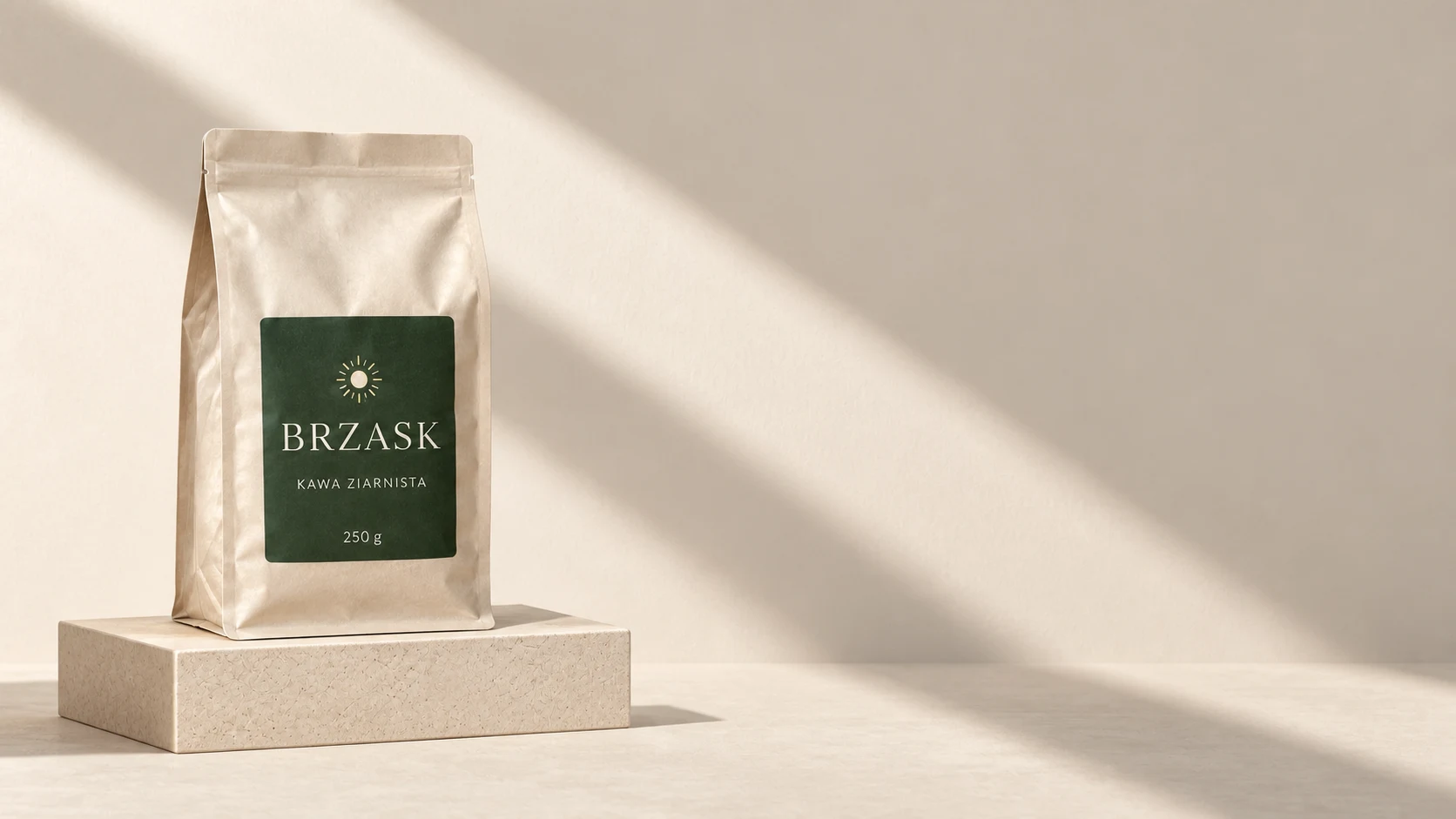
The direction of the diagonal shadow is clearer than in the first attempt. The working marks indicating text were not copied into the final image.
Prompt to copy:
Create a realistic 16:9 advertising photograph. Keep the product from the first reference: cream BRZASK bag, dark green label with sun, text KAWA ZIARNISTA and 250 g. The bag stands in the left third of the frame on a low rectangular pedestal, the right half remains empty for a later headline. One diagonal shadow streak runs from upper left to lower right corner. Cream background, natural side lighting, matte materials, no decorations or additional text. The second attached image is a sketch: translate the object placement and empty space proportions into the photograph. Don't copy the pencil texture or the two marks; the marks only indicate empty space for later text.
3. Product, Sketch, and Lighting Reference
Attachments for this prompt, in order: BRZASK product, composition sketch, lighting and stone reference.
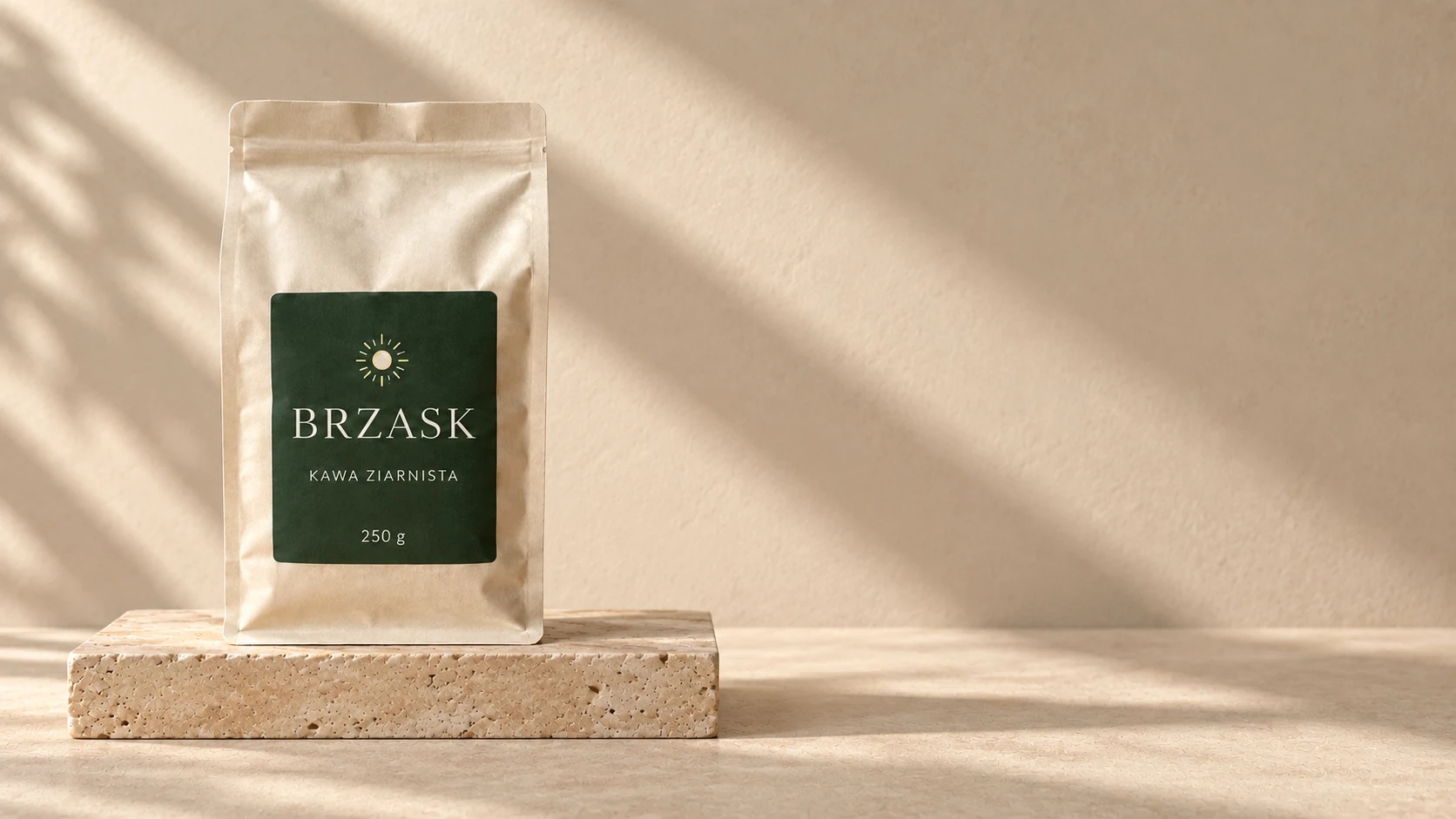
The style reference had a stronger influence on stone texture and light warmth. The layout remains similar, but additional shadow patches appear - more references didn’t ensure full agreement on every detail.
Prompt to copy:
Create a realistic 16:9 advertising photograph. Keep the product from the first reference: cream BRZASK bag, dark green label with sun, text KAWA ZIARNISTA and 250 g. The bag stands in the left third of the frame on a low rectangular pedestal, the right half remains empty for a later headline. One diagonal shadow streak runs from upper left to lower right corner. Cream background, natural side lighting, matte materials, no decorations or additional text. The second reference defines layout: product on the left, text space on the right. The marks indicate empty space, don't draw them. The third reference defines warm beiges, stone texture, and soft light. Don't transfer its composition instead of the sketch.
What We Compare in the Results
First we check whether the product is on the left and whether the right side actually remains empty. Then we evaluate pedestal height and shadow path. Last is texture and lighting mood, because beautiful materials don’t fix bad layout.
An additional reference doesn’t automatically improve every element. It may refine lighting while simultaneously introducing a competing composition. That’s why describing the role of attachments is as important as their number.
Google · Your sourcesQuantslant higher in your Google - one clickAdd to preferred sources →When We’d Use Each Approach
Description alone is enough for a simple layout with one product. We’d add a sketch when the placement of several objects or a large empty field matters. A style reference - when we need a specific material and lighting character that a short term like “minimalist” doesn’t capture.
If the model copies working marks, we ask it to remove only those lines and keep the composition. If layout is the problem, we return to a simpler sketch. Adding more images without a clear task usually makes it harder to assess where the error came from.
See also: Same Product, 10 AI Advertising Frames. Prompts and Examples.
More on this from QUANTSLANT

 guides·Same Photo, 6 Cameras: AI Photography Style PromptsSony, Fujifilm, Ricoh, Leica, Nikon and Polaroid: 6 prompts to style one photo. We explain what AI mimics and what it doesn't measure.