One Photo, 5 Print Styles: Linocut, Riso & More with AI
Linocut, risograph, screen print, cyanotype and watercolor. We show 5 AI stylizations of one photo, with prompts and differences in line and texture.
👁 116 reads
Turning a photograph into an illustration can go far beyond applying a filter to a finished image. In this set we test five ways to describe line, mark, paper and color: linocut, risograph, screen print, cyanotype, and watercolor with pencil.
These are digital AI stylizations inspired by the look of these techniques. They are not physical prints or documentation of workshop graphics. A shared input photo lets you see how changing the way an image is built affects the same scene.
Describing the Effect You Want
For linocut we ask for strong black marks and bright traces resembling cuts. For riso - a limited palette and grainy surface. In screen print we look for clear fields of color, and in cyanotype a blue image. Watercolor should work with soft transitions and translucent paper.
These descriptions are aesthetic briefs, not complete definitions of techniques. The generator can mix their features, so the variant title alone is not enough to consider the result accurate. It’s worth comparing what you actually see.
Input Materials
1. Linocut
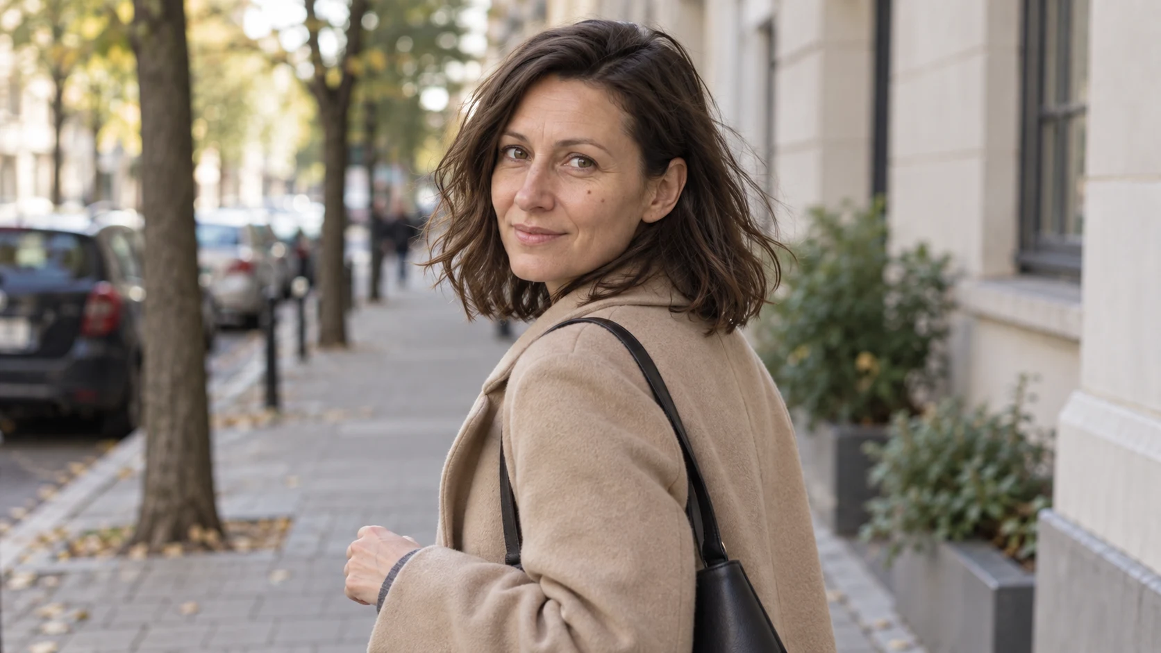
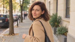
Attachments for this prompt, in order: street scene.
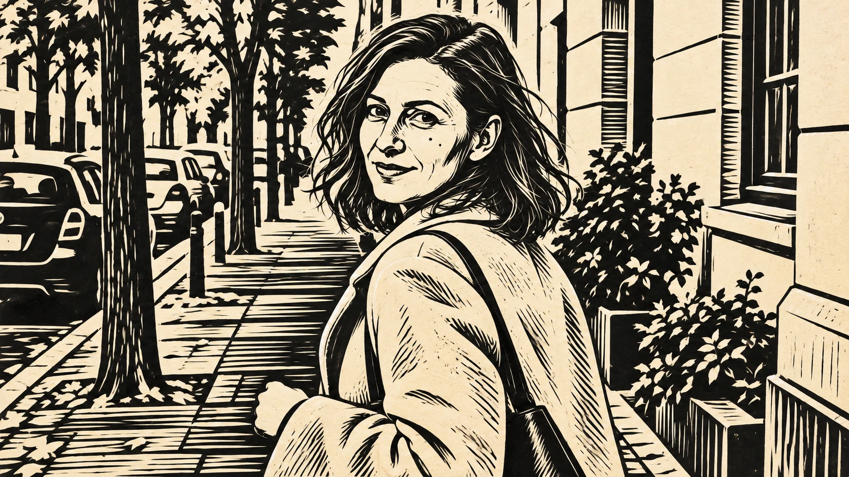
Large black surfaces and sharp bright traces rebuild the scene. Dense line work on the sidewalk is stronger than in the input photograph.
Prompt to copy:
Transform the attached photograph of a woman on the street into a single 16:9 illustration. Keep the composition, person turned over shoulder, coat, bag and directions of buildings. No text, logos, decorative frames or other figures. Two-color linocut appearance: black and cream paper, decisive cuts, simplified lights on face, clear rhythm of line. Texture comes from cuts, not from random dirt overlay.
2. Risograph
Attachments for this prompt, in order: street scene.
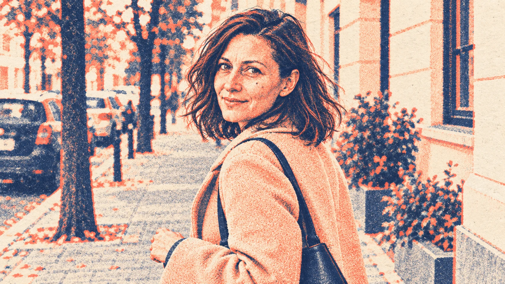
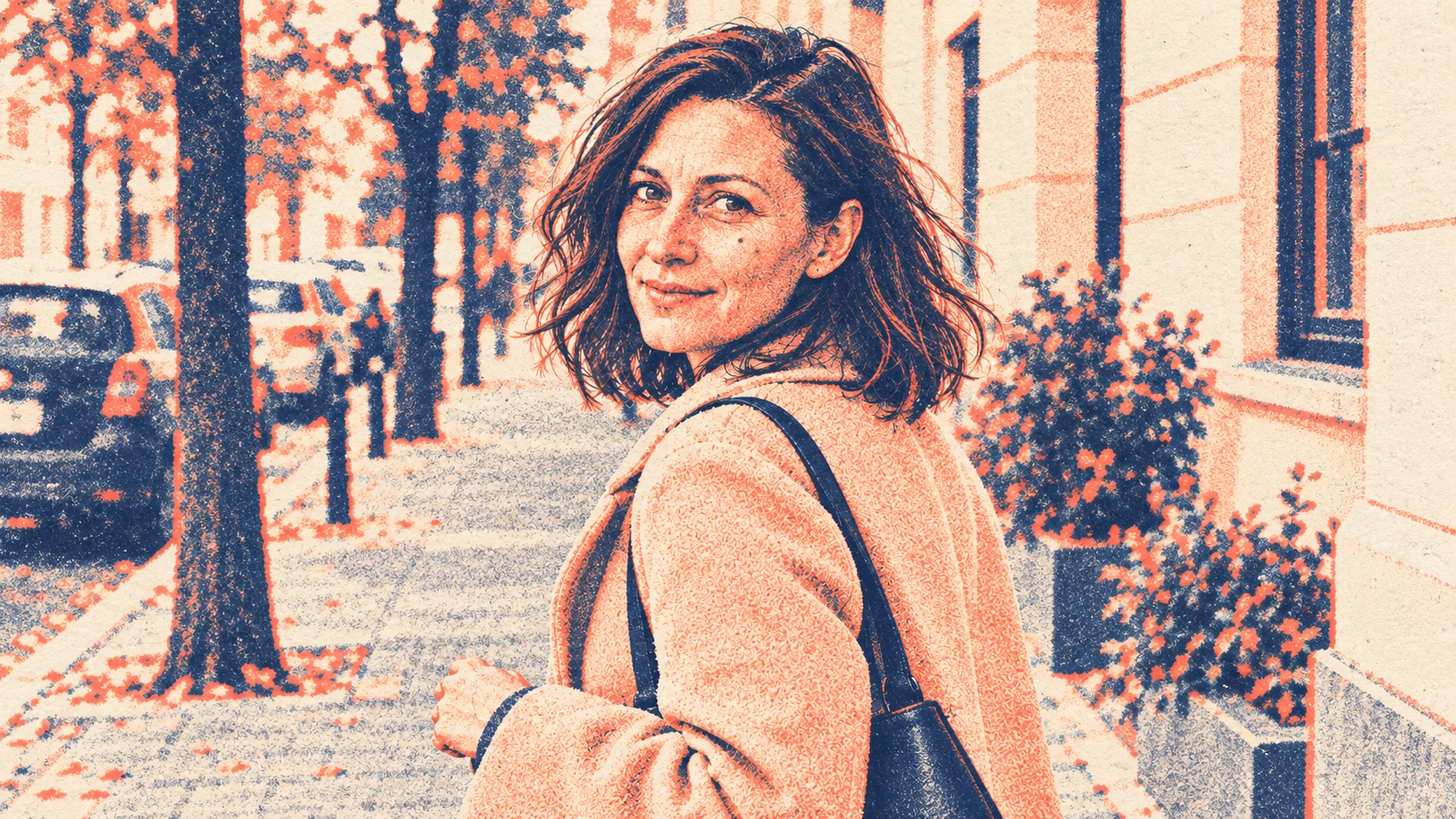
The limited palette strongly changes the mood. Grainy texture is visible across the entire scene, including the face, so it’s worth evaluating its strength at smaller size.
Prompt to copy:
Transform the attached photograph of a woman on the street into a single 16:9 illustration. Keep the composition, person turned over shoulder, coat, bag and directions of buildings. No text, logos, decorative frames or other figures. Two-color risograph print interpretation: muted navy and coral on cream paper, transparent ink layering, subtle registration shift in selected edges, grainy print texture. Face still legible.
3. Screen Print
Attachments for this prompt, in order: street scene.
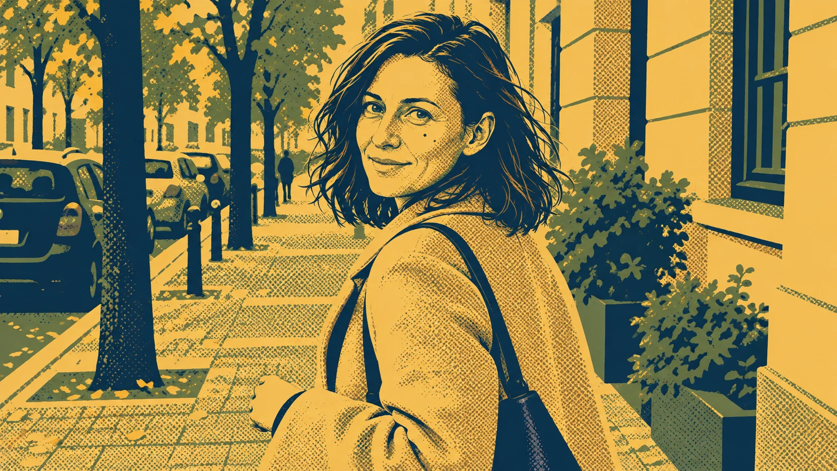
Large fields of color give the image a poster character. Halftone fills in shadows, but this is still a visual interpretation, not ready ink separations.
Prompt to copy:
Transform the attached photograph of a woman on the street into a single 16:9 illustration. Keep the composition, person turned over shoulder, coat, bag and directions of buildings. No text, logos, decorative frames or other figures. Screen print poster aesthetic: three flat inks, navy olive ochre, large organized shapes, clean silhouettes, single halftone fields. No photographic gradients, no aging.
4. Cyanotype
Attachments for this prompt, in order: street scene.
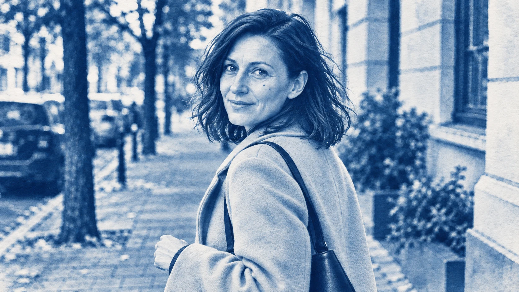
One family of blues unifies the entire scene. Many photographic midtones remain, so the effect is closer to a print stylization than a graphic simplification.
Prompt to copy:
Transform the attached photograph of a woman on the street into a single 16:9 illustration. Keep the composition, person turned over shoulder, coat, bag and directions of buildings. No text, logos, decorative frames or other figures. Artistic cyanotype interpretation, only deep Prussian blue and paper white, soft photographic transitions, face detail preserved, subtle paper texture. No sepia, text or ragged frame.
5. Watercolor and Pencil
Attachments for this prompt, in order: street scene.
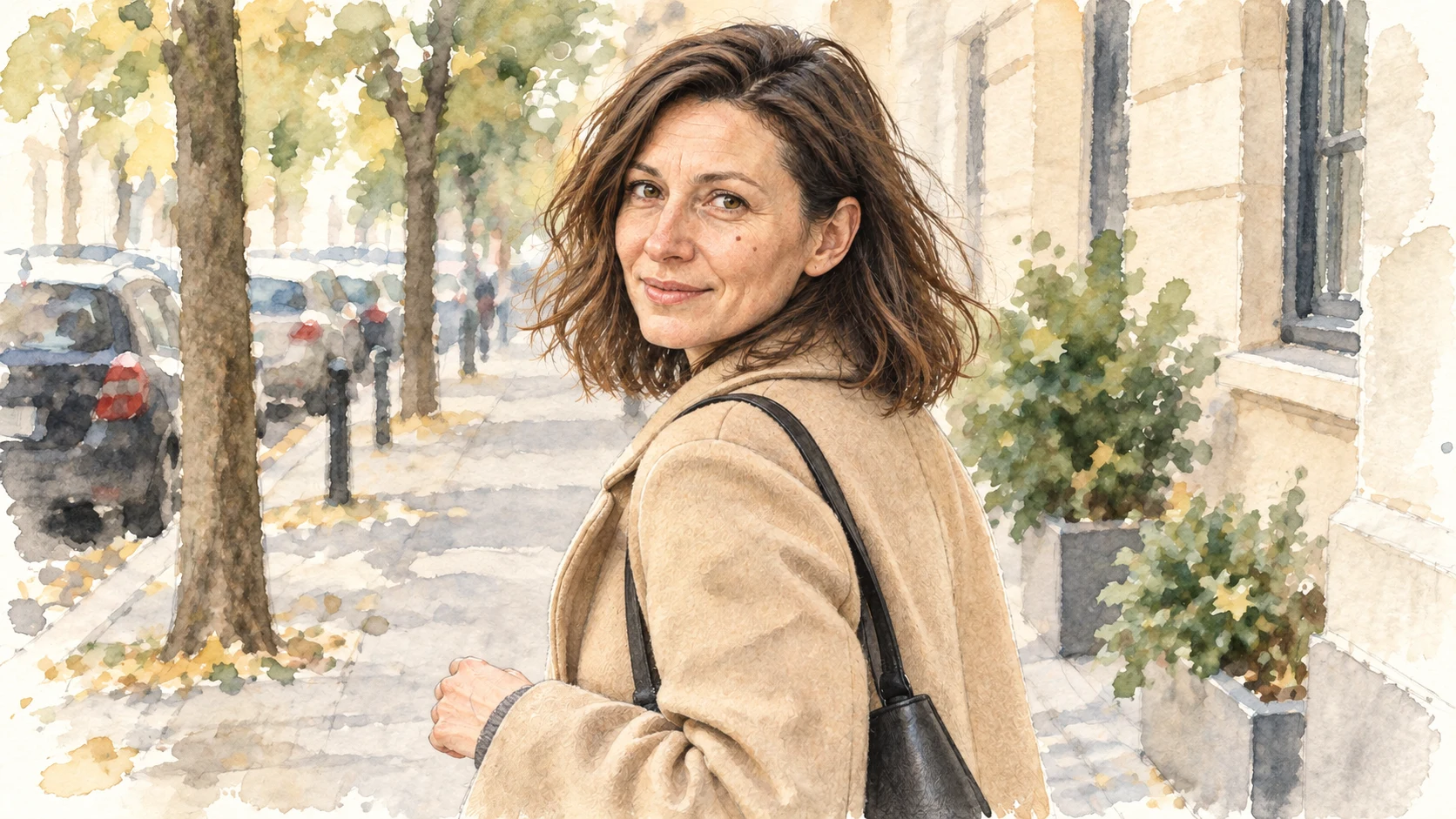
Soft washes and translucent ground loosen the edges of the scene. The face is more precise than the background, so it still draws attention.
Prompt to copy:
Transform the attached photograph of a woman on the street into a single 16:9 illustration. Keep the composition, person turned over shoulder, coat, bag and directions of buildings. No text, logos, decorative frames or other figures. Watercolor illustration with delicate pencil sketch, transparent washes, paper left in highlights, limited palette of natural beiges and greens, looser background and more detailed face. No digital gloss.
What Limiting the Palette Does
A small number of colors forces the image to organize light and shadow. The face can remain recognizable despite the lack of photographic transitions. At the same time, too dense texture easily covers eyes and mouth, so we also evaluate the portrait after reducing it.
In these tests we don’t expect all details of cars and leaves to be copied. However, we do require maintaining the main pose and direction of gaze. These allow you to read the illustrations as interpretations of the same scene.
Google · Your sourcesQuantslant higher in your Google - one clickAdd to preferred sources →How to Prepare Your Own Version
First choose one dominant feature: chisel mark, halftone, flat wash or soft watercolor. Then specify the number and type of colors. Adding “paper texture” without these decisions may only age the photo instead of transforming it into an illustration.
If you want to actually print the work using the chosen technique later, treat the result as a visual design to be developed. An image imitating two inks is not automatically prepared separations of two colors. That’s a separate stage of working on the file.
See also: Photo in cartoon style: 6 different directions and AI prompts.
More on this from QUANTSLANT

 guides·AI Material Study: Glass, Metal, Ceramic & Wood - Same ObjectWe changed one vase into four materials using AI: transparent glass, polished metal, glazed ceramic, and wood. Here's how to control reflections and texture.