Ideogram 4.5 Brand Rebranding: 10 Concepts with Prompts
We created 10 brand identity concepts in Ideogram 4.5: coffee roaster, dairy, bakery, pharmacy, railway, cosmetics, brewery, festival, fintech and shelter.
👁 125 reads
We created ten visual identity and rebranding concepts in Ideogram 4.5: a coffee roaster, dairy, bakery, pharmacy, railway, cosmetics, brewery, festival, fintech and animal shelter. The model excels at laying out boards with mockups (packaging, cups, cans, t-shirts), but the more small text on the board, the more errors appear, from currency mistakes to mirrored letters. The average score is 3.9 out of 5, and only 4 out of 10 boards had text without any errors.
All brands in this test are deliberately fictional, so we don’t generate someone else’s trademarks. An identity board is a good test because the model must maintain one logo, one typeface and one palette across several applications at once. We show the result from one generation per prompt, with errors that a client would notice in the first minute.
How We Tested Ideogram 4.5
- Model: Ideogram 4.5 (released September 30, 2026), via fal.ai API, endpoint
ideogram/v4.5. - Quality: “high”, prompt expansion disabled.
- One generation per prompt, no rerolling.
- Formats: mainly
landscape_16_9(boards), plussquare_hdandportrait_4_3. - Date: October 1, 2026.
- Cost: on fal.ai Ideogram 4.5 is billed per image by quality: very_low $0.008, low $0.03, medium $0.06, high $0.22. We used high, so 10 boards cost $2.20.
Ideogram also understands prompts in Polish, but we wrote them in English to make the test repeatable. We tested the model in Polish by providing Polish brand names and slogans in quotes within the prompt.
1. Coffee Roaster “PRAŻALNIA“
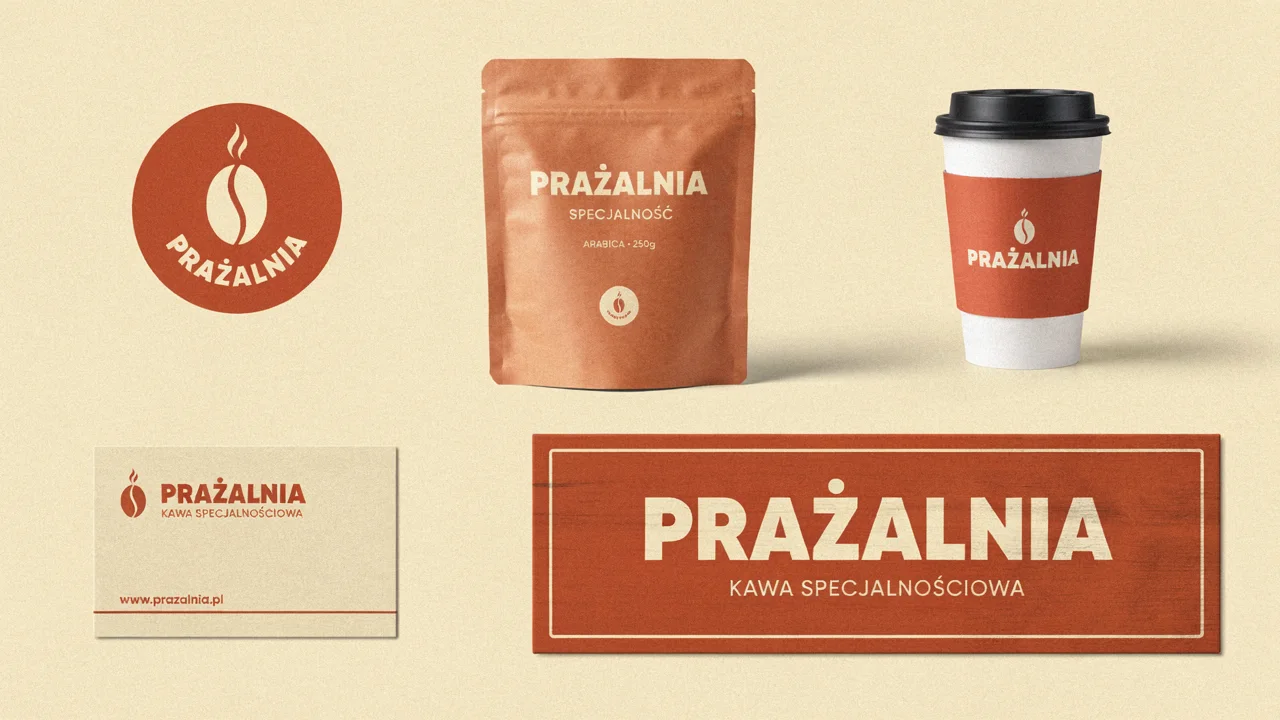
Brand identity board for a fictional specialty coffee brand "PRAŻALNIA" (Polish: roastery): logo, coffee bag packaging, paper cup, business card and storefront sign, warm terracotta and cream palette, clean layout on a neutral backgroundA model board. The Polish letter “Ż” is correct on all five applications, the bean with steam works as a mark, and the typeface and color are consistent. The model added “KAWA SPECJALNOŚCIOWA” (specialty coffee), “ARABICA 250g” and a website address on its own, all without typos. We later repainted this board in green in the article about edits and the text survived unchanged.
2. Dairy “ZAGRODA”: Before and After
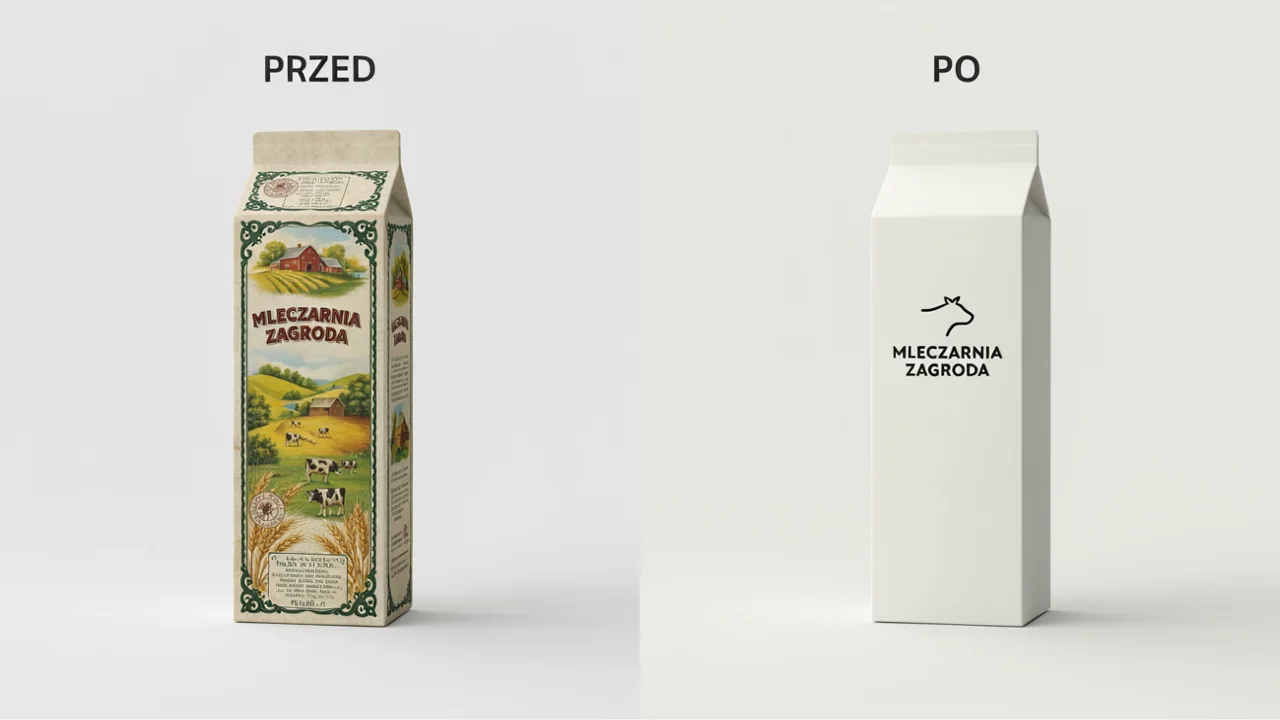
Rebranding concept for a traditional dairy "MLECZARNIA ZAGRODA" (Polish: farmstead dairy): before and after side by side, left old-fashioned cluttered milk carton labeled "PRZED" (before), right minimal modern carton with bold sans serif and a cow line icon labeled "PO" (after)The contrast is clear, the labels “PRZED” (before) and “PO” (after) are where they should be, and the single-line cow icon is ready for further work. The fine print on the old carton is pseudo-text - from a distance it looks like copy, up close it’s illegible. The new carton is so empty it looks unfinished. Add after: add fat percentage "3,2%" and volume "1 l" in the same typeface.
3. Bakery “ZOSIA”
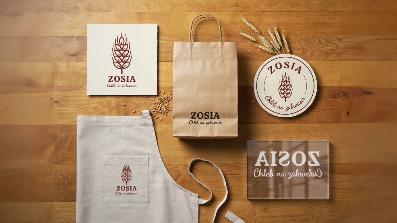
Visual identity for a neighborhood bakery "ZOSIA. Chleb na zakwasie": logo mark of a wheat ear, kraft paper bag, sticker, apron and shop window lettering, mockups arranged on a tableFour out of five applications are good: wheat ear as a mark, bag, round sticker with text along the arc, apron. The shop window failed. The model wanted to show text seen from inside the shop and reversed the letters, but inconsistently: “ZOSIA” reads as “AISOZ”, while “Chleb na zakwasie” (sourdough bread) is normal, just with a broken ending. Instead of “shop window lettering” write window decal seen from the street, text reads normally.
4. Pharmacy “Zielony Krzyż“
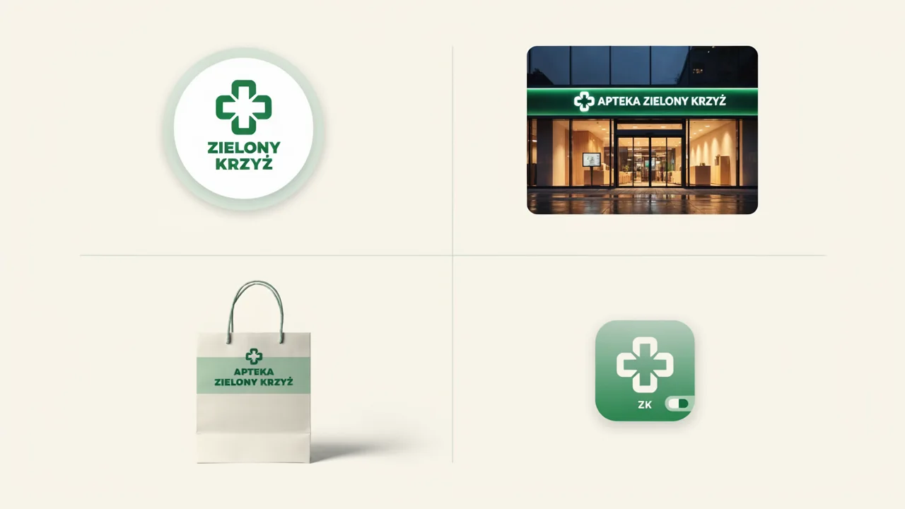
Modern rebrand of a pharmacy chain "Apteka Zielony Krzyż" (Polish: Green Cross Pharmacy): green cross logo redesign, shop facade at night, shopping bag, app icon, calm green and white systemA calm, credible board. “KRZYŻ” (cross) with the correct Polish letter “Ż” repeats across four applications, and the cross with rounded arms distinguishes itself from the standard pharmacy symbol. On the app icon the model added a toggle and letters “ZK”, which mean nothing. Icons are best generated separately, with the note app icon: symbol only, no text, no UI elements.
5. Regional Railway “KOLEJE POMORSKIE”
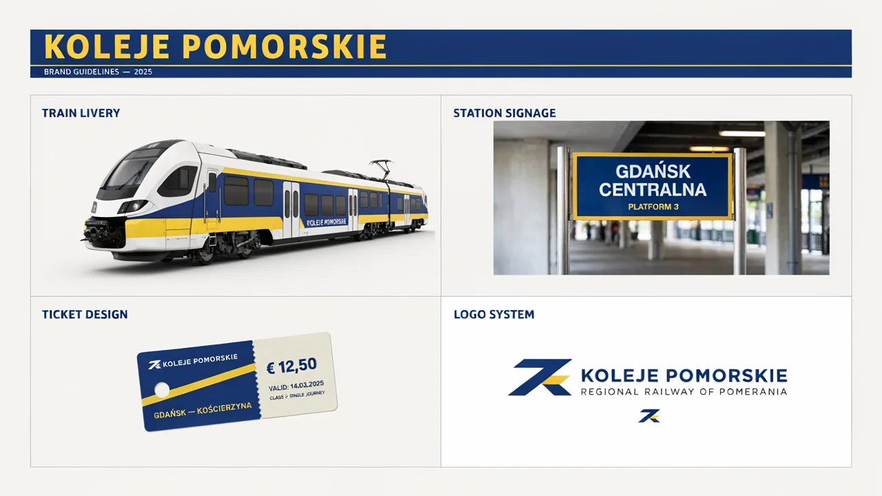
Concept rebrand of a regional railway "KOLEJE POMORSKIE": train livery with bold blue and yellow stripes, station signage, ticket design and logo, presented as a brand guidelines pageThe brandbook layout and train livery look professional, but the content is full of errors. The ticket costs “€ 12.50”, the station is called “GDAŃSK CENTRALNA” (in Gdańsk the main station is Główny, Centralna is in Warsaw), subtitles are in English (“PLATFORM 3”, “REGIONAL RAILWAY OF POMERANIA”), and dates say 2025. “GDAŃSK - KOŚCIERZYNA” came out correctly though. Provide every inscription yourself: ticket price "18.40 zł", station sign "GDAŃSK GŁÓWNY, PERON 3", all text in Polish.
6. Cosmetics “BAŁTYK“
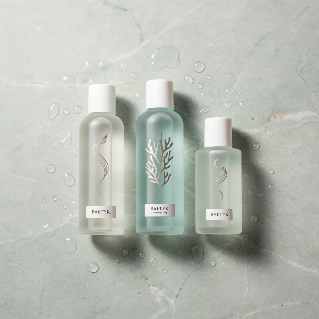
Minimal skincare brand "BAŁTYK. Kosmetyki z alg": three frosted glass bottles with seaweed illustrations, sea foam palette, product photo on stone with water dropsProduct photography at the level of a good shoot: frost on glass, water drops, shadows from a single light source. “BAŁTYK.” with the Polish letter “Ł” repeats correctly, and the subtitle “Kosmetyki z alg” (seaweed cosmetics) is so small you can barely see it. The middle illustration looks more like coral than seaweed. Add kelp and bladderwrack line drawings, because those algae grow in the Baltic.
7. Brewery “PÓŁNOC“
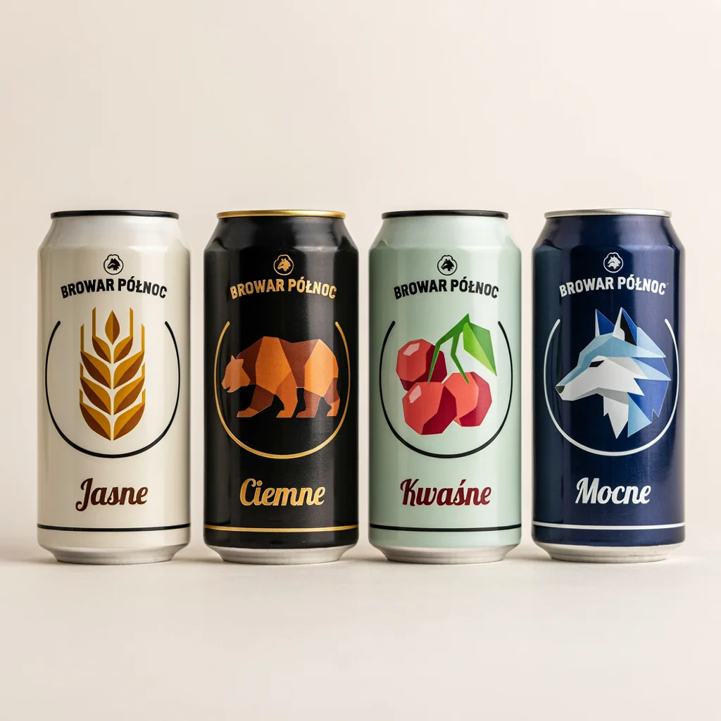
Craft beer can designs for a fictional brewery "BROWAR PÓŁNOC": four cans in a row, each with a bold geometric illustration and flavor name "Jasne", "Ciemne", "Kwaśne", "Mocne"Best board alongside the coffee roaster. Four names without error, “PÓŁNOC” (north) with two Polish characters on each can, and the illustrations make sense: wheat for “Jasne” (light), bear for “Ciemne” (dark), cherries for “Kwaśne” (sour), wolf for “Mocne” (strong). The can lids differ in color, which looks like a thoughtful detail. Only note: the logo above the name is too small to see anything in it.
8. Festival “OFF LASU 2027”
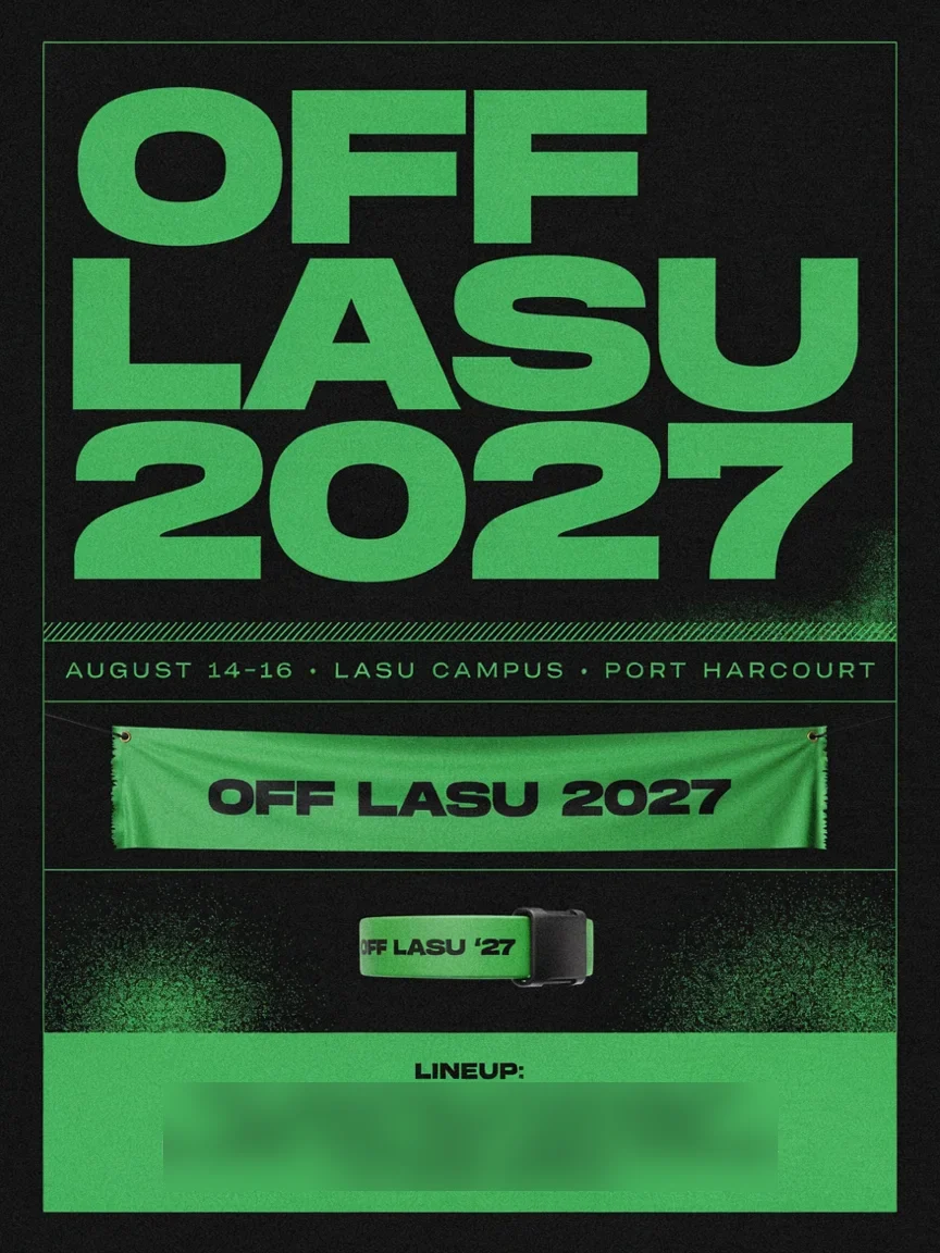
Music festival identity "OFF LASU 2027": poster, wristband and stage banner, acid green and black, experimental typography, lineup text blocksWeakest result in the set. The model read “LASU” as an acronym for Lagos State University and built a festival in Nigeria around it: “LASU CAMPUS, PORT HARCOURT” (which actually lies in a different state than Lagos), dates in English and a line-up with names of real Nigerian musicians (we blurred them in the graphic). Such names are a legal risk for brand materials. The typography isn’t experimental either, just a regular wide grotesque. Provide the line-up and location yourself: lineup text exactly: "ARTIST 1 • ARTIST 2", location "Puszcza Kampinoska".
9. Fintech “GROSZ”
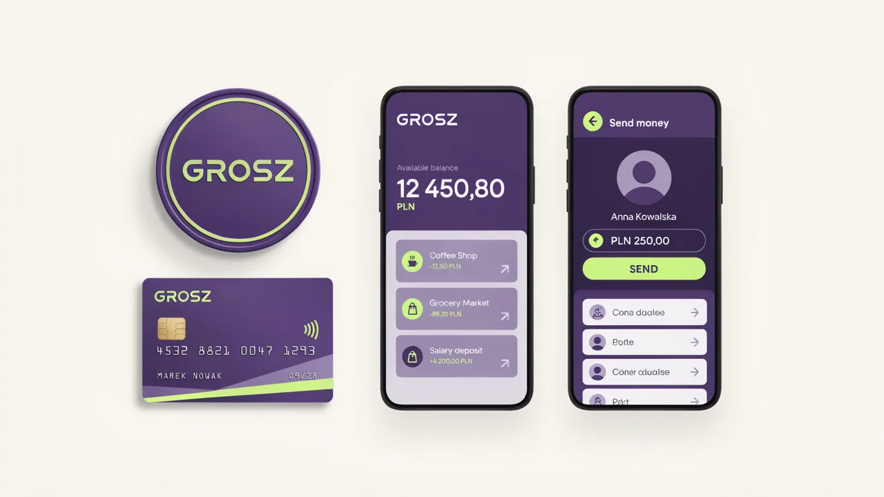
Fintech app brand identity "GROSZ" (Polish: penny): coin-shaped logo, mobile app screens with balances in PLN, debit card design, purple and lime palette, clean UI mockupThe palette and coin-shaped logo are good, the balance “12 450,80 PLN” has Polish notation with comma and space. The interface is in English though (“Available balance”, “Send money”), and the contact list on the second screen is gibberish: “Cona daalee”, “Potte”, “Coner cadaise”. For app screens provide every label: UI language Polish: "Dostępne środki", "Wyślij", contacts "Anna", "Marek", "Ola".
10. Animal Shelter “PRZYTUL ŁAPĘ“
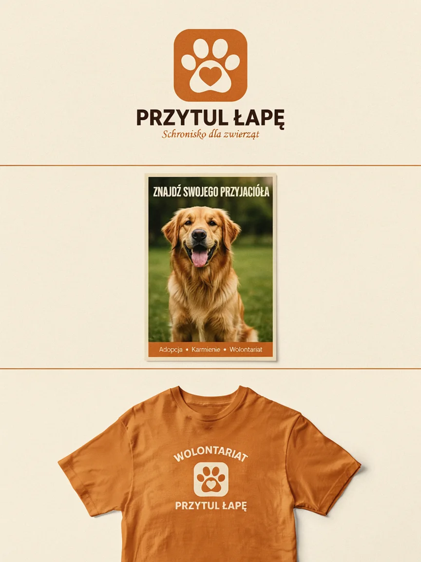
Friendly rebrand for an animal shelter "PRZYTUL ŁAPĘ": logo with a paw and heart, adoption poster with a dog photo, volunteer t-shirt, warm orange paletteThe logo with a heart in the paw pad is simple and memorable, “ŁAPĘ” (paw) with two Polish characters came out correctly on three applications, and the added “Schronisko dla zwierząt” (animal shelter) too. On the poster the model composed a slogan on its own and made an error: “ZNAJDŹ SWOJEGO PRZYJACIÓŁA” instead of the correct “PRZYJACIELA” (find your friend). Slogans that need to go to print should always be provided in the prompt, don’t leave them to the model.
Summary: Scores for 10 Concepts
| Brand | Score 1-5 | Text Error-Free | Notes |
|---|---|---|---|
| Coffee Roaster PRAŻALNIA | 5 | yes | consistent board, “Ż” everywhere |
| Dairy ZAGRODA | 4.5 | no | pseudo-text in fine print |
| Bakery ZOSIA | 3 | no | “AISOZ” on window |
| Pharmacy Zielony Krzyż | 4.5 | yes | unnecessary “ZK” on icon |
| Railway Koleje Pomorskie | 3 | no | euro, wrong station, English |
| Cosmetics BAŁTYK | 4.5 | yes | coral instead of seaweed |
| Brewery PÓŁNOC | 5 | yes | best board |
| Festival OFF LASU | 2 | no | Nigeria, real artists |
| Fintech GROSZ | 3 | no | English UI, gibberish contacts |
| Shelter PRZYTUL ŁAPĘ | 4 | no | grammar error in slogan |
Most Common Errors and How to Avoid Them
- Model adds its own text. Prices, dates, slogans and station names that weren’t in the prompt are the main source of errors. Provide every inscription in quotes and forbid the rest:
no other text. - English instead of target language. Without guidance the model writes interfaces and captions in English. Add
all text in [language]and provide currencies and labels explicitly. - Ambiguous names. “LASU” became a university in Nigeria. If a name looks like an acronym, add context: city, country, language.
- Mirrored text. “Shop window lettering” tempts the model to reverse letters. Describe which side the viewer is looking from.
- Too many applications on one board. With five or more elements the number of small texts grows. Split the board in two or generate applications separately.
- Real names and brands. Check line-ups, partner logos and product names before anything goes to the client.
FAQ
Will Ideogram 4.5 create a logo for my company?
It will create a good concept and board for a conversation with the client, as with the coffee roaster and brewery. You won’t get a registration-ready logo from this: the image is raster, and the mark needs to be redrawn as vector and checked in the trademark registry.
Why are the brands in the test fictional?
So we don’t generate someone else’s trademarks and don’t suggest that any company ordered a rebrand. A fictional name also shows better how the model handles text it couldn’t have seen in training data.
How much does such a board cost?
On fal.ai an image in high quality costs $0.22, so 10 boards cost $2.20. For boards with small text we wouldn’t go lower than high, because small text is the first thing to break.
How do you fix incorrect text without regenerating everything?
Through editing (ideogram/v4.5/edit) with precision mode: you provide the image, write which text to change, and add change nothing else. Examples of such corrections, with what worked and what went wrong, are in the article about photo editing.
More About Ideogram 4.5
- Ideogram 4.5: 15 Graphic Styles with Prompts
- Ideogram 4.5 in Photography: 12 Frames with Prompts
- Ideogram 4.5 for Social Media and Print: 10 Projects
- Photo Editing in Ideogram 4.5: 10 Before and After Examples
- Edit Test: 10 Corrections in a Row Against 7 Models
- Polish Text in Ideogram 4.5 Against 8 Models
More on this from QUANTSLANT
 benchmarks·Grok 4.7: Full Benchmark Table and Pricing at Launch2 USD per million input tokens with a new base model. Seven benchmarks, three wins, triple advantage in legal work. Launched September 21, 2026.